Emmanuel Lubezki will likely be walking home with his second Oscar in a row on February 22 for Birdman, a film that essentially serves a feature-length summation of Lubezki’s talents. But how did he get to acquire those talents, and why did they appear so late in his career? I hope to give you the answers to those questions and less in the course of this article, where I’ll take a look at his odd career path from beauty to Birdman.


Period I (1991-1999)
Lubezki began his career working with Alfonso Cuaron, his longtime friend and collaborator since film school. Their first feature was Solo con tu pareja (currently available from the Criterion Collection, alongside gems like Border Radio and Fanfan la Tulipe). It’s only barely tolerable as a sex comedy and has few laughs, but it announced a true talent behind the camera. Lubezki fills the film’s exaggerated world with appropriately exaggerated lighting, using wild shifts of lighting between exteriors (bright, lush settings) and interiors (dark with rich, shaded contrast). It’s a bad movie, but a technical marvel. With his lack of concern for “realism” in these early days, it’s no wonder he made the quick jump to working on Hollywood movies. After a few American low-budget films and the Mexican hit Like Water for Chocolate, he made his studio debut shooting Ben Stiller’s Gen-X comedy Reality Bites. I’ll give the film that it’s better than Solo con tu pareja, although not by much, but whatever the film’s merits, it looks fantastic. As opposed to the grime and dirt than many a Gen-X-baiting film went for in its look, Reality Bites has a romantically lush look, full of beautiful golden lighting in even the most unlikely of places (no one’s 90s apartment looked as good as Lelaina’s does here). From that job shooting a moderately successful comedy for Universal, he got more studio work, again focusing on lushness over naturalism. His second film with Cuaron (for Warner Bros. in 1995), A Little Princess, has an almost storybook-like look, with bright light everywhere except the Hell on Earth that is the school where the heroine must spend her time, where light is restricted from all sources (adding to the storybook quality is the omnipresent green which covers every surface in the school). The one sequence in the film which deviates from this formula is a scene following the heroine’s dad in the trenches, shot handheld in broad daylight, which suggests the filmmakers’ future work on Children of Men. Also in 1995 was A Walk in the Clouds, an attempt to bring back the 50s melodrama which fell flat on its face, although for reasons unrelated to Lubezki’s excellent cinematography. Again, he goes for a romantic look, filling a California vineyard with endless pools of light, even in the dark. Again, the scenes that break from this pattern are ones at war, where the normally staid camera goes wild, and the image becomes desaturated down to almost black-and-white (the only way of telling that it isn’t exactly b&w is the very slight coloration on the lens flares). His love of sunny surroundings continues into The Birdcage, where the South Beach sunshine is practically its own character in the movie. It’s here that we also see the birth of one of Lubezki’s most recognizable trademarks; the long take. Sure, he’s far from the only one who does long takes, but he’s done so many memorable ones that they might as well be a registered trademark of his. Birdcage opens with a doozy, where the camera travels over the water, over the streets, and deep into the titular club. After this, Lubezki took 1997 off, but his 1998 represents the nadir of his style at that time. His lush style may have made Meet Joe Black and Cuaron’s adaptation of Great Expectations looks splendid, but they were both relative failures (Cuaron admits that his main concern day-to-day working on Expectations was making it look nice, and he purposely moved away from that line of thinking with his later films), and his next film, Sleepy Hollow, could be seen as moving away from the style. Although it’s definitely a far cry from reality (director Tim Burton and Lubezki went for the monochromatic look of a Hammer film, after all), it’s also not “lush”, favoring limited or no light even at day, and saving any warmth or brightness for flashbacks to Ichabod Crane’s childhood. It’s a new step, but not as radical of one as the one he would make into the next decade.


Period II (2000-2008)
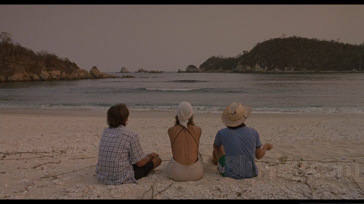
Lubezki’s use of natural light and handheld can be traced back to the little-seen Things You Can Tell Just By Looking at Her at the start of the decade, but 2001 would mark a big year for Lubezki’s evolution as an artist. First (in the U.S., at least) came Michael Mann’s Ali, a biopic which stubbornly refuses many biopic conventions, which include still compositions (the camera is almost literally never not moving), “warm” film stock to indicate the past, and studio lighting. I’ve already talked about that film here, so I’ll move onto his other 2001 feature, Y tu mama tambien, a reunion with Cuaron. This is perhaps the defining text of the Lubezki handbook to filmmaking, with all of his obsessions handily collected in one film. There’s the handheld photography, which starts immediately and never stops, and the long takes, of which there are many (the one of Maribel Verdu seducing the boys and the camera is a personal favorite). It was a pointed reaction to the beauty of Cuaron and Lubezki’s Hollywood movies, but in its own way, it looks fucking gorgeous. However, this new style would have to go on hiatus for a few years as Lubezki shot two family films, the abomination unto the Lord that is The Cat in the Hat (whose eye-searing look I don’t blame on him so much as the art designers and the director thinking it was a good idea) and the decently underrated A Series of Unfortunate Events (where Lubezki goes back to the style he used for Sleepy Hollow), before it returned in full form on The Assassination of Richard Nixon. The film has largely been forgotten in the ten years since its release, but viewed now, it serves, if nothing else, as a perfect warm-up to the likes of Children of Men, predicting that film’s style with its constant handheld photography, the coarse grain covering the image, and the “dirty” natural lighting. After that, he would begin a collaboration with director Terrence Malick that continues to this day, with The New World, where the camera roves around the gorgeous surroundings with the same glee and freedom that the characters (especially Pocahontas) often do. Again, natural light is a big factor, leaving the settings to reveal their beauty without the aid of studio lighting. The year after that came Children of Men, his work there becoming legendary amongst filmgoers and critics whose names don’t rhyme with Schmike D’Schmangelo. If Y tu mama tambien is the definitive Lubezki work, Children of Men is one of the most Lubezkian works, taking the handheld camerawork, long takes, and “found” lighting to their natural conclusion. And with nowhere left to go (for a few years), Lubezki did a little victory lap with Burn After Reading, whose deceptive blandness feels like a typically Coen brothers-esque prank (“Hey, did you think No Country for Old Men looked great? Well, we’ll get the other best DoP to shoot our next movie, and it’s gonna be set entirely in dully-lit offices and buildings!”). And that’s it for this decade.


Period III (2011-)
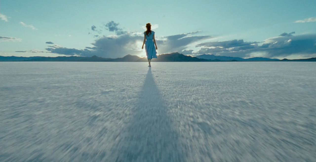
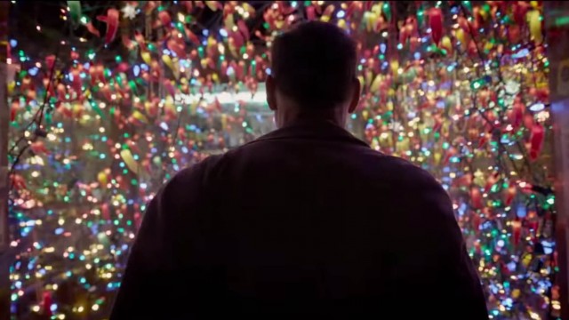
This current decade finds Lubezki neatly summing up his talents with a variety of films. The Tree of Life is one of the most impossibly beautiful films I’ve ever seen, each frame a work of art crafted by Lubezki, Malick, and their team, sometimes on the spot. The camera views each image as an eye views a dream, always moving and shifting with the image. To the Wonder continued that string of lovely imagemaking, even when the film itself wasn’t up to snuff at times (I still really like it, because I like Malick even at his most self-parodic, and if nothing else, the Javier Bardem sequences are things of beauty). But Gravity would be the film that would finally get Lubezki an Oscar and a lot of recognition outside of film buff circles. The Lubezki hallmark of long takes is there in a big way, with about as many visible cuts as hours in the day, although the film’s overall camerawork seems more in debt to his work with Malick as opposed to Cuaron, with the camera swooping and flying with the actors (in space, no one can see you go handheld). Some have complained that he won an Oscar for the effects team’s work, which is fair, but I think a little unfair. While something like Avatar or Life of Pi is content to point the camera at pretty digital effects, the camerawork in Gravity is at least half the battle, because it’s always in motion, always framing the actors and space for maximum terror and inexplicable claustrophobia. But it almost all feels like a warm-up for Birdman, which is the direct follow-up to Children of Men‘s cinematography, taking those handheld long takes unfolding in natural light to their breaking point, at feature-length. It’s audacious work, which manages to be showy and emphasize the actors at once, and it will deservedly win him his next Oscar. He’s busy these next years, with four films in production (two Terrence Malick films, The Revenant for Birdman director Alejandro González Iñárritu, and the Jesus movie Last Days in the Desert), three of which come out this year. Let’s see if he can continue his evolution into upcoming years, and hopefully stay away from 2 Cat 2 Hat.


Period I/II (assorted years)
There are many Lubezki-related things that I couldn’t get to writing this piece. As far as his feature work, I neglected to mention Twenty Bucks (which I haven’t seen), his uncredited work on Hearts in Atlantis (ditto), and his camera operating on Martin Scorsese’s Rolling Stones documentary Shine a Light (couldn’t find a way to fit it in). I also couldn’t fit in his two episodes of Fallen Angels, the neo-noir Showtime anthology series (he shot the season 1 episodes directed by Alfonso Cuaron and Steven Soderbergh). He’s also shot two short-form works for Alejandro González Iñárritu, one being Anna, a segment in the omnibus film To Each His Own Cinema, which can (and should) be viewed here, and the inventive Nike ad “Write the Future”. And speaking of ads, he’s done a lot of them. Like, a lot more than you would imagine. You know those DirecTV ads that tell you to switch to cable before you do something ridiculous as a result of it (like get bodyslammed by a lowland gorilla, or attend your funeral as a guy named Phil Schiffley)? He shot those. All of them. (he didn’t shoot the Rob Lowe DirecTV ads though. Those where done by Hoyte van Hoytema. I am not kidding.) He also shot two David Fincher-directed Nike ads. He also did an American Express ad with Martin Scorsese. This has nothing to do with his artistic evolution, it’s just really interesting to know.

