The Elements of Style is a new feature at The Solute, where we look at stylistic tics of various filmmakers–directors, writers, cinematographers, composers, even producers. I encourage other Solute writers to join in on this.
Steven Soderbergh is a hard director to pin down in terms of style, because he works not to have one. Rather than film different stories (Soderbergh rarely writes his own scripts) in a unified way, he applies himself to each story–really, it seems, to each scene–and find the best way to present that one scene. At his best (and he is often at his best), that gives his work an ideal feel, like we are seeing the only way this scene could happen, and the only way we could see it. Style, though, is the thing you can’t help doing, and Soderbergh never seems to be able to stop himself from elliptical editing and scrambled time schemes, and he never stops using shots of objects.
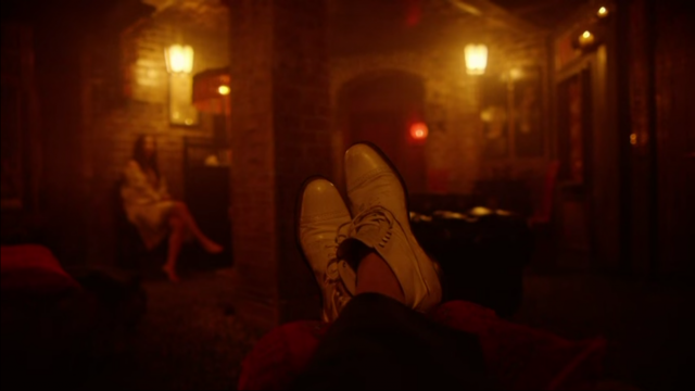
Of course, anyone can shoot an object and many have; what makes Soderbergh’s object shots distinctive is the editing cadence: the shot gets an isolated moment, with a cut into and out of it, and it often comes as the downbeat of a sequence. He cuts out of blackness or out of a previous, active sequence into the static shot of an object, and that shot launches a new sequence. The opening shot of The Knick’s pilot–Clive Owen’s feet against the background of a brothel–shows this well. Coming into this shot cold, with nothing before it, immediately poses a question to us: why am I seeing this? and that’s a great way to keep our attention. Soderbergh will wait to reveal the rest: it’s a moment later before we get the title card indicating NEW YORK CITY 1900–most directors would start with that information, and it’s only when Owen gets up and leaves that we know where he is. Like Kubrick in Barry Lyndon, Soderbergh creates something that has aesthetic impact before he reveals the narrative significance, and showing an object without context is a good way to do that.
Another kind of object shot works as the reverse of that, using our knowledge of the object to launch a sequence. In Side Effects, we’ve already heard about the significance of the new drug Rooney Mara will be taking, so when Soderbergh cuts to the bottle of pills, this means that the plot is going to take its next step. VAGUE SPOILERS FOLLOW: Soderbergh uses the shot of the bottle to load this moment with more significance than it will actually have; he also uses it to put us in the point of view of Mara’s character. The first act of Side Effects is a massive misdirect, where Soderbergh continually makes us think we know more than we do by making shots more significant to us than they are to Mara’s character–we see what she sees and that makes us assume we know what she knows. (We don’t.) It’s some of his subtlest and best direction.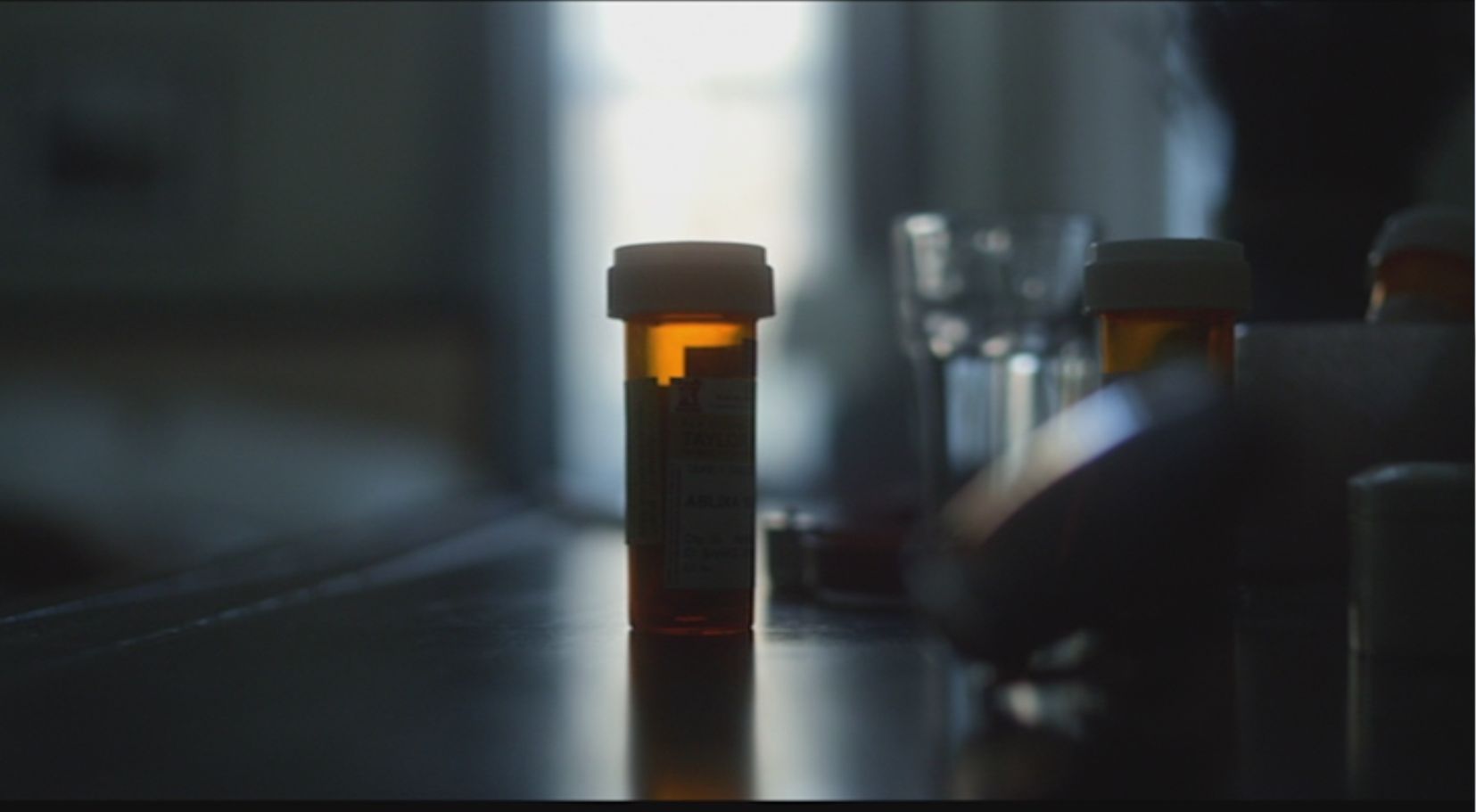 The object shots enable another aspect of Soderbergh’s style: his relentless narrative compression. (Side Effects actually takes too long in some of its scenes, which should be a warning that Soderbergh is up to something.) In the last ten years, some of his best films–particularly Che Part One and Contagion–take that compression as a necessity. Both of these films take place on such a scale and with so many characters and events that material has to be left out and implied if the running time is to be kept to movie rather than miniseries length. Che Part One uses a lot of object shots: in the 1964 interview sequences, Soderbergh cuts to all the paraphernalia surrounding Che, starting with an iconic cigar, but the best narrative use of an object shot comes in the massive Battle of Santa Clara sequence at the end. Soderbergh has to manage so many distinct missions going on here, just like Che did. One of them involves derailing a train with Batista’s troops on it, and rather than show the entire process of the guerrillas, he cuts to a single image:
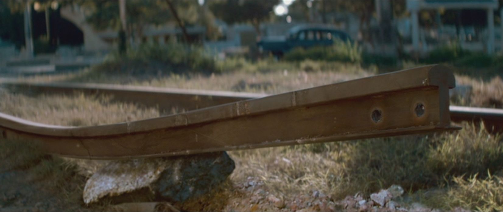 We know what they did now, we know why, and we know what’s going to happen. All of this takes about one second of screen time, and then it’s back to the rest of the action.
Soderbergh can also use objects for less plot-based effects. In the early scenes of Che Part Two, he creates a montage of Che and others setting up their training camp in Bolivia, and there’s a shot of oiled rifle parts that comes across as a moment of beautiful guerrilla propaganda;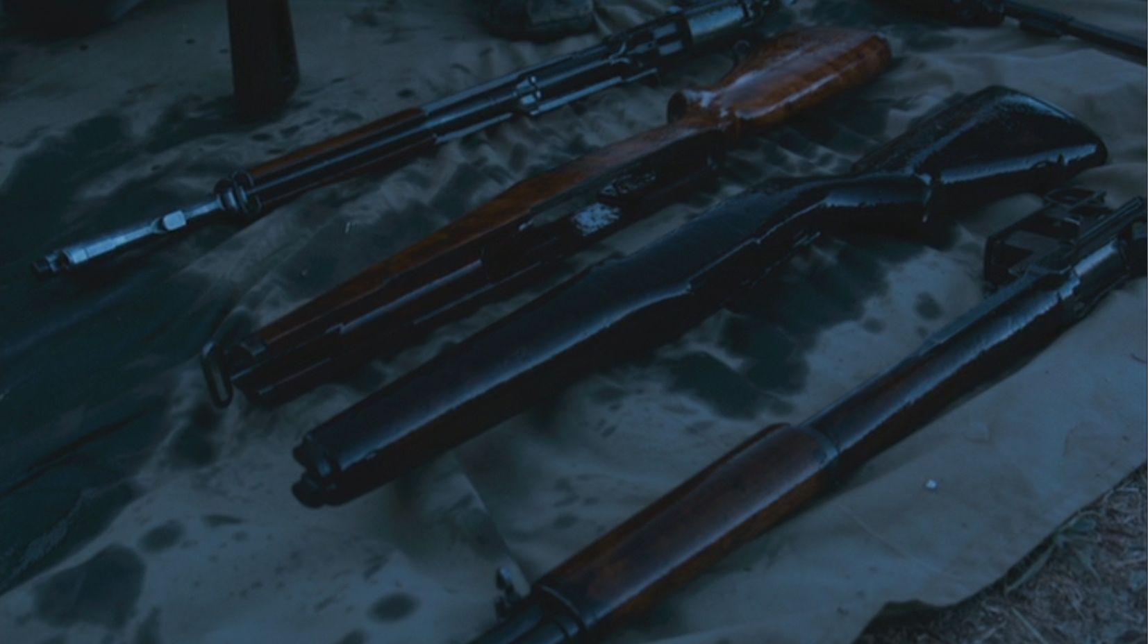 you can almost see this as part of a fundraising pamphlet. Alberto Iglesias’ score here is gentle and also stirring, unlike the dissonant, horror-score drone he’ll employ later; at the beginning of Part Two, Soderbergh creates some of the revolutionary thrill that ended Part One. Before long, everything’s gonna go to shit, but here the rifles are part of revolutionary folklore. Soderbergh can also use objects for a good visual joke, like this introduction to the Scott Caan and Casey Affleck characters in Ocean’s 11:
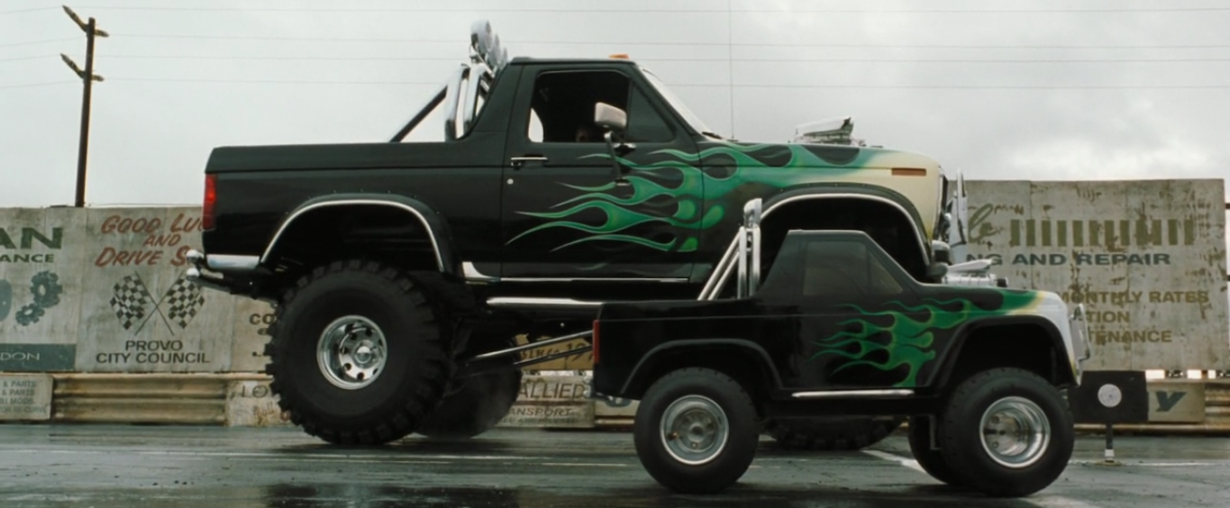 On the commentary, Soderbergh says he intends to use this in all his films from now on, beginning with Solaris. I’m still mad at him for not delivering on that one.
What makes object shots disorienting and uniquely powerful is an unspoken rule about narrative: stories are about the actions of people. Cutting to a person in a montage or a conversation doesn’t have the same jarring effect as cutting to an object; Kubrick used this in 2001, where he repeatedly cut to the red light of HAL–his eye, really–as a way of turning an object into a character. Soderbergh’s most powerful object shots go the other way: they are shots of newly dead people, shots of characters that have now become objects. He uses this in Contagion, where the decline and death of Kate Winslet’s character gets revealed to us with brutal economy: one scene where she’s tired, one scene where she’s sick, one scene where she’s a corpse wrapped for burial. Soderbergh makes it worse by cutting from that shot to a line of wrapped corpses; she’s not even an object anymore but a statistic. In Solaris, we already know that Natasha McElhone’s character committed suicide, and Soderbergh reveals it with a single image of her hand clutching a copy of Dylan Thomas’ “And Death Shall Have No Dominion,” read by George Clooney in voiceover during the montage.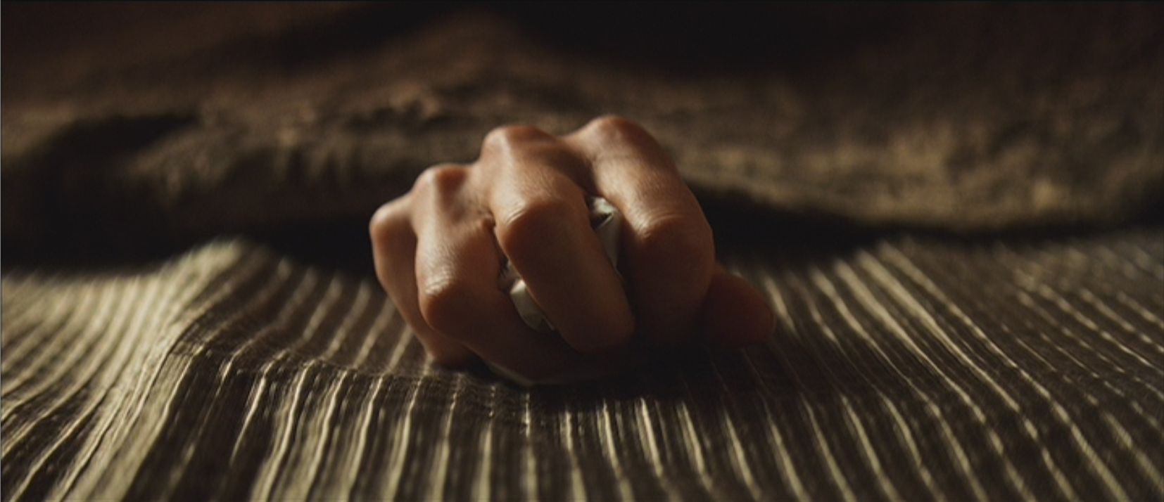 The stark centering of the composition creates a feeling of stillness that is absolute; we know this is the moment she’s gone, and Clooney knows it too. It’s one more way Soderbergh composes a scene as if there were no other way to do it.
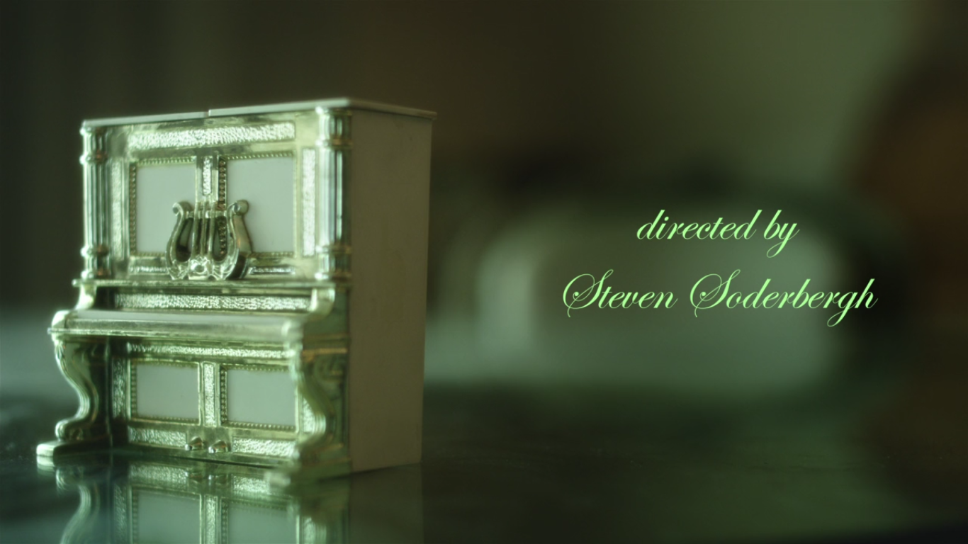
If he can do a shot of an object, why not a montage of them? Ocean’s 12 goes into its final scene with the caption MONDAY NIGHT taking over the whole screen and then a quick series of shots of all the goodies for the party–poker chips, booze, cigars–with all the edits synced to David Holmes’ zinging score. (Ocean’s 12 most resembles the original Rat Pack Ocean’s 11–buncha stars, including Soderbergh, goofing it up on a studio paycheck–and this sequence is definitely ring-a-ding.) The same series of shots continue at a steadier pace all through the end credits. Soderbergh pulls the same move for the end credits of Behind the Candelabra, which absolutely no one believed was gonna be his last movie. In Ocean’s 12, the shots of objects at the end are fun; in Behind the Candelabra, they’re touching. Seeing all of Liberace’s miniature goodies feels like the perfect goodbye to a man who lived life to its maximum fabulousness. Soderbergh could never hate one of his characters to the extent where he criticized his excess; in these ending credits, he does better than criticize or glorify Liberace: he uses his objects to make him genuinely aesthetically worthy.