The Golden Age of Hollywood Animation lines up neatly with the Golden Age of Hollywood in general. Both screeched to a halt with the disastrous impact of television. But while the standard histories trace the transition from Old Hollywood to an equally exciting New Hollywood, most animation fans write off the decades between Walt Disney’s death in 1966 to the release of “The Little Mermaid” in 1989 as the Dark Age.
There’s more than a little truth to that. Like all new technologies, TV inspired a multitude of innovations. Unfortunately, most of them were in the growing field of corner-cutting. The collapse of the classic shorts-newsreel-feature movie experience meant the slow death of nearly every Hollywood cartoon studio. Disney, the lone survivor, barely held on — without Walt, they were like sheep without a shepherd, and they spent most of the ‘70s and ‘80s on the edge of oblivion.
But what was bad for Disney wasn’t bad for everyone. During the Golden Age, Fleischer Brothers was the only studio that dared to compete with Disney in the features market, and it played no small role in the Brothers’ eventual bankruptcy. With Disney no longer the juggernaut it was in its prime, there was suddenly a power gap that other studios, big and small, American and abroad, rushed to fill.
Now that the Disney formula had failed, these creators were empowered to try strange — sometimes very strange — new things. We’ve talked about some of the results before. But the Dark Age went out not with a whimper, but a bang. On the eve of The Little Mermaid’s release (I’d argue a different movie more definitively ended the Dark Age, but we’ll get to that), we have three of the greatest animated films — or films of any kind — ever made, two more that are darned close, and at least one that better critics than I would rank just as highly.
Shorts were no longer a commercial medium, but they still thrived as a showcase for independent animators — including some who’d end up taking over the industry. If I give my parents cool points for anything, it’s for getting in on the ground floor of the legendary Spike and Mike Animation Festival back when it was just a private screening in Spike and Mike’s house. By 1988, they were big enough to go on the road, which is how my parents first saw Pixar’s Tin Toy in San Diego.
Pixar had made three shorts before this, along with spinning off one of them, Luxo Jr., into a series of vignettes for Sesame Street. But Tin Toy was a turning point. It was a big enough hit for Pixar to go to work expanding it into a TV special that eventually evolved into Toy Story.
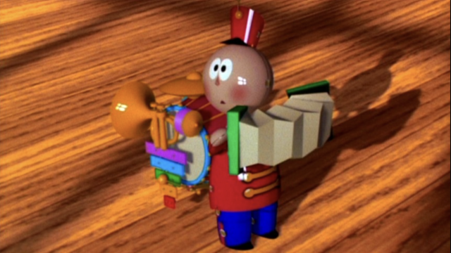
It’s easy to see why. Tin Toy packs a lot of personality and comedy into five minutes. Just like their first short, Andre and Wally B., it shows Pixar understood that CGI had different strengths than traditional animation, and they turned the limited palette of shapes and textures into a strength with the appealingly minimalist character designs. They respond to CGI’s limited range of movement by rendering Tinnny’s face in 2d, making him as expressive as any Chuck Jones creation. Pixar’s also smart enough to know when to cheat: the hardwood floor and a magazine cover introduce a photo-collage element. And some of the genuine CGI tech is astonishing — it’s absolutely mindboggling to me that they were able to make the simulated cardboard and plastic Tinny arrives in so indistinguishable from the real thing in 19 fucking 88.
Tin Toy would be a classic example of not trying to walk before you learn to crawl — except it has a character who is learning to crawl, and hoo boy, is it a trainwreck. TInny’s a present for a baby who he learns to his horror has a nasty habit of breaking toys. And it’s terrifying for the viewer too — for different reasons. The credits list a bunch of “babies John watched a lot,” and he obviously needed to watch even more, because this baby’s lurched straight out of the uncanny valley. His face is a mishmash of intersecting polygons He turns into a plastic doll during a close-up on his foot. And his diaper is apparently made of concrete.
Oh well. Technological proficiency was part of what made Pixar such a gamechanger, but no one would have noticed if it weren’t for the stories. And even this early, with this slim a runtime, Tin Toy delivers. Tinny’s escape from the baby gets a great punchline when he discovers all the other toys have hidden under the couch — so that’s how they always end up there! (It’s even funnier when you notice one of them is just a severed head.) And then the classic Pixar sentimentality kicks in when the baby falls and starts crying, so Tinny decides to risk life and limb to comfort him. Then Tin Toy complicates its happy ending with another sharp bit of observational comedy. The baby loses interest in Tinny and decides to play with the bag he came in instead. The short ends with the tables turned: Now Tinny’s trying to get the baby’s attention instead of avoiding it.
Future Pixar star Pete Docter was just a student at CalArts in 1988, but his short Winter shows he had mastered storytelling before he ever walked through Pixar’s doors. It’s even shorter and simpler than Tin Toy — if that was a Sunday comic, this is a one-panel New Yorker cartoon, all setup for a hilarious punchline. It also has a simple, relatable idea to build on, in this case, the childhood indignity of your mom bundling you up so tightly you can’t move. The shoestring animation is equally simple, but money can’t buy you personality, and Winter’s pint-sized protagonist has plenty of it.
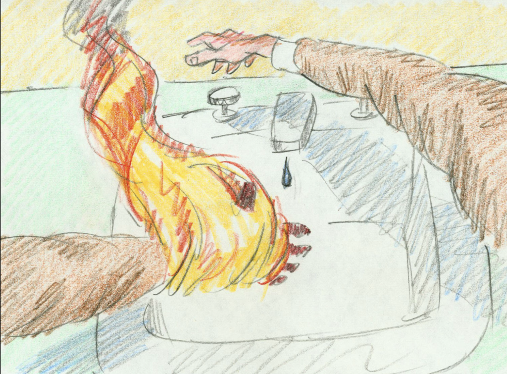
Docter eventually moved on to bigger and better things, but Bill Plympton has been plugging along on his handmade little films for the past half a century with a “studio” that amounts to him and a couple friends. He makes the most of his constraints much like Docter does: working in colored pencil, lurching between astonishingly elaborate and barely-animate animation.
“One of Those Days” shows its no-budget origins more obviously than most of Plympton’s work. The line art frequently descends into illegible scribbles. Somehow, that approach coexists with some of Plympton’s most ambitious work. The whole short takes place from a first-person perspective, meaning Plympton has to do the kind of “camera” moves that are easy enough in live action but require him to redraw the short’s whole world 12 times a second. More importantly, the short’s just plain hilarious. The title is an understatement for the ages, as Plympton spends eight minutes seeing how badly he can mangle his protagonist in a way that’s somewhere between Tom and Jerry and a slasher flick. Best of all, the joke never gets old. At one point, the poor schmuck’s dog bites on his leg, and we see five or ten times that it’s refused to loosen its death grip through all the mayhem his owner suffers. And I still laughed almost every time.
Plympton explores manglings of another kind in “How to Kiss.” The textures are much more carefully realized than in “One of Those Days,” the better to appreciate the nastiness of a man and woman’s faces melting into play-doh or rubber balloons. Trouble is, Plympton can’t find nearly as many variations as he did in “Days,” which means that even though “How to Kiss” is about two minutes shorter, it feels twice as long. The overwhelming grossness of the whole thing doesn’t help — kudos to Plympton for finding the nastiest, slimiest kissing sounds ever recorded, but artful grossness is still grossness. Worse, it feels like reheated leftovers: Plympton had found much more inventive ways to warp the human face in his Oscar-winning masterpiece, “Your Face,“ a year earlier. I have no way of proving this for obvious reasons, but it’s easy to imagine Plympton watching the middle section of Czech animator Jan Svankmajer’s “Dimensions of Dialogue” and thinking, “Why don’t I just mash up ‘Your Face’ with that?”
Speaking of Svankmajer, he was keeping busy in 1988. Along with his mindboggling feature Something of Alice — don’t worry, we’ll have plenty of time for that later — he also found time for a new short, Muzné Hry, translated as “Manly” or sometimes “Virile Games.” As you’d expect, this is a setup for a good old-fashioned machismo-skewering, as a football game devolves into mindless violence (imagine what Svankmajer would think of American football, or rugby, or heaven forbid, boxing), somewhere between “How to Kiss” and “One of Those Days.” And Svankmajer has some extra tricks to make his film even more hilariously disturbing than Plympton’s. Pre-destruction, the footballers’ faces are eerily realistic, setting up a great little uncanny thrill as they’re revealed to be nothing but hollow clay with dentures and glass eyes as they’re turned inside out. Svankmajer never liked to think of himself as an animator, and Manly Games is a true collage of techniques — something like a third is live-action, with one man playing all the parts, mixed with stop-motion and paper-cutout animation straight out of Monty Python. Unlike either Tom and Jerry or the slasher flicks, the violence is much more outrageous for the subdued presentation: no music but plenty of sound effects during the face-manglings, and what music we get is some hysterically inappropriate sappy strings as, for instance, some coffins dance around the field. Manly Games hits its zenith of hilarious callousness in one of the cutout scenes, where the men carrying an injured player on a stretcher dump him into a coffin and turn around without even pausing.
Meanwhile in China, Te Wei released the polar opposite of all this anarchic violence with Feelings of Mountains and Water. It’s an appropriate title for a movie that’s much more about feelings than story — I still couldn’t tell you what the relationship is supposed to be between its only two characters. And it delivers as promised with Te Wei’s gorgeous vision of shan shui painting in motion. That gives the titles a double meaning: the original Chinese is Shān Shuǐ Qíng, which could refer to either the setting or the medium.
Unfortunately, vibes can only get you so far: what could have been a masterpiece at five or ten minutes stretches awful thin at twenty. But even as the “wow” factor of the first few minutes disappears, Te Wei continues providing reasons to keep watching. The stillness of much of the movie makes the moments of full animation shockingly beautiful, and the simplicity of the character designs makes it clear just how much detail goes into their movements. But my favorite moment turns that simplicity inside out. Much of Feelings of Mountains and Water revolves around a zither-like guqin, and I never believed it was anything but a real, solid object until a stunning match dissolve reveals it’s just a single brushstroke that could just as easily represent a rock. Even better, this look behind the curtain does nothing to dispel the magic.


