Over the weekend I went to the George Eastman House, the founder of Kodak’s mansion/museum that has an incredible amount of film and photo artworks and nearly as many ashtrays made out of animal feet. The images were more rewarding — there was a very cool exhibit from photographer Gregory Halpern blending borders in his images of Buffalo; a delightful display of Phenakistoscope disc animations made by some talented students in Rochester schools; a well-curated collection from the museum’s archives tracing the development of photos through technique but also artistic philosophy, subject matter and ethical concerns. And there were also some movies.
The Crashing Into The 60s exhibit examined how poster art changed during the decade, and while photos are present here they are frequently altered or subordinate to enhancements of color and shape. Saul Bass had been making poster art since the 50s and his bold colors and flat icons are here as well, and his broader motif of telling what the movie is without using images from the movie itself really takes hold. Of course, there were also designers who kept time-honored designs but used looser overall standards to really sell their pulp:
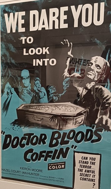
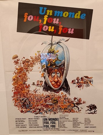
And detail-wise, many illustrators went in the opposite direction. Gorgeous washes of color create moods more enticing and ominous than Bass’ starkness, and clustered images from the film overwhelm, selling sensation. The great EC comics artist “Jolly” Jack Davis cut out the bloody stumps and exposed intestines of his original line of work but kept his vivid cartoony excess, making posters that nearly contained the movies themselves even as they burst off the one-sheet:
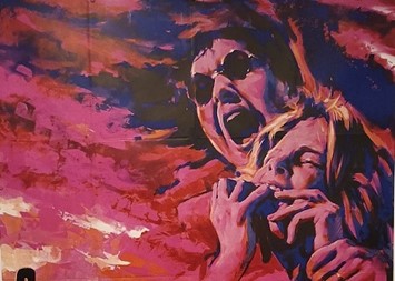
The exhibit had quite a few international posters and it was fun to see what differed from the American versions, if anything. But the one that really caught my eye was another French poster, for the 1963 film The Miracle Worker. The original is striking and disturbing, making great use of a single warped photo, but the French version really ups the ante:
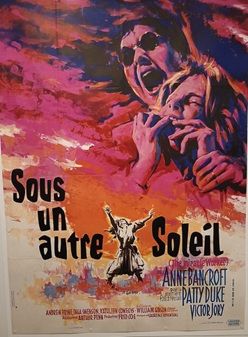
The screaming! The biting! The staggering! This could be an ad for Carrie a decade before its time, especially with the red splashed over 2/3 of the images. It’s a hell of a poster but it looks like Anne Bancroft is the nurse to good old Doctor Blood from above. If there’s one thing that generally ties the posters in the exhibit together, it’s the use of different tools and styles to express the movie’s vibe even if the movie itself remains opaque. Here, the vibe is off, and I don’t think in a purposefully misleading way that any fan of schlock knows and has been burned by (looking at you, Metalstorm: The Destruction Of Jared-Syn). And the poster’s existence as an advertisement above everything else means whiffs like this are few and far between. But on the other hand, this poster is a million times better than 99 percent of the composited photo/graphic dogshit out there today. Maybe it’s “wrong” but it’s art.
What’s your favorite misleading or misinformed movie poster?

