The art of the movie poster is being degraded with each passing day. Major studios have run dry of ideas for posters besides “lotsa sparks!” and “lotsa heads!”, and even those ideas are executed with a sixth grader’s understanding of Photoshop. But a few brave souls have kept the art alive, and few have done so with more passion than Neil Kellerhouse. Kellerhouse is a graphic designer, and started out doing movie logos (he created the title treatment for Finding Nemo) before moving into designing Criterion DVDs and eventually posters. His work often plays with elements too seldom included in major posters, namely excessive negative space and fractured or “imperfect” images, so it’s no wonder that he would gravitate towards a director with a slightly cracked sensibility. And that describes Steven Soderbergh pretty well. Over the course of 10 years, Kellerhouse crafted arresting artwork for seven of Soderbergh’s films,
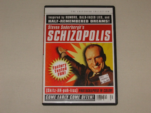
Kellerhouse’s first collaboration with Soderbergh was on the packaging of the Criterion DVD of Schizopolis. Befitting that film’s manic, throw-it-at-the-wall approach, Kellerhouse went all-out here, combining marketing lingo, cheeky acknowledgements of the DVD form (like the price sticker and bar code), a sensory overload of stills from the film (including the ones of the pantsless guy running), and outright nonsense (and that’s not even getting into the “legal disclaimer” on the back of the cover). Soderbergh’s carnival-barker pose on the cover says it all; Criterion and Kellerhouse are shouting at you to experience this truly bizarre, unique spectacle.
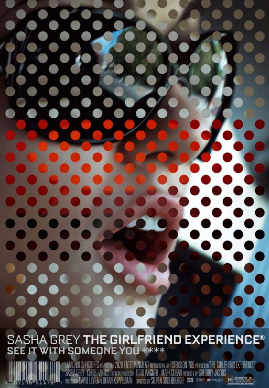
Kellerhouse’s first poster for Soderbergh would be for his tiny indie experiment (and inspiration for the later, superior television series), The Girlfriend Experience. The film is about call girls, but it almost seems made to be as patently unsexy as a film about the oldest profession could be. Kellerhouse matches (and maybe even exceeds) the film’s combination of alluring and disappointing, filling the poster with the beautiful face of then-porn star Sasha Grey but rendering it frustratingly incomplete. And whatever, if anything, is pictured in those dots abstracting her face is completely blurry and incomprehensible. It feels like a vaguely dirty, upscale magazine (including the continuation of Schizopolis‘s bar code, plus the registered trademark logo, which also tie into the film’s portrayal of prostitution as the one business not affected by the recession), showing you nothing but leaving you with the feeling that you’re missing out on sexy times (just look at that goddamn tagline).
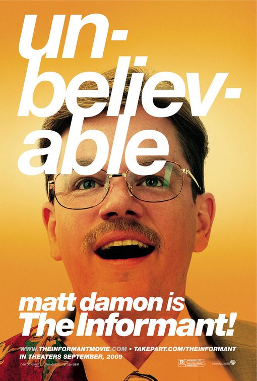
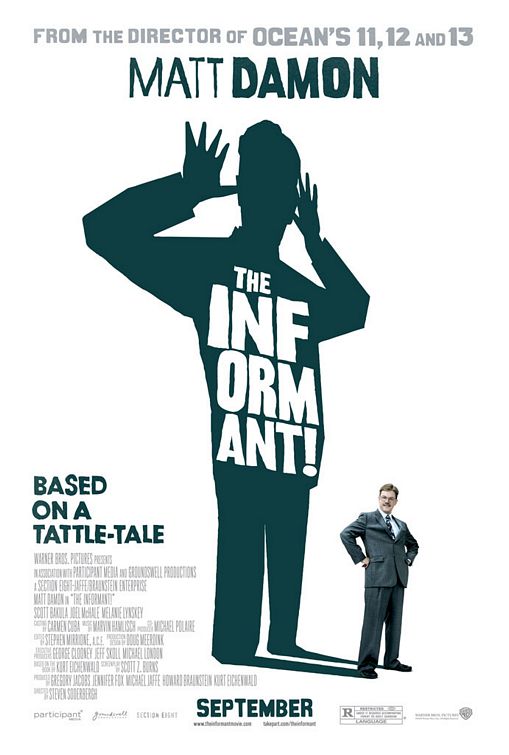
Kellerhouse’s first posters for a Soderbergh film aimed at an audience of more than five people would be for The Informant!, a comedy about topics that would absolutely not be played for laughs in another version of this story, which is on the surface a serious story about corporate malfeasance and mental illness. Kellerhouse not only goes all-in on the goofball elements of the film, he seems to specifically thumb his nose at the Erin Brockovich/A Civil Action-type film that could have been made from this story. The first poster gets its amusement primarily from Matt Damon’s wide-eyed look of astonishment at the fact that he is the informant(!), but even the way Kellerhouse plays with text is funny, from the inexplicable lower-case treatment of Damon’s name to how many lines it takes to fit the word “unbelievable” onto the poster. Kellerhouse would revisit this layout for his later, more iconic Social Network poster, but there’s something about the sheer goofiness of this version of it that works even better for me.
This poster isn’t much more forthcoming about the content of the film than the first one, but it quietly gets a lot across in a simple design. There’s once again a focus on its funniness, with Damon’s wannabe important posture being dwarfed by his shadow’s playground taunting, and calling the man he’s playing a “tattle-tale” instead of even a whistleblower. But the taunting is quietly a clue to Damon/Mark Whitacre’s true motives. He might be mocking the bosses he’s sending to jail, but it residing in his shadow suggests it may be more about him secretly taunting the FBI for failing to pick up on the scent of his own crimes while they worked together.
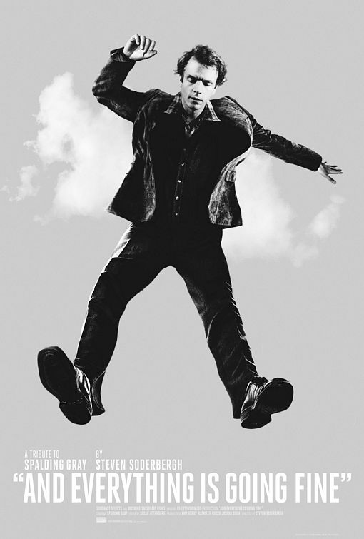
And Everything is Going Fine was made, as the poster says, as “a tribute to Spalding Gray”, the raconteur storyteller who Soderbergh worked with on Gray’s Anatomy and King of the Hill, and Kellerhouse follows suit with his evocative one-sheet. It captures a young(er) Gray mid-leap, what he jumped from and the limits of how high he can go not visible. It’s something of a metaphor for Gray’s storytelling risks, taking bold leaps without concern for their possible limits, but it’s maybe moreso a metaphor for Gray’s life as depicted in the film. The fall will come for Gray in the poster just as it did for Gray in real life (just look at those looming clouds behind Gray), and it will be tragic, but Soderbergh aims to present him before that point (there’s no explicit mention of his death in the film), because that’s the kind of loving tribute a friend deserves.
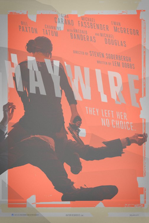
Made as a pisstake in the rubble of Soderbergh’s Moneyball, Haywire is as meat-and-potatoes a movie can get while still being uber-Soderberghian, and Kellerhouse gets both of those across beautifully in the poster. The basic idea of the poster and the image it uses to convey that couldn’t be more simple; do not fuck with this woman. The way Kellerhouse presents this idea is deceptively messy, with the image and the title being fractured and the background being filled in with color like the guy in charge of it started it and couldn’t be arsed to finish. But, as with any Soderbergh project, there’s artistry even in the mess, with the fracturing representing the typical Soderbergh approach to chronology, the crowdedness of the title and names of the stars at the top being balanced out with some empty space at the bottom, and even the incomplete paint job being a great deal less messy than it looks on first blush (Kellerhouse even was able to cleanly reverse the colors for the version of this poster with the credits block added). The other, non-Kellerhouse posters for the film were either boring or actively terrible takes on standard action movie posters, which makes Kellerhouse’s vision all the more refreshing.
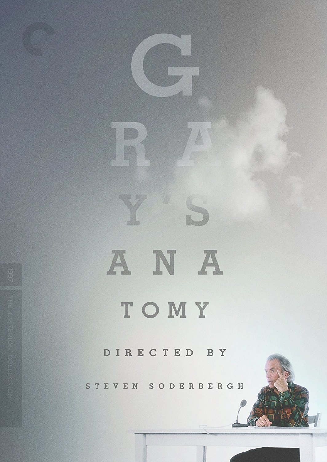
Kellerhouse’s second design for a Soderbergh-Spalding Gray film was for the Criterion release of Gray’s Anatomy, the third theatrically-released Gray monologue. While the tone of Anatomy is much more overtly comedic than the wistfulness of And Everything is Going Fine, Kellerhouse doesn’t stray too far from the tone set by his poster for that film (which makes sense, considering both films were given companion releases by Criterion), maintaining the same grey (hey, wait a minute) color palette and even the same clouds (which he would later reuse again for the promotional materials of Gone Girl). But Kellerhouse also shifts his approach slightly to fit the subject of the monologue, which is Gray’s eye problem. There’s obviously the clever positioning of the title and director credit as an eye chart, but also the grainy background and clouds and Gray’s surprisingly small placement in the frame giving the consumer the experience of Gray’s struggle to see (the booklet design continues this even further, with images of Gray continually obscured by fog and grain).
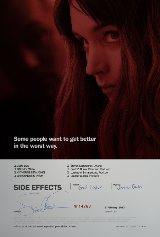
Kellerhouse’s final work for Soderbergh would happen to be for what was then Soderbergh’s final theatrical work, Side Effects. Compared to the relative simplicity of much of his other Soderbergh work, Kellerhouse returns to the busyness of the Schizopolis artwork here, filling the bottom half of the one-sheet with names, signatures, and pharmaceutical double-speak (there’s even a lengthy disclaimer, although this one doesn’t run the whole length of a DVD cover). It all seems to set up the film as a scathing attack on the prescription drugs industry, but seeing the poster after seeing the film reveals that it’s actually a clever distraction from the real laying out of what the film’s about, which occurs in the blood-red image of Jude Law struggling to come into focus behind Rooney Mara, and most obviously in the tagline.

