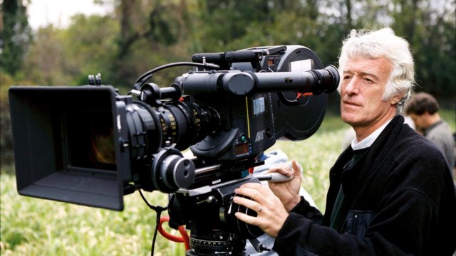
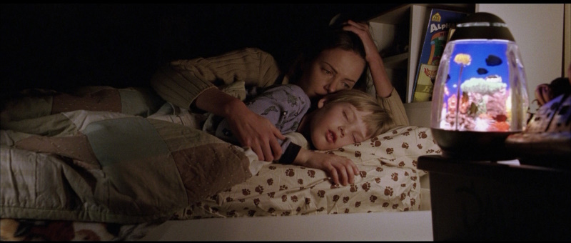
Roger Deakins is one of the finest cinematographers currently working, giving his all on almost every film he’s ever worked on, regardless of whether or not the film deserves that kind of work or not. With his newest film, the Coen brothers’ Hail, Caesar!, now out, The Narrator has decided to take a look at almost every film he’s ever shot in the context of his career. If you want to look at him analyzing all of Deakins’ work from 1984 to 1999 that was available to him, part 1 is here.
2000
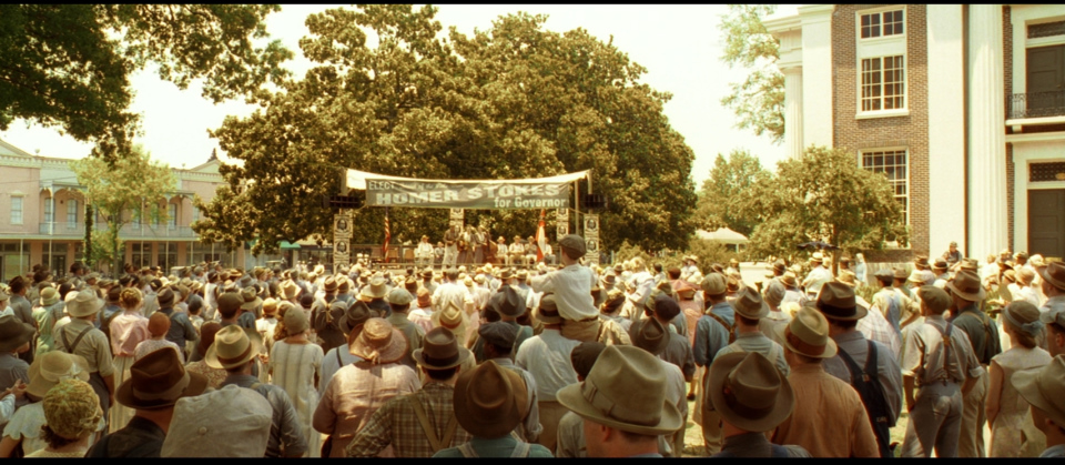
Roger Deakins decided to start off the millennium by changing the way people would make movies from then on. Sure, partial digital intermediates existed before O Brother, Where Art Thou, but Deakins and the Coen brothers weren’t using it for effects sequences (which early DIs were used for), but to shape the look of the film in ways that photochemical color correction simply couldn’t. And, whaddya know? They did a bang-up job on it. The look Deakins and the Coens’ were searching for is the look of Old America, not how it existed but how it exists in people’s minds, in sepia tone with wide-open (this would be the first Coen brothers film to be shot in 2.35:1), rustic spaces. Compared to so many uses of the DI since, the sepia tone here is, while pervasive, never distracting or absurdly overapplied. But it wouldn’t matter what filter was applied to the image in post if the rest of Deakins’ work wasn’t up-to-snuff. It is. In fact, this could be one of Deakins’ most purely beautiful movies in terms of lighting and composition. After the (relatively) naturalistic Fargo and Big Lebowksi, this marks a return by the Coens and Deakins to the more heightened lighting of their earlier(, funny) movies. In addition to the color grading, the lighting adds to the film’s mythic appeal, with shots so beautiful in every way that they could only exist in an artist’s rendering of the period and not in any form of reality. Eh, reality’s overrated anyway.
2001
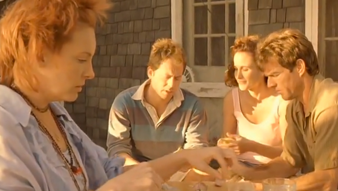
Deakins had himself a very busy 2001, with three films of his released that year, two into theaters, one on HBO. The one on HBO is the one of the bunch that you’ve almost certainly never heard of, and it’s his second film with The Hurricane‘s director Norman Jewison, Dinner with Friends. In case you’re wondering if the film’s cable origins meant that Deakins phoned this one in, I can safely say that he did not do that, even though the movie itself isn’t great shakes. The film, based on Marguiles’ play of the same name, follows a couple (Gabe and Karen) after their friends (Tom and Beth) get a divorce, and the film contrasts the past and present lives of these friends just through subtle (and not-so-subtle) lighting choices. Deakins lights Gabe and Karen’s house for maximum upper-class lushness, giving it a warm and comfortable feel which separates it completely from the murk and shadows we see in Tom and Beth’s house. And then Deakins reveals that both houses are lacking with a sequence set at Martha’s Vineyard when Tom and Beth first met, which has a scorching color palette compared to the neutral color tones of the first act. When Gabe and Karen go back to Martha’s Vineyard at the end of the film, the location may lack its previously blistering hot color scheme, but it still has an organic quality that both households lacked, thus setting the stage for their love for each other to be reaffirmed.
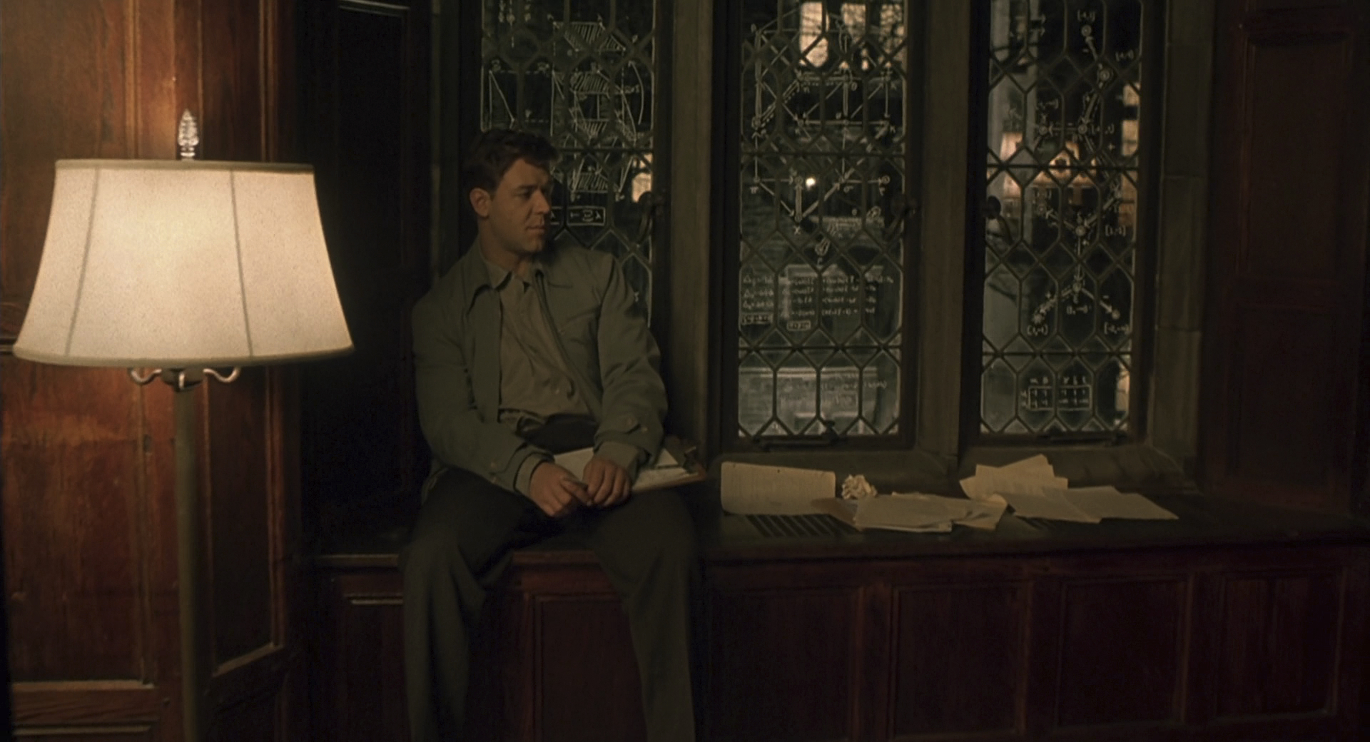
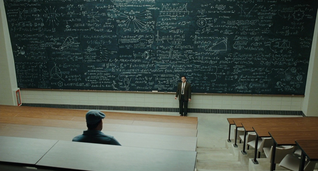
After shooting two nominees, this would be the year that Deakins finally shot a Best Picture winner, that being Ron Howard’s A Beautiful Mind. And if the film is, well, not very good, Deakins’ work on its does lift up to “beautiful” being in the title. As the film opens with John Nash (Russell Crowe) in Princeton, every image is a lush one, full of warm browns and soft lighting that gives the feeling that the lens was bathed in nostalgia before doing each take (as nostalgia is, to the best of my knowledge, not an object you can put on a camera lens, Deakins had to make do by slightly flashing the film stock, which toned down the contrast a bit and gave the images a flatter, warmer, friendlier look). These were the salad days of Nash’s existence (in his commentary, Howard calls these scenes the “Life Magazine section”), although the pleasant nostalgia of these bits is slightly counteracted by the camera often closing in on Nash, foreshadowing the reveal of his disease (the camera also foreshadows this by introducing the characters who are nothing but delusions of Nash exclusively from Nash’s point of view, only becoming more naturally integrated when Nash has accepted them into his life). When the action shifts to several years later, when Nash is working for the Pentagon, the images become darker (shadows are but a distant memory early on, but they take prominence starting here), the light becomes harder, and the colors are substantially more muted, as Nash begins to go into (or believe that he’s going into) a life of mystery and intrigue. But then there’s also the scenes between Nash and his future wife Alicia (Jennifer Connelly), which take on a romantic softness, bringing light to the frame when it’s otherwise absent. It is these moments that help Nash to make it through the murk unscathed, Deakins conveying this better than Akiva Goldsman could ever dream about doing.
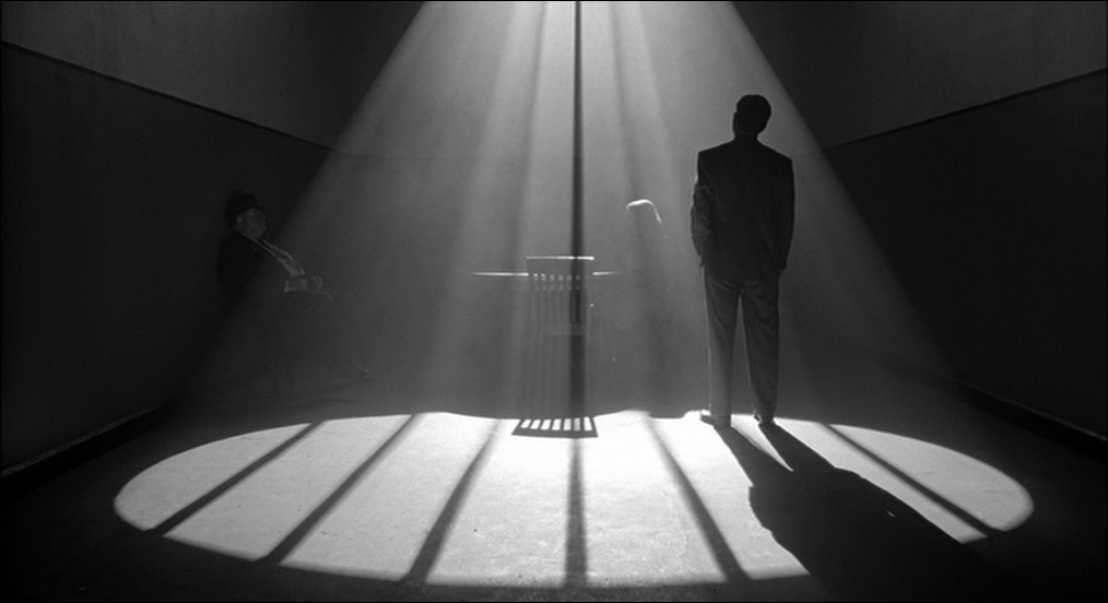
Thankfully, even though A Beautiful Mind was (inexplicably) the champion of Oscar night, the Academy chose to nominate Deakins for the true best-looking film he shot that year, that being the Coens’ The Man Who Wasn’t There. While Deakins had worked in black-and-white in the past, this is the first, and sadly last, completely black-and-white film he’s shot (although it was actually shot in color and converted to black-and-white in post). And oh boy, what a looker this movie is. In the first half or so of the film, a visual pattern is established; the barbershop where the main character Ed (Billy Bob Thornton) works is lit in a high-key fashion, making it a “safe place”, while the department store and office of James Gandolfini’s character are shadowy to the extreme, blacks practically swallowing him and Thornton, and the various other places where Ed finds himself (mostly his house) being somewhere in between. But as the story goes along and the circumstances grow stranger, Deakins’ approach grows more abstract, his ways of lighting becoming much less literal. The most obvious one is the scene in which Tony Shalhoub’s character gives a monologue about Heisenberg’s uncertainty principle, the scene lit by one giant circle of light above them. There’s also the scenes with Ed in prison, where the lighting is so stylized that it suggests that the prison where Ed is held is nothing more than a concept that doesn’t seem to exist outside of Ed’s line of vision (compare this to the comparatively realistic views of prisons in The Shawshank Redemption and The Hurricane). And then the final sequence, in the execution chamber, which is basically a white void with a window (compare that to the genuine realism of the similar scene in Dead Man Walking).
2003
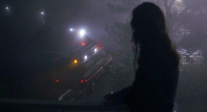
As Vadim Perelman’s House of Sand and Fog opens, Deakins seems to be doing his damndest to live up to the title. As you can see in the shot above, the film opens with Jennifer Connelly (hot off an Oscar win for her other then-recent Deakins-shot project) observing as ambulances in the distance can barely be made out through the fog. The images get slightly clearer from there on, but the misery suggested by that shot continues unabated. This film sees Deakins in a more observational mode, allowing the events of the story to occur (I’d say occur naturally, but “natural” doesn’t really describe this film well at all) without Deakins obviously nudging them along (although he does add another to his soon-to-be very long line of well-lit shitty motels). The hues of the film’s Malibu locations aren’t blisteringly warm nor unreasonably cool; for the most part, they remain neutral, entirely oblivious to the strife of the main characters (this is especially true of the scenes of Ben Kingsley’s characters having to work as a roadside worker, which are cast in warm hues that completely jar with the humiliation of a man this educated having to scrounge this hard for money). The images are softened, no doubt, but whatever fog is present in the much of the meat of the film isn’t quite so obscuring. But as the film goes on, and the horrifying events pile up, Deakins circles back to the beginning, and the fog begins to creep in yet again, eventually consuming all, including the lives of three characters and the soul of another. There’s also a lot of sand in it, but I don’t think that part was Deakins’ doing.
I covered Ed Solomon’s directorial debut Levity for the cinematographers series, and I was not a fan. In fact, I find it to be a tiresome, humorless slog. But among the things I found to like about it (including the score by Eels’ Mark Oliver Everett), Deakins’ cinematography was first on the list (incidentally, the DVD of this is, currently, the only release of one of his films to proudly include his name in the pull quote on the back). In fact, Deakins seems to be on much surer ground telling the tale of a man finding redemption for crimes he committed 22 years before than Solomon does. As the film starts, Manual Jordan (Billy Bob Thornton) has just left a dimly-lit prison to rejoin society in his not much better-lit old neighborhood. Colors here are toned way down, with the strongest hue being the deep blue of the sky. The sun never seems to shine on whatever city Manual has left behind and returned to, an overlay of clouds never leaving the camera’s sight. This, plus the classical, precise framing and smooth textures, is revealed as a reaction to Manual’s crime in a later flashback to the incident, where the colors are brighter and more blown-out, the grain much heavier, and the camera finally not locked-down. But as Manual begins to warm, so do the images, first with the sodium lighting of streetlights, and then with more and more sneaky golden hues, culminating with a dinner between Thornton and Holly Hunter which resembles the bright, high-contrast sheen of another 2003 Deakins project. Why, maybe I’ll talk about that one right now…
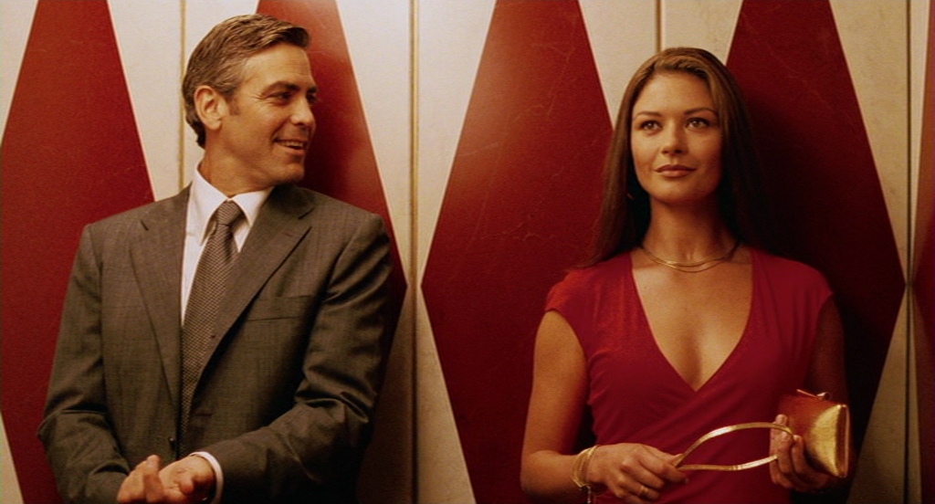
On the surface, the Coens’ Intolerable Cruelty appears to be a straightforward sell-out movie; the Coens polishing someone else’s generic rom-com script and directing the results for a paycheck. And it also appears that Deakins phones this one in; the film is largely beholden to the typical lush rom-com look, with lots of warm colors and orangey skin tones. But just as Cruelty reveals that it’s not quite so willing to surrender to cliches, Deakins’ photography can’t be narrowed down so easily. For one thing, just as the flashes of pure Coens oddness interrupt the film’s story, so do flashes of utter brilliance on Deakins’ part. First, there’s the handheld photography he uses during the opening, which is usual not just for the genre, but for his work with the Coens in general (there’s Jerry getting arrested in Fargo and the ending of A Serious Man as the only examples I can think of). There’s also the motif of characters being completely blotted out by the bright sunlight reflecting on their windshields (which could be read as a brutal commentary on rom-com cinematography), plus the scenes set in the senior partner’s office, which are lit like The Godfather with blacks hiding half of the partner’s face and all of the (limited) light coming through the blinds, and the fact that the main character is introduced from the teeth up. And even the “regular” sequences can get so over-the-top with the orange lighting that it seems entirely possible Deakins is going for satire with his cinematography (after all, so often the lighting looks like the negative got a bad L.A. spray tan, and one of the lushest sequences is one where characters flail around trying to call off a contract killing). This may not be one of his best-looking movies, but it certainly brings a lot more to the table stylistically than one would think taking a passing look at it.
2004
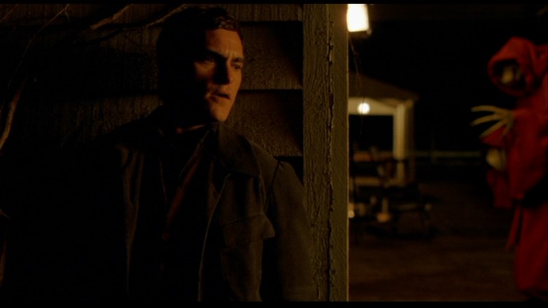
At the time of its release, M. Night Shyamalan’s The Village was immediately reviled as a punchline, and its reputation has not grown over time (save for a few brave souls, including yours truly, holding up the reappraisal flag). This is a shame, not just because people are missing out on a good movie, but because people are missing out on some truly stunning work by Deakins. It fits surprisingly well with his work on O Brother, Where Art Thou too. O Brother made a myth of Old America through cinematic choices, and so does The Village, in a much more literal sense (and an older myth, too). But whereas the expansive compositions and mobile camera of O Brother made the myth a pleasing one, the myth at the heart of The Village is faded and uncomfortable at every moment. Shyamalan’s penchant for static compositions is put to excellent use here (the gag of Shyamalan’s cameo depends entirely on the camera standing still while a character opens a cabinet door just enough), with many scenes unfolding in tight, claustrophobic tableaux, as if we’re looking at old photographs. This compositions are also effective as a suspense-building tool, particularly during the dread-inducing scenes involving Those We Do Not Speak Of, giving the viewer no place to hide as they creep in the background (there’s a shot sometime after the screenshot above, which holds on Bryce Dallas Howard’s hand as she waits for Joaquin Phoenix, while one of those motherfuckers slowly comes closer, that’s both achingly beautiful and pulse-raising). Those We Do Not Speak Of are also well-served by Deakins’ restrained color palette. Much of the film is told in very muted, rustic colors (the brown of the houses and the light green of grass are the most dominant colors), with occasional disturbing flashes of deep red, like the cloaks of Those We Do Not Speak Of (there’s a static shot of a stream as the red of the cloak slowly bleeds into the stream that’s gorgeous) and lantern-lit, almost sepia-toned night scenes. But instead of the warm sepia of O Brother, it’s almost amber here, like the characters are bugs trapped in their environment. And of course, they are (well, at least the new generation, represented by Phoenix and Howard, are).
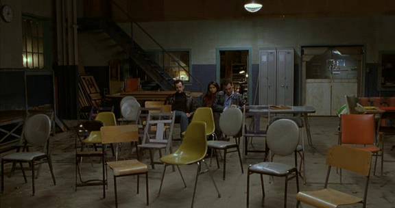
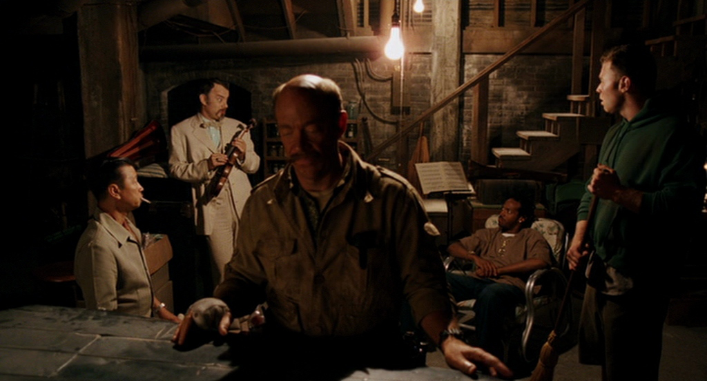
The same year he shot the film that completely derailed M. Night Shyamalan’s reputation as an audience- and critic-beloved auteur, Deakins shot what is considered, by an astonishingly strong consensus, to be the worst film the Coen brothers have ever made. But regardless of whether you think The Ladykillers is a cinematic atrocity or only so far down their catalog because of the absurdly high quality of everything else (I myself belong to the latter group), one cannot deny the quality of Deakins’ work here. In fact, I would go as far to say that Deakins’ work helps suggest that the film is far more than the mean-spirited poke its detractors have made it out to be. Compared to Intolerable Cruelty, the warmth of the images are toned down (although scenes on a riverboat casino are full of garish yellows and golds), but as the film opens, the frame is awash in gorgeous sunlight (never overbearing or blown-out, it’s worth noting), making even the image of a garbage island into something beautiful. It’s as if God is making his approval of the film’s setting and its main character, Marva Munson, known, suggesting that the Coens mean to do much more than mock her, but celebrate her good faith, even if it does make her seem ridiculous at times, winning out over comical evil. The first instance of a deviation from this pattern of lighting comes with the introduction of Tom Hanks’ villainous Professor Dorr, whose presence brings about shadows in Munson’s house, only amplified in the cellar where he and his cohorts in a robbery of a riverboat casino carry out their plans. There, with the only illumination being a few judiciously-placed lightbulbs, shadows devour much of the cellar, but with the recognizable warmth still shining through, which is more than can be said about the scenes with them outside and out of Munson’s company, which are starkly-lit with cool streetlamp light and shrouded in fog. But as the film goes on, and the criminals have to kill her, the cellar begins to catch up with those exteriors, the lighting growing more abstract and shadow-heavy (as with Man Who Wasn’t There, their crimes are externalized onto their environments, and yes, I did just compare The Ladykillers to The Man Who Wasn’t There) and tight dutch angles becoming the most prominent shooting style (a scene where one of the gang tries to kill the old lady is told entirely with askew angles of the house covered with the shadows of the curtains). Deakins tries to alert the viewer to his and the Coens’ intentions for the film as a straightforward tale of good vs. evil, but he was ignored in favor of looking at it as “ha ha, look at those idiots, what a bunch of idiots”.
(I couldn’t fit this into the capsule, so I’ll leave it here; this has two of my favorite Deakins shots/sequences, both in the introductions to the criminals. The first is the “helmet cam” shot of Ryan Hurst’s character getting the shit kicked out of him as he plays football badly, the second being a shot of robbers reflected in the counter glass of Tzi Ma’s donut shop, which I almost chose for the screenshot before deciding to go with something more representative.)
2005
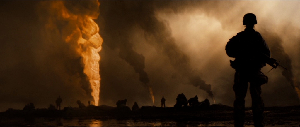
Since the release of Saving Private Ryan in 1998, that film’s style, with its washed-out colors, grainy imagery, and handheld photography, is the one that’s come into vogue as the way to shoot war movies. And indeed, all three of those descriptors are used by Deakins in his cinematography for Sam Mendes (who he would work with twice more, to escalating accolades)’ Jarhead, which follows Marine Anthony Swofford (Jake Gyllenhaal) as he waits for something to happen when he’s stationed in Kuwait during the Gulf War. But Deakins, as always, wasn’t merely contain to copy Private Ryan and its imitators and leave it at that (in an American Cinematographer article, he maintains that the look wasn’t decided because it was what all the other war movies were doing, but as a result of what was best for the script), adding plenty of his own style to the mix (one scene where the Marines watch Apocalypse Now and go crazy for the “Ride of the Valkyries” scene calls to mind the way Deakins shoots the masses cheering for Big Brother at the very beginning of 1984). The style isn’t here to put the viewer in the middle of the action, like it was with Ryan, because there’s no action to be found. Instead, it’s meant to leave the viewer just as restless with the surroundings as the Marines are. Any colors besides beiges and the light greens of their uniforms are mostly a distant memory (only the red of Swoff’s two judiciously-placed Santa hats helps liven up the color palette once the boys are in the thick of it). The colors of the skies and the sand are so indistinguishable from each other that the scenes of the Marines trudging through the desert look like they’re navigating through a two-dimensional backdrop (Deakins used this same trick, or maybe just stumbled upon it, shooting the skies and the snow in Fargo). The handheld is not the strong, forceful kind that’s meant to evoke newsreels, but a subtler variation on it, to give the feeling that the camera is just as antsy with all this waiting as the Marines are. The deviations from this style, like the early windowboxed flashbacks to the events of Swoff’s past that he can and cannot show us, a very warmly-lit Christmas party set to “O.P.P.”, an amber-lit dream sequence after Swoff discovers that his girlfriend has been unfaithful, and, my personal favorite, the shots adjacent to the burning Kuwaiti oil wells (the shot I used for this capsule is up there with the very best of Deakins’ profile shots, and he’s hardly at a loss for them), only come as a massive relief. Even if it looks like the apocalypse, it’s still better than looking like Purgatory.
2007
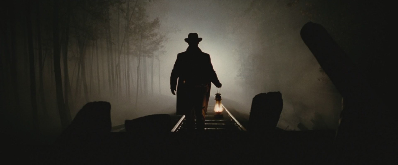
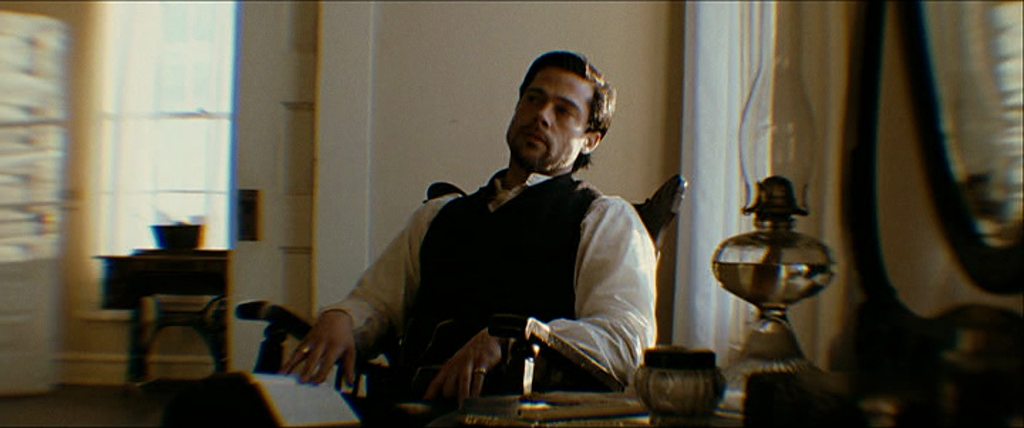
2007 was a good year for all kinds of movies, but it was an especially good year for Deakins, one in which he shot two of his most beautiful films, received his first (and, thus far, last) double-nomination at the Oscars, and shot another movie absolutely free (okay, it probably wasn’t free). His first film of the year was one that is still looked upon by many to be one of the best-shot films of Deakins’ career, and maybe of the last ten years as well. That would be Andrew Dominik’s The Assassination of Jesse James by the Coward Robert Ford. When people think of Deakins’ work on it, chances are they’re just reflecting on one sequence, very early in the film, when the James Gang carries out a train robbery in pitch-darkness. Indeed, this sequence is probably the most jaw-droppingly gorgeous thing Deakins has ever captured on film (or digital), starting before the train even arrives with the lanterns carried by the Gang being the only thing separating them from impenetrable shadows, continuing to the arrival of the train, spreading godly light throughout the forest and spreading the shadows of the trees all throughout, and going into the Gang entering and robbing the train, the interiors of which are filled with high-contrast, gorgeous golden light (the interiors also spawn the horrifying image of a bloodied man standing frozen just off-center in the frame, whose blood almost passes for black when he’s finally killed). But the rest of the film is so unspeakably gorgeous as well that it’s almost a shame this bit has to hog all the attention. Just as O Brother before it, Jesse James sets to create a visual myth inspired by photographs of the area (here, the main influence of photos comes during the film’s many interludes with narration; the edges of those scenes are blurred, not unlike fringing at the edges of an old photo, an effect created with lenses that would become known as “Deakinizers”). But whereas O Brother was filled with gloriously warm sepia tones, Assassination‘s look isn’t nearly so clear-cut. Many exteriors early on are very rustic, with glorious sunlight and earth tones galore (the grass looks closer to a shade of brown or yellow than it does to green), but as the seasons change, the prospects of the James Gang grow dimmer, and the James Gang grow more distant from the outdoors, exteriors are sucked of all life, and interiors take on the feeling of the train, all warm golden lighting with blacks from which there are no escape (Deakins did a bleach-bypass on the negative to achieve this effect). But the gorgeous, painterly rustic views of early on make a reappearance later on, when Robert Ford (Casey Affleck) is seriously planning the titular assassination with his brother, ready to become the somebody he was desperately trying to be as a member of the Gang. By the time he actually has to carry it out, there are no lanterns or fire lighting the interiors, the earth tones are back with a vengeance (inside and out), the sunlight is so strong that the windows are completely blown-out, and the camera settles down, recording the assassination in as static of shots as possible, culminating in three or so disturbing tableaux of the event itself, just like those still photographs Deakins had tried to emulate with motion earlier. But both accomplishments are short-lived; the camera resumes its normal function, and Robert’s public life is cast entirely in the dark golds of the train, his connection to his murder victim seeming a lot more constricting than it might have looked at the time.
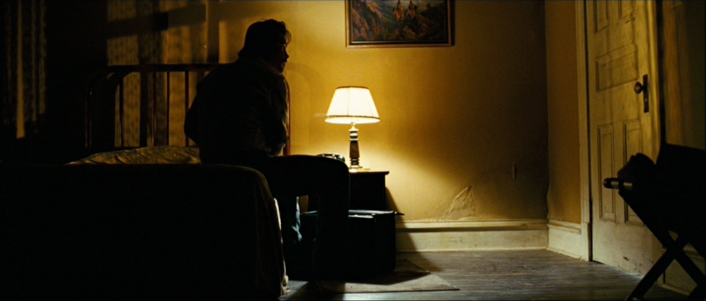
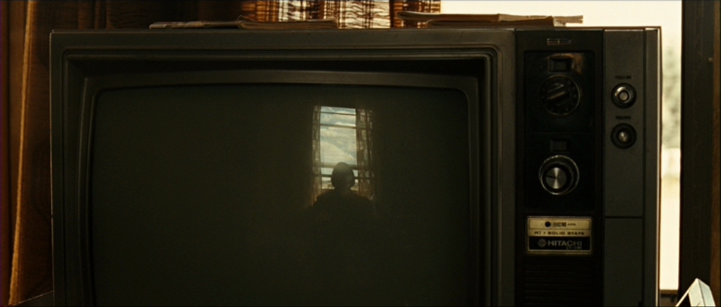
Deakins’ second Oscar nomination this year came from the year’s eventual Best Picture winner, the Coens’ No Country for Old Men. If Assassination of Jesse James is one of the most overtly stylish films of Deakins’ career, No Country is most certainly not that. Even moreso than Fargo, this is the Coen brothers film that makes the most conservative use of the camera. While the camera does move in most of the shots, the movements are very, very rarely the whiz-bang kind that the Coens and Deakins used in their earlier films, with a much greater focus on simply observing the actions of characters and their surroundings. What this approach lacks in technical virtuosity, it more than makes up for with its effect. So many sequences here are greatly aided by the more muted camera, like the bit with Llewellyn Moss (Josh Brolin) getting chased by the drug runners’ dog, whose power is gained from the fact that Deakins shoots it as simply as he would a scene of someone idly walking to work (it reminds me a lot of Gordon Willis’s work on The Parallax View, specifically the horrifyingly static image of a man walking off the Space Needle), or that first coin toss, where any camera moves on the two main angles of the scene are near-subliminal. This may seem like an odd use of what was only the Coens’ second go-around with the 2.35:1 frame, but regardless of how the camera is moved or how it isn’t, widescreen is completely necessary to best showcase the film’s visions of expansive landscapes and towns disrupted by disturbing violence. In particular, the first part of the film, which takes place mostly in front of Texas vistas, is gorgeous and awful all at the same time, no moreso than when a foot chase between Moss and the drug runners extends from when the landscape is cast entirely in shadow (with a sky that’s an almost too-perfect shade of dark blue) to the point when some semblance of light shows up. During that first part, the palette is largely dusty and dry, not even blood adding significant punch to the arid locations. When the action shifts to mostly interiors in the second part, the palette of the first part gives way to the pronounced sodium lighting of motel room lamps and streetlights, with shadows swallowing up what isn’t in their proximity. But it’s only when Moss returns to Texas and gets some fresh air that him being fucked becomes more than an abstract concept. Only Deakins can make the beautiful outdoors fucking terrifying by just displaying them as-is.
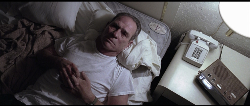
Saying that In the Valley of Elah is the least aesthetically interesting film Deakins shot in 2007 is kind of like pointing out the shortest person in a “big and tall” store. It’s only that because the other two are so goddamn good, and this one is goddamn good is well. The colors here are a lot more muted than in the other two films, occasionally slightly beyond what is necessary but mostly spot-on. We do get some sequences with vivid hues, namely the ones in the strip club where Tommy Lee Jones’ character looks for information as to what happened to his son (who served in Iraq before going missing after returning home) and the views inside police detective Charlize Theron’s home, but for the most part, the film occurs in some pretty drab locations which Deakins manages to make look beautiful through the magic of cinema. It helps that there are so many impeccable tableaux here, like an overhead shot of Susan Sarandon (playing Jones’ wife) breaking down after getting the news about her son’s death, or every shot of Jones’ tightly-controlled daily routine in his shitty little motel room (shitty motel rooms are seemingly a constant in Deakinsland).
2008
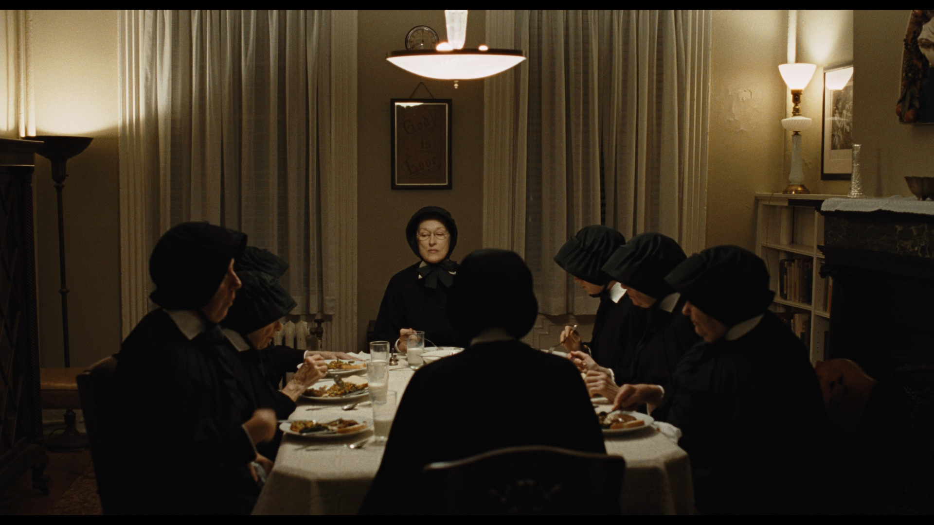
As you may have learned from this (or that you may have already known), Deakins has had more than a few years where three of his projects were released in the same year. But 2008 was something special in that regard (it also seemed to take a lot out of Deakins; this would be the last three-project year he’s done to this date); three films of his were released in the same year, in the same month, and within two weeks of each other (around Christmastime, perfect for awards contention). Any fan of Deakins could’ve walked into a New York or LA theater on the day after Christmas and be overloaded with potential places to enjoy his work. Starting with my favorite film of the three, I’ll talk about Deakins’ work on John Patrick Shanley’s Doubt. Whereas Deakins had spent 2005 and 2007 working exclusively in 2.35:1, his work on Doubt is not just shot in 1.85:1, it seems to wholeheartedly reject any kind of visual expansiveness, whether in widescreen or not. The film was based on Shanley’s play, and while there are many outdoor scenes, Deakins’ approach isn’t one that tries to artificially expand the action beyond its rigid origins. Camera movements are limited to when they’re absolutely necessary, and much of the film’s action is captured in tableaux, which often observe the action from an ever-so-slightly (sometimes extremely) heightened perspective, as if God himself is casting His eye on what’s going on. But the shots are so unblinking that they’re more likely coming from Sister Aloysius (Meryl Streep), the film’s stern driving character who views everything around her with suspicion, but especially the head priest, Father Flynn (Philip Seymour Hoffman). With his lighting, however, Deakins almost seems like he aims to cast doubt (hey, that’s the name of the movie!) on Aloysius’s belief that Flynn has done something bad, with the scenes in Flynn’s presence, whether he’s delivering a sermon, teaching the boys at the central church school how to shoot hoops, or enjoying an entertaining dinner with his fellow clergy, being some of the warmest-lit scenes in the film. Compare this to the scenes haunted by Aloysius’s humorless presence, whether it’s the nuns’ dinner table or the classroom overseen by her and led by Sister James (Amy Adams), which are much chillier than Flynn’s surroundings. But the exteriors are the coldest ones of all, and it’s here where the extent of Flynn’s possible wrongdoing is revealed
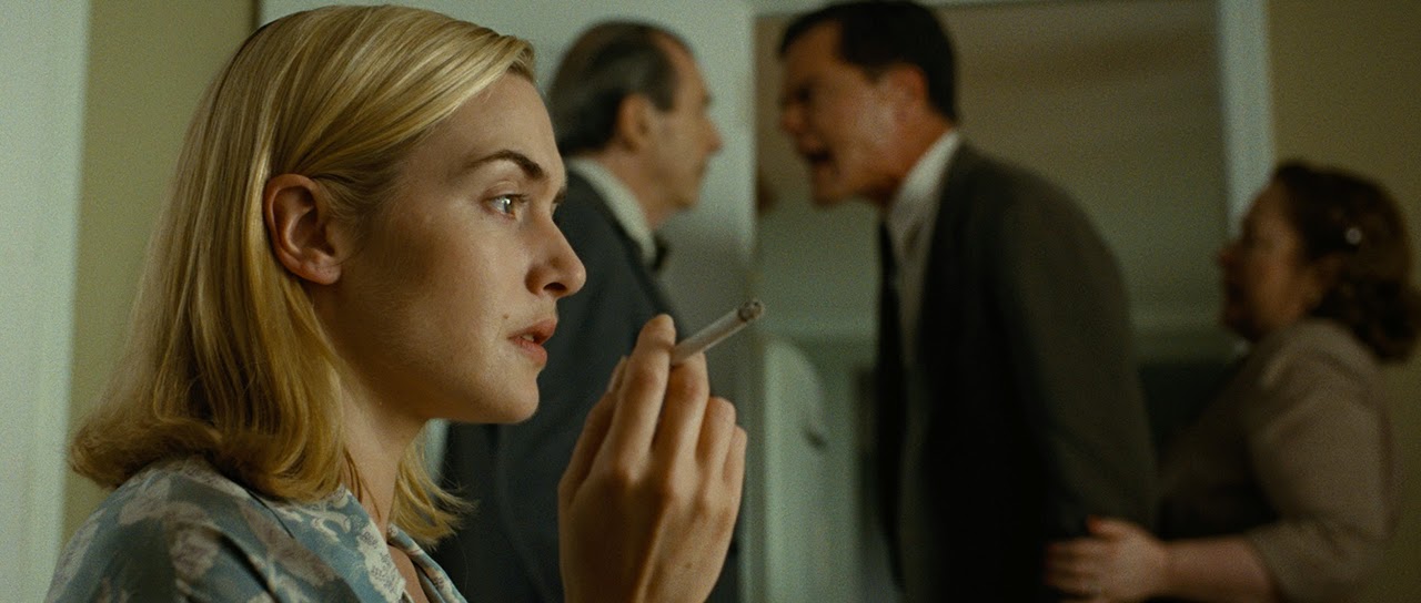
Deakins’ second 2008 film was also his second for Sam Mendes, although its milieu couldn’t be further away from Jarhead‘s Gulf War battlefield boredom. An adaptation of Richard Yates’ novel, Revolutionary Road and Deakins waste no time establishing a visual precedent for the rest of the film. The opening, focusing on the meeting of Frank (Leonardo DiCaprio) and April (Kate Winslet) at a party, is very warmly-lit, almost sepia-toned, and the widescreen frame is filled with activity from the fellow partygoers initially, until the two grow closer, at which point the camera begins to block out everyone else and focus on these two kindling a spark. The spark dies suddenly and immediately with the cut to seven years later, the color sucked out (the film actually shares its color palette with Jarhead, like the negative was doused in bleach before the prints were made, although the effect is certainly different), the life in the frame dead (any mass movement in much of the rest of the film is trudging as opposed to the effortless strides at the party; a later scene is meant to resemble the part scene in lighting, but it’s not the same because everyone is just going through the motions in it), and any emotion besides resentment well-hidden, if it’s present at all. As much as one would like to go back to that early world, we spend the rest of the film stuck in the second one, Deakins making conformity, depression, and mind-numbing dullness beautiful in its own way. An early scene of Frank walking to work in Grand Central Station is a veritable anti-rainbow of colors, told entirely in dull browns, greens, and blues, where Frank is nearly invisible in the crowd (this pays off later, with a perfectly-centered shot of Frank outside the rat race), his workplace being more of the same with a greater emphasis on blue (although life and warmth enters the frame when Frank has drinks with his secretary, it’s gone by the time he’s done fucking her), and his and April’s house being so pale that not only do they resemble ghosts, their house does (a flashback to Frank and April in Frank’s old apartment reveals such a disparity between the warm, healthy sunlight then and the perpetually chilly light lighting their house now). Seemingly the only color besides beige and tan that exists around their house is the bright green of the grass (a suburban paradise), which isn’t even visible inside. Composition-wise, Deakins mostly keeps things austere, mostly keeping to exceedingly well-crafted tableaux (my favorites are the repeated profile shots of Frank and April’s neighbor staring at the house), as if the camera is trying to keep up a pretense of civility even as the characters aren’t bothering to do so anymore (just look at the above shot, where the camera has to compensate for Michael Shannon’s fury disrupting the film’s balance by leaving him completely out-of-focus), which makes the sequence where Mendes and Deakins return to Jarhead‘s handheld all the more shocking and unnerving by contrast.
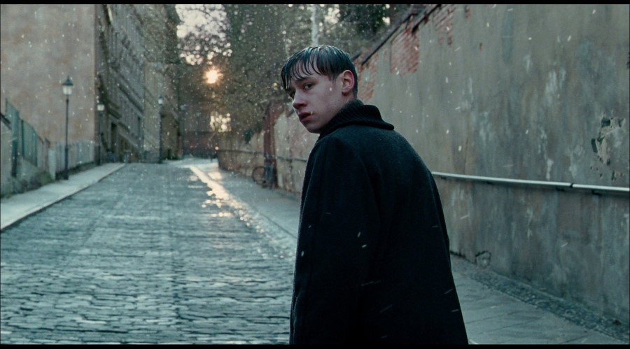
Despite him shooting three possible Oscar contenders, Deakins’ sole Oscar nomination this year came from Stephen Daldry’s The Reader. However, the circumstances of Deakins’ work on the film also make it very hard to accurately analyze it in terms of Deakins’ overall career (this same reasoning is why I didn’t include the films that Deakins made uncredited contributions to, namely Rob Roy and Thirteen Days, here). After the little-known (and not available to be covered in this feature) La donna della luna, this is the second (and, thus far, last) narrative film where Deakins would share the “Director of photography” credit, in this case with Oscar-winner Chris Menges. Deakins shot a month on the film when Nicole Kidman was set to star in the role that would eventually be played by Kate Winslet (she was unavailable at the time). Thankfully, he didn’t shoot any scenes with Kidman, because Kidman dropped the project and Winslet signed back up, but at this point, Deakins had to move on to shoot Doubt, so Menges took over. This means that, at the very least, Menges shot every sequence/shot with Kate Winslet and, at the very most, Deakins shot every sequence/shot without Kate Winslet, and that’s very likely not the case. It’s hard to exactly tell, beyond the Winslet stuff, which shot belongs to which cinematographer, which is a good thing in the sense of visual consistency being a desirable asset for a film, but a bad thing when you’re analyzing the work of exactly one of those cinematographers. Sucking it up and just talking about the film as a whole, it starts off most clearly recalling Deakins’ work on Doubt, being similarly chilly and exploring the tightly ordered world of Michael Berg (Ralph Fiennes, plus Thomas Kross as a teenager) almost exclusively via tableaux, which is revealed to be a reaction to the circumstances he dealt with as a teenager in Germany. Once we go back there, the airless, cool colors of Berg’s house give way to a rather surprisingly warm color palette (and not just during the passionate love scenes between Berg and Kate Winslet’s illiterate former concentration camp guard Hanna), given the story takes place in the midst of a depressing German winter and that it revolves around, you know, the consequences of the Holocaust. But all the while, to remind the viewer of what exactly the story is about, Deakins and Menges give the scenes in Hanna’s apartment where she and Berg interact (and do much more) a much moodier look than any other scenes in the film. It’s very good work by Menges and Deakins on a bad, dull, airless movie. Stephen Daldry, you hack fraud, stop hiring such ace cinematographers to shoot your Oscar-bait slop.
2009
After missing a Coen brothers film for the first time since Miller’s Crossing the year before (of course, they got Emmanuel Lubezki to replace him, so it’s not a particularly great loss), Deakins returned for their next project, A Serious Man, and made it his only film in 2009. Whatever the disappointment of this being only his third single-project year this decade is made up for when one looks at his work on the film, which may be a subtler type of beauty than that of almost all of their other films together, but it’s incredibly rewarding, nonetheless. The film starts with a prologue set in old times, and here, Deakins utilizes the 1.33:1 frame for the first time in his career shooting narrative films, with added fringing at the edges of the frame to give it the feeling of an old film (sort of like what Assassination of Jesse James did with its interludes). The prologue mainly takes place in a shack lit entirely with fire, and the lighting is constantly in flux, making the viewer uneasy even before the introduction of the possible dybbuk. As the main film begins, a visual pattern quickly begins to establish itself. While the home life of Larry Gopnick (Michael Stuhlbarg) could charitably be called a mess, the bright brown wood tiling and everpresent sunshine coming through the windows ensures that his house is always completely, ironically cheery-looking, with rich skin tones (the one scene at the house we see sans Larry is a much moodier, dimmer affair, suggesting he’s the one keeping the family tethered to good fortune even as he finds little good fortune to come around). It says something about how fucked up Larry’s life is that most of his scenes outside the house aren’t even dignified with warm hues, ironic or otherwise. Almost everywhere else he goes, the color palette is either cool (like a meeting at a diner with Larry, his wife, and her incomparably smug lover Sy Ableman) or completely sanded-down (like his scenes in his office), and his skin tone never rises above pale. During his first visit with a rabbi, Larry is even denied the warm lighting provided for the rabbi. The only exceptions are the synagogue where he goes to attend his son’s bar mitzvah and the house of his seductive neighor, which are very warmly-lit, providing Larry with rare sources of joy in his existence. Other than that, Larry is also mocked by the compositions (mostly tableaux, with few flashy camera angles or movements besides canted angles and blurring around the perimeter of the frame for scenes where the characters get high), which dwarf him at every step, denying him even particularly many close-ups. It’s almost as if Deakins is playing the role of God, either denying Larry simple pleasures at every turn or just not caring enough to make sure he gets those simple pleasures.
2010
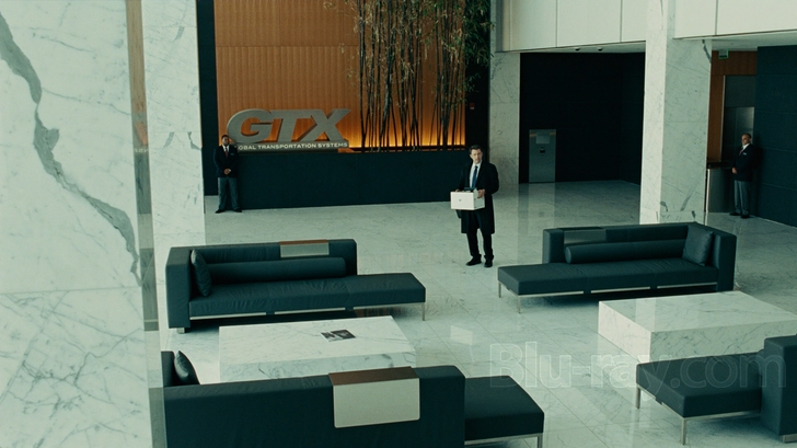
To the extent that any film Deakins has shot in the last ten years or so is “obscure”, John Wells’ The Company Men is obscure. And as well it should be. It’s a mediocre look at the decline of America in the wake of the recession, enlivened mostly by a game cast (although we as a society need to stop making Kevin Costner try to do Massachusetts accents) and by Deakins’ cinematography. But man, this has some nice cinematography. Given that Wells got his start as a TV director doing snappy conversation-directing on The West Wing, it’s interesting how much of this film unfolds entirely in tableaux. But it works for the film, specifically its ambitions to be an examination of how the American male has lost his place a bit in recent years (Deakins accomplishes this task much better than Wells does as either writer or director). As the film opens, after some news footage about the 2008 financial collapse, we are treated to static images of what the lives of upper-class corporate males are like; the camera is locked on images of shiny, brand-new-looking cars, perfect suits and ties, beautiful houses, and pristine subdivisions. None of the people who possess these things know that they are luxuries, but they will. The writing’s on the walls by the time they enter their workplace. The way Deakins lights this area, he makes it look so hostile, cavernous, and chilly that it’s a wonder everybody wasn’t canned before the movie had a chance to begin . And when the characters start to get fired, they also start to look for other work. But Deakins makes sure that these prospects don’t look any more pleasant than the others, making them look just as uncaring and cool as the big bad corporations, leaving a few of the characters at the end of their rope as the film goes on (one elects to commit suicide, an image hauntingly showcased as a tight tableau of him deciding to close the garage door). And eventually, they’re helped to find some measure of solace, whether at home or going back to work in a smaller fashion, scenes where Deakins finally allows warmth into the frame. It’s wonderful work for a film that few saw.
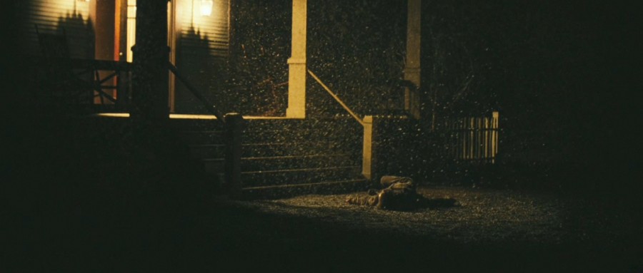
For about five years, it seemed like Deakins’ work on the Coens’ adaptation of Charles Portis’s True Grit (which actually opened around the exact same time as Company Men‘s borderline nonexistent theatrical run) would mark his farewell to 35mm. It didn’t quite work out like that (more on that a bit later), but even as that title has been taken from it, it’s still some particularly remarkable work in a remarkable career. From literally the very first shot, the viewer knows they’re in for something special visually. That first shot, of the body of Mattie Ross (Hailee Steinfeld)’s father, lit only with the amber light of the lanterns outside his house, is among the very best in Deakins or the Coens’ careers, and the rest of the film hardly lets down from the standard set by it. If a comparison to one of the Coens and Deakins’ other collaborations could be made, it would likely be to No Country, both films taking place against gorgeously dusty widescreen Texas locales. But here, Deakins’ camera is much less content to simply observe the action, with more of the sweeping camera movements that Deakins has come back to again and again over the course of his career. This fits the film’s tone as a rollicking adventure (No Country is… not really that, unless you view it as a road movie starring a guy with a pageboy haircut and an oxygen tank). As for other comparisons with No Country, this film’s visual structure is almost directly the opposite as that film’s. It starts out, after the shooting, at Fort Smith, which is full of rustic earth tones, whether by the wood of the buildings or the lamps inside them that Deakins lights so that every frame is teeming with warmth and safety (adding to that, in his first two on-screen appearances, Federal Marshal Rooster Cogburn is lit with Janusz Kaminski-esque streams of light through windows, suggesting his ultimate good nature regardless of what everything else about him suggests). When Mattie and Rooster head out for the country, however, the palette becomes as dry as that Texas desert Llewellyn Moss unwisely travailed (the sky is so dusty that it can barely be classified as blue), and the situations become just as dangerous. But whereas No Country seems to take place in the harsh light of summer, Grit‘s winter setting (which I suppose puts it alongside Assassination of Jesse James, for more reasons than just their similar time frames) adds another element of inhospitality to the proceedings (the finale of the film sees Cogburn overcoming the obstacles of the cold, represented by the blue tint of the frame, and the snow before making his way back to warmth, represented by a return to the amber lantern lighting of the beginning), befitting, again, the film’s tale of an adventure against the odds, as opposed to everyone in the film being just completely fucked from the get-go. One of the great things about Deakins is his stubborn refusal to shoot anything the same way as anything else (well, at least until Angelina Jolie gave him a call), and this film is a prime example of that, finding variation and smart contrasts in what could have been a copy-and-paste job that still would have looked beautiful. And he could do the same thing without film grain, too.
(Please note that it’s a bit hard for me to be objective about this film or its cinematography, as it was probably the film that first got me interested in the art of cinematography in the first place, or at the very least it was the first time I ever got angry at something losing Best Cinematography.)
2011
In 2011, Deakins switched from film to digital, a move that likely would have spawned a thousand thinkpieces about the death of film at the time if the film he was shooting on digital wasn’t the mediocre, instantly-forgotten sci-fi-action movie In Time. But even in the space of a movie which wastes all of its potential by the halfway point in favor of mindless car chases, Deakins works wonders and shows the massive potential of the digital format. Deakins has said that using the ARRI ALEXA helped him immensely during the making of the film, because they were shooting on a very tight budget and needed to get the most out of every bit of light that they could. His work here is a testament of the powers of the ALEXA, creating immaculately-lit scenes out of what’s there on the day, like the overbright neon scuzziness of the bar that the main character visits, or the overwhelming sodium lighting of the streets at night (one shot does a whip-pan from a green-tinted bar exterior to the sodium-lit outside world). Beyond that, Deakins does a typically bang-up job on the film, contrasting the worlds of the main character’s home in the ghetto (with its brutally pale, washed-out daytime scenes and amber night scenes, again trapping the poor working-class schmucks in like insects), and the “time zone” for the wealthy (full of rich golds and greens) which he visits and causes a stir in. In fact, his cinematography does a much better, more subtle job analyzing the struggle between classes, in the film and in the real world, than the movie, which eventually devolves into mindless car chases and tired Bonnie and Clydeisms, does.
2012
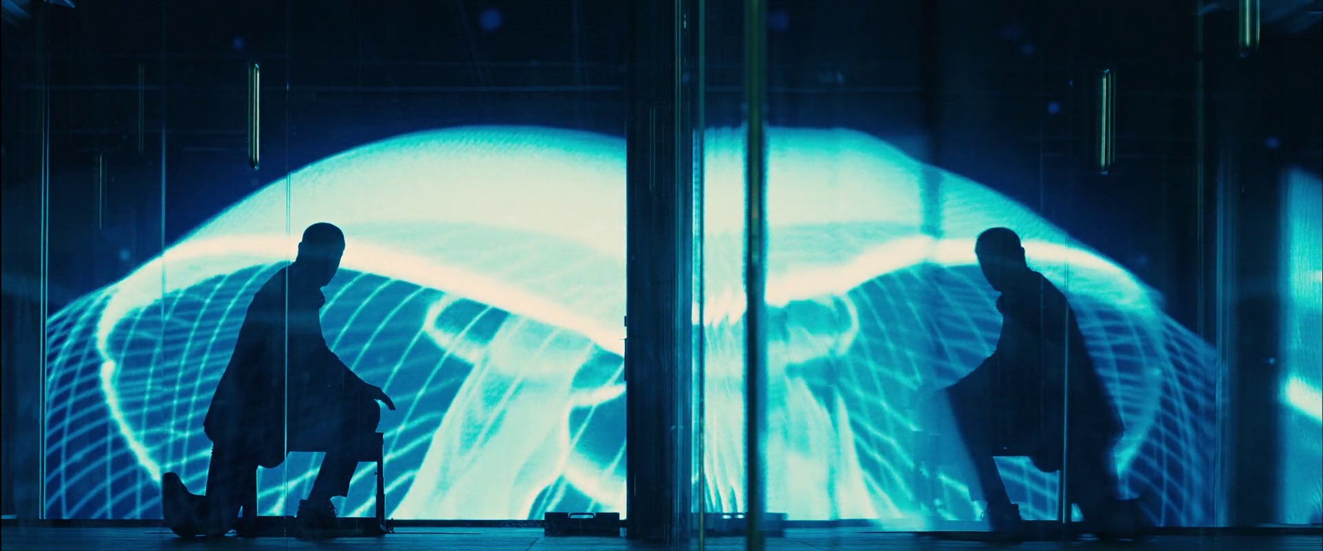
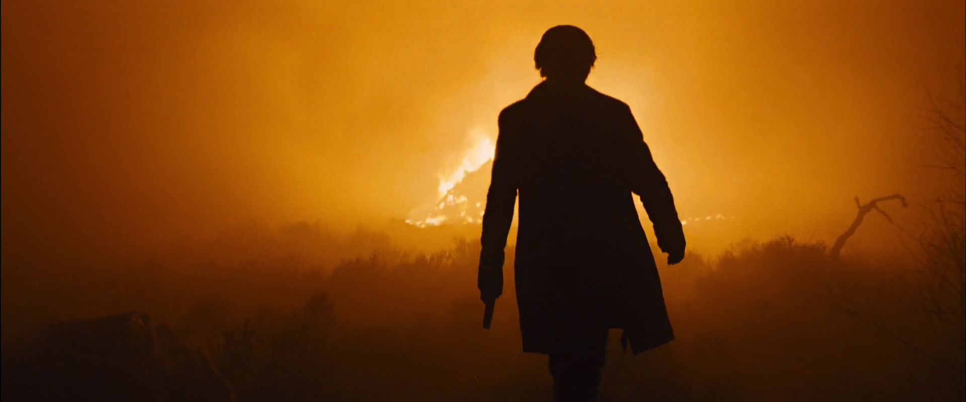
Obviously, Deakins had made plenty of a name for himself prior to shooting Skyfall, even just on the basis of his work with the Coen brothers. But I think it’s this film that really brought his name to the tongues of many who might have ignored it previously. Many people probably didn’t expect a Bond movie to reinvent the wheel in terms of its cinematography, or really expect to pay any attention to its look besides during the big action sequences. That set the stage for Deakins to blow their puny little minds with his work here, which is practically a love letter to the color spectrum, plus much, much more. The most obvious example to bring up (and the one everyone has) is the sequence where Bond goes to Shanghai, mostly for how goddamn purty the neon lights of the city look in Deakins’ frames. But in the course of this sequence, Deakins does much more than just make the viewer go “ahhh”. Those ultra-modern lights are the perfect contrast to Bond’s stubbornly old-fashioned ways, helping the film’s view of him as a relic in an ultra-modern world, leaving him as a black-and-white silhouette in front of a Technicolor display of color and light. And yet at the same time, the panes of glass in the building where Bond is trying to take down a sniper help abstract the color and lights even further than they would have been already, purposely putting the viewer in Bond’s hopelessly lost, tired shoes as it tries to push them out. As is custom for any Bond film, the film explores many locales beyond just one, and so Deakins gets to play around with new modes of shooting for each one. When Bond arrives in Macau, the image remains colorful, but in a way to shifts more to Bond’s strengths (a cleanly warm, golden tint over the image, no neon craziness to be found), putting him back in something resembling his comfort zone. Of course, any fears that that’s where Bond will stay are quickly tampered by the time he comes into the hands of Raoul Silva (Javier Bardem, playing his second oddly-coiffed baddie under Deakins’ lens), who’s introduced in such a long, patient take that it seems to belong more in No Country than a globetrotting action-adventure. And then we get to visit Silva’s island, which Deakins paints as a place where color goes to die, all there being left is bleached-out views of rubble as far as the eye can see. The film climaxes at the titular Bond family manor, which allows Deakins to get some stunning shots of the Scottish Highlands before Bond heads inside, his return to the natural represented by how all the light in Skyfall comes directly through the windows. And then Deakins travels even further back, allowing the climactic scene to be lit entirely with uncontrollable fire, that oldest of natural light sources. It’s brilliant enough work that it almost makes you forget those jellyfish by the time you’re done.
2013
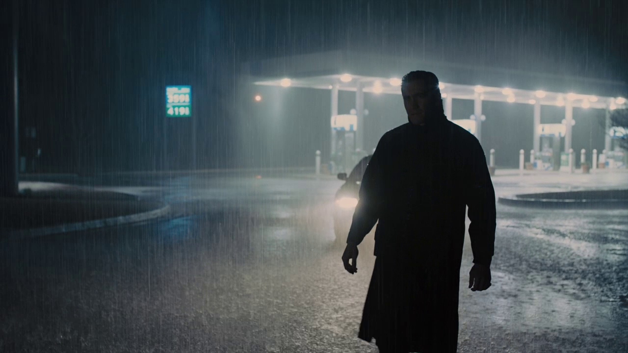
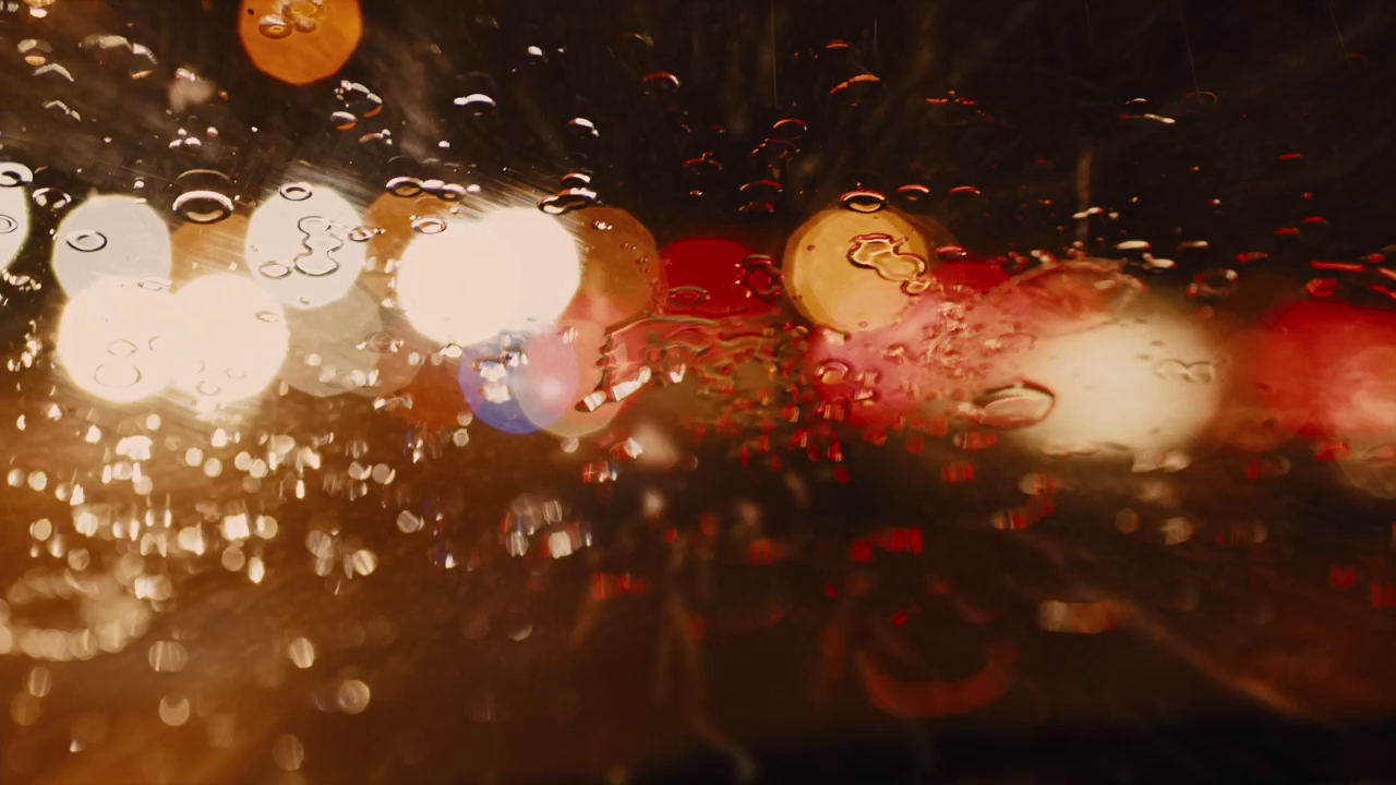
Skyfall had the Shanghai fight, Assassination of Jesse James had the train robbery, and Denis Villeneuve’s Prisoners has the climactic scene of Jake Gyllenhaal’s Detective Loki speeding through a crowded freeway. Indeed, it’s there that a film that was mostly interested in exploring the nuances of the grey rainbow introduces the wild colors of neon signs and streetlights, amplified by the reflections of all these lights caused by the downpour of rain into the road and the windshield. The viewer wants this scene to slow down, partially because they’re deathly afraid Loki is going to get into a terrible accident, partially because they want to pause and savor the visual splendor present in each frame. But I can’t say that the rest of the film doesn’t live up to that scene, because the rest of the film is working on a completely different register before it explodes into glorious living color at the end. From the first shot of the film (a view of a depressingly grey forest where the only color in site is the orange of the suits of the father and son hunting deer there), Deakins reveals the specific mode in which most of the film will reside; an unflinching depiction of a really shitty winter. Actually, it’s even worse; winter hasn’t really come to the film’s Pennsylvanian (although it was shot in Georgia) town. There’s no snow on the ground, but there are no leaves on the trees and the grass is dead, and it’s just warm enough that the precipitation mostly comes down as rain before freezing while still being cold enough that the mothers of the two girls who go missing in the film have to tell them to make sure to bring their hats when they go outside. Deakins’ lighting gives only the faintest suggestion of the existence of the sun in daytime exteriors (nighttime exteriors are often even murkier, as one can see in the first shot, where Gyllenhaal is constantly in danger of completely fading into the ether), and he often shoots scenes through windshields and windows that are either rain-soaked or dirty enough to suggest that they were rain-soaked not too long ago. Interiors either continue this pattern or go too far to compensate, filled with sickly sodium lighting that’s meant to seem friendly but which only makes the viewer more anxious (and that’s all that lights the scenes of Hugh Jackman torturing Paul Dano, his battered-beyond-recognition mug taking on a disturbing shade of orange as a result). As for the camera, until the bitter end, Deakins does a lot with a little in terms in terms of movements. This is also set up with that first scene, where the viewer barely notices the camera is moving at all until it comes upon human life as it slowly pushes out. Much of the action unfolds in relatively simple shots that still feel oddly constricting (this is aided by Deakins’ return to 1.85:1), subconsciously alerting the viewer to bad things to come even when what’s on-screen is completely banal and seemingly meaningless. Any camera movement beyond the arbitrary puts the viewer ill at ease, with one very early push-in on a tree telling the viewer everything about what’s occurring nearby while putting absolutely none of that on-screen.
2014
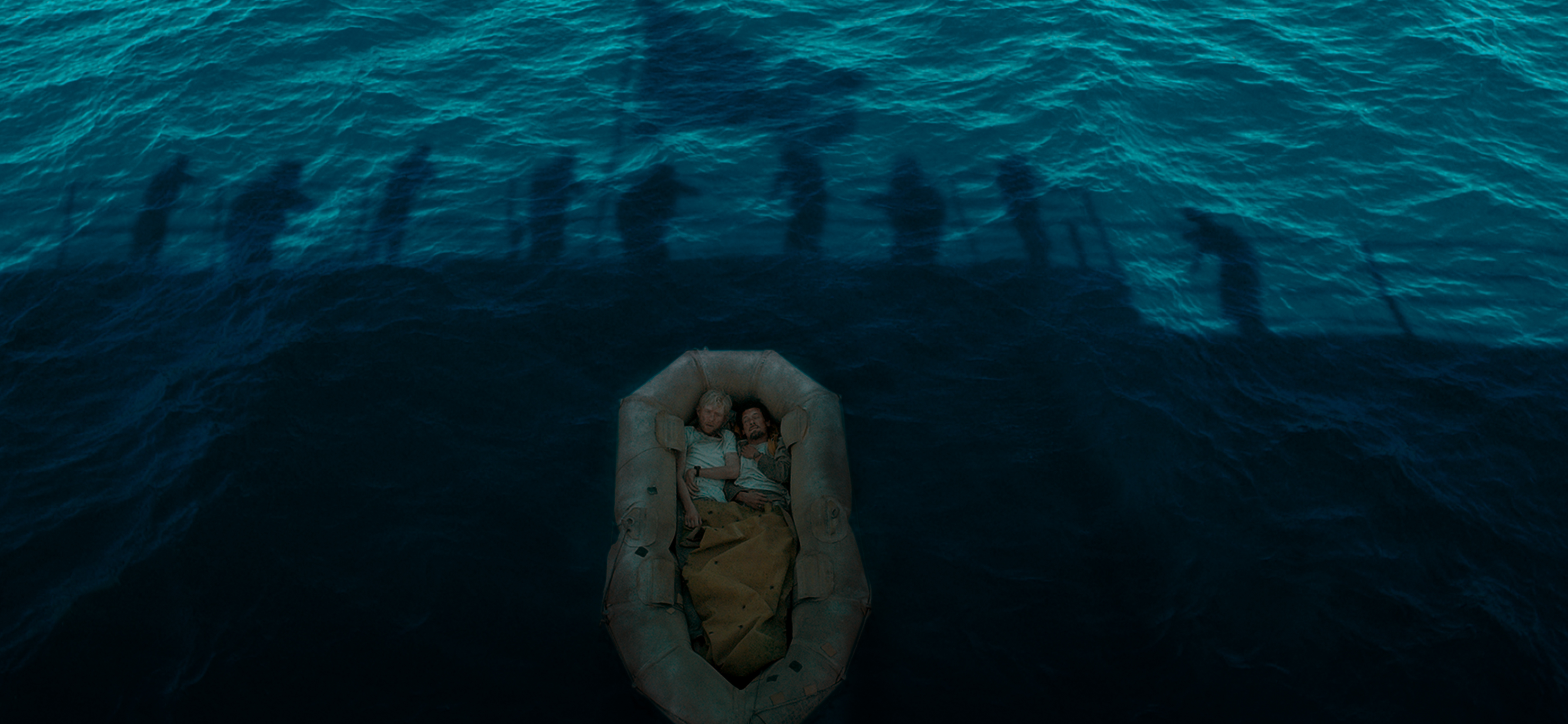
There was some hope out there that Angelina Jolie’s Unbroken, based on its Best Picture-ready premise of the true story of an Olympic athlete turned prisoner of war, would be the film to finally get Deakins the Oscar. Those hopes died on the day Birdman came out, more nails were sunk into their coffin when the reviews of Unbroken started coming out, and their corpse was defiled by the time people actually saw the damn movie. Deakins did get a nomination, but this is a rare case where Deakins shouldn’t have won the Oscar, not just because he was up against really deserving contenders, but because his work was simply not worthy of the recognition. Which is not to say Unbroken is a bad-looking movie. Far from it, it’s very pretty. But that’s the problem, it’s not beautiful, it’s pretty. Jarhead (Deakins’ previous straight war movie) was not a pretty-looking movie, but Deakins made the washed-out desert where it largely took place look beautiful. Unbroken is shot by Deakins in a way that resembles a depressing fashion catalog; every shot is lit and framed so that it’s a glamour shot, even if it’s of a POW getting the shit knocked out of him by his fellow POWs. All this prettiness does is anesthetize the viewer so that violence against our main character (Louie Zamperini, played by Jack O’Connell) doesn’t register, and keeps on not registered as Jolie keeps returning to that well. Going beyond that, much of his work here is simply Deakins-By-Numbers. You get the requisite golden-hued flashback sequences to Louie’s youth, the digitally-desaturated scenes at the POW camp, the swooping camera movements, etc., and it all feels so predictable. The one sequence that I felt Deakins had really never done before (although he was going to do something like it with To the White Sea) is when Louie and two of his fellow pilots are stranded at sea, their ordeal mocked by the perfect blue of the sky and the ocean and by their increasingly-perfect tans (this is the one time the film’s weird need to be pristine works in its favor). When this sequence is over (capped off by the wonderful shot shown above), you can almost hear Deakins say “fuck it, I’m done”. I can’t say that I’m too broken up about Jolie and Deakins’ planned next collaboration falling apart during pre-production.
2015
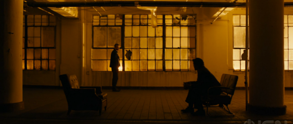
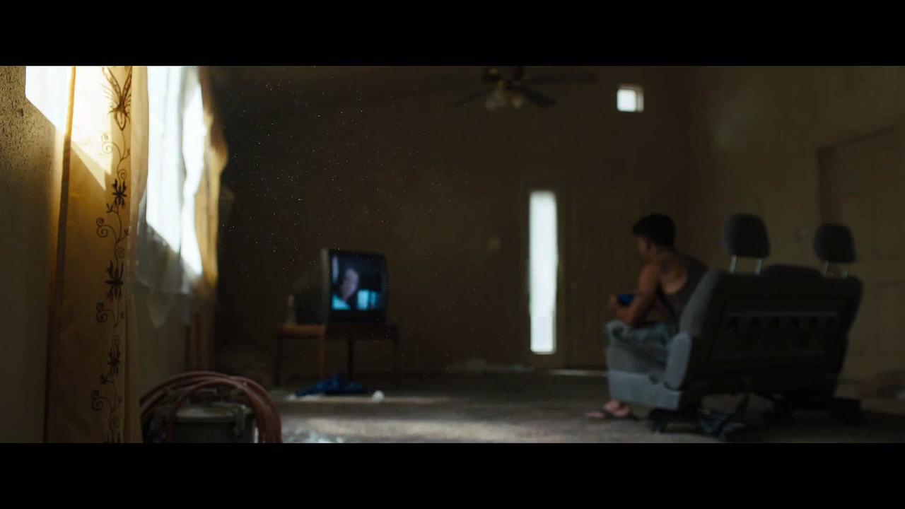
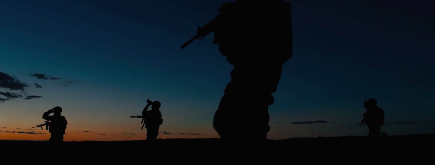
Deakins’ second collaboration with Denis Villeneuve, Sicario, does not have a pretty story (it opens with the discovery of a staggering amount of dead bodies, and only gets more cheerful from there), but neither did Unbroken. But unlike that movie, here, Deakins knows that he can’t make it look pretty, and he wisely opts to avoid that route altogether. The result is a film whose cinematography is up there with the very best of Deakins’ career to date. The most obvious comparison to make with another Deakins-shot film here is No Country for Old Men, as both films take place near the Mexico-America border, full of arid, bleached-out landscapes that photograph well (there’s a shot here of a car driving through the desert into a looming thunderstorm that might as well have been deleted from No Country), and that comparison wouldn’t be off-base for more than just that reason (for one, both share Josh Brolin and feature tense scenes in shitty hotels and motels). Neither would comparisons to some other Deakins films, like Prisoners (the sodium-lit scenes of people getting tortured, including the most painful-looking wet willy in cinematic history) or Barton Fink (there’s a shot slowly zooming in on a drain, just like the shot venturing into the sinkhole of Barton’s bathroom). But whereas Unbroken felt like a rehash, this takes those influences and does new things with them (to use the shot of the drain as an example, in Barton, it’s used as another of the film’s bizarre, pseudo-nightmare images, while here, the nightmare here is very much real, and the camera’s only focusing on the drain to keep that nightmare off-screen), and those even semi-familiar images are surrounded with very new and very wonderful ideas. Just to name a few of my favorites, I love the sequences shot just after or before magic hour, so there’s a sliver of light, but it’s mostly just dark and blue (the one sequence that actually takes place at magic hour, the one pictured in the second screenshot, depicts the film’s task force venturing into complete darkness to raid a drug tunnel, not very subtle but subtlety was overrated anyway), I love the sequences at the Mexican police officer’s house, which, in contrast to the rest of the film, are lit (or, more accurately, appear to be lit) solely through the windows, I love the shots that demonstrate the play of light on curtains (I included an example as the first screenshot), I love the lushness of the climax (contrasting with everything happening during it), and I absolutely love the sequence in the tunnel shot alternately with night-vision and thermal-vision filters, which keep just enough information off-screen to get the audience grasping their armrests. To bring up Unbroken again (god, fuck that movie), that felt like a greatest-hits compilation, but this is a brand-new album, and it kicks ass. I give it a 9.6.
2016
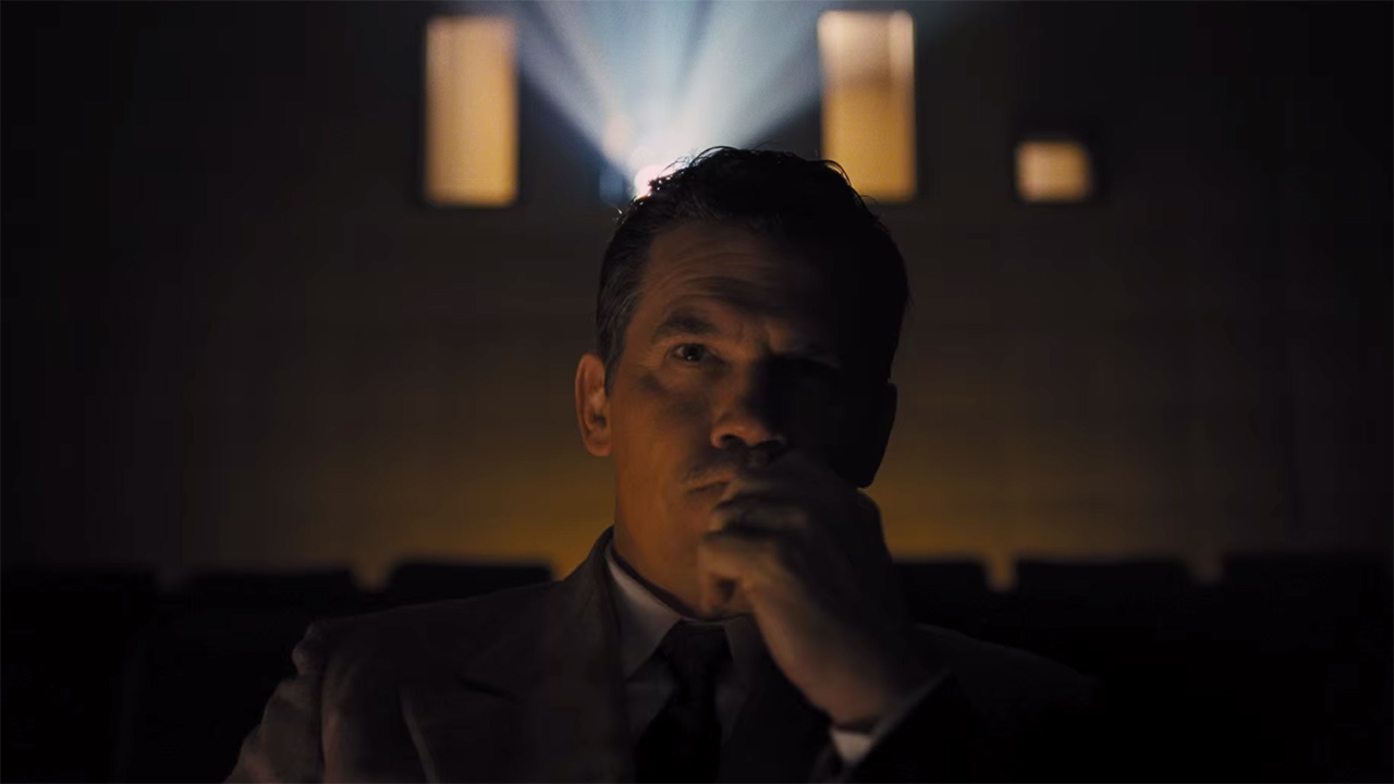
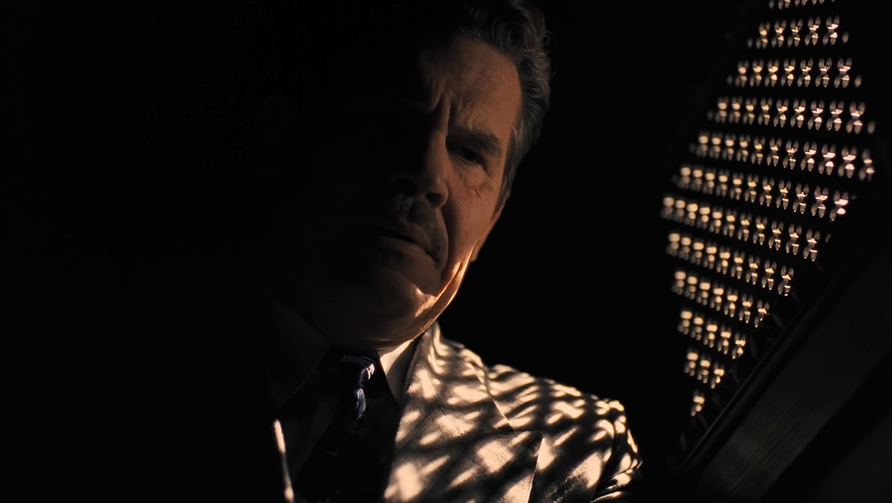
After staying off it for five years, Deakins has come crawling back to 35mm for his latest film, and his twelfth film for the Coens (after taking a break and letting Bruno Delbonnel have the chance to shoot Inside Llewyn Davis), Hail, Caesar!. The decision was almost certainly pushed by the Coens, as a result of the movie a). taking place in 1950s Hollywood and b). featuring many style parodies of 50s movies, which would probably look fakey on digital even with someone as talented with the format as Deakins behind the camera. Much of the press about the cinematography has and will be focused on the film aspect and on those parodies. And not without good reason, too. Deakins does a bang-up job on all of the movies-within-the-movie, not just lazily doing the same style for all, but switching it up with the shift to each one. For his take on the “aquatic picture”, he mostly uses tableaux to best capture the movements of all the performers, and wide shots to illustrate the vastness of the set built for the film. Compare this to the roving camera used for the titular Technicolor biblical epic, Burt Gurney’s latest musical, and Laurence Laurentz’s latest melodrama, or the muted camera movements that capture the absurd stunt theatrics of Hobie Doyle’s latest oater (the film Doyle is working on at the beginning of the film also has a substantially drier, more arid color palette than the other color films, including the gorgeously blue-hued nighttime scene we see from Hobie’s Lazy Ol’ Moon). But there’s much more to Deakins’ work than those things. In fact, those parts weren’t even what I was most impressed with watching it. No, what really caught my eye were the many scenes in the company of the film’s main character, Eddie Mannix (Josh Brolin). As the film opens, he’s covered in shadow at a confessional, barely visible through the black, and then he’s up at an ungodly hour making sure that racy photos of a starlet don’t get out, once again stuck in a moodily-lit location, with the orange and his and the other characters’ skin tones being the only thing to stick out. This visual style is utilized for all of the scenes involving Mannix’s dirty business, whether he’s arranging for the star of the aquatic picture to give up her unborn baby to the studio’s “professional person” so that she can adopt it later, dropping off ransom money in exchange for the studio’s big star, Baird Whitlock, or meeting with a representation from Lockheed at a Chinese restaurant (amusingly, at the table where they’re sitting, the restaurant’s dark red lighting is juxtaposed with the bright blue of a fishtank, calling back to the aquatic picture). But when Eddie Mannix is at work or at home, the images perk up considerably. The scenes at Capitol Pictures where Mannix is doing his “public” job are unceasingly bright, full of tans and warm browns on the sets, in the offices, and on the lot (the screening room and the editor’s hideout are about the only places immune from the warmth). Regardless of what kind of stylistic tomfoolery may stick in the viewer’s mind, Deakins knows that Mannix’s struggle with his job and with his faith (these struggles are combined in one masterful shot of him, cast in silhouette, praying beneath fakes crosses against an absurdly fake backdrop) are the meat of the film, and what he really needs to get right. And oh boy, does he. In particular, one of the film’s final shots is possibly one of my new favorite Deakins shot; Mannix is about to be completely left in the dark in the confessional, before he chimes in while the window is half-open and there’s still the possibility to make the right decision.
Thank you for reading… whatever the fuck this is! In case you’re wondering if I’d be dumb enough to try to do this again, keep an eye out for similar features on Darius Khondji and Joaquin Phoenix in the near-future.

