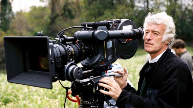
Roger Deakins is one of the finest cinematographers currently working, giving his all on almost every film he’s ever worked on, regardless of whether or not the film deserves that kind of work or not. With his newest film, the Coen brothers’ Hail, Caesar!, now out, The Narrator has decided to take a look at almost every film he’s ever shot in the context of his career. However, there will admittedly be many exclusions, all early on. This is for feature films, so Deakins’ early career shooting documentaries will mostly go undiscussed outside of here, and more than a few of his early feature films are completely unavailable here or in any country. Also, The Narrator was going to (begrudgingly) include Marquis de Sade’s Justine (his first feature film) here, but it went off Netflix Instant before he could get to it without paying too much money to blind-buy it.
1984
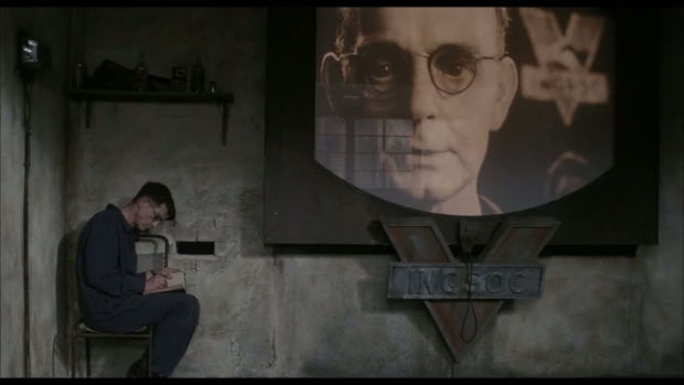
Roger Deakins had been working steadily for about nine years prior to the release of Michael Radford’s adaptation of 1984, shooting many documentaries and working on Radford’s Another Time, Another Place (their work together marked Deakins’ first major collaboration), but it would be this film that would give him any kind of international attention. This recognition was at least partially the result of Deakins and Radford’s use of the bleach bypass, then a very new concept, to give the film the right kind of desaturated color timing for its recreation of Orwell’s not entirely pleasant future (or present, when the film was released). But the color timing is hardly the only thing about Deakins’ work there that’s worth noting. His lighting here is just as crucial to the film’s effect as the desaturation, creating a believable hellscape from which Winston Smith (John Hurt, lit so that every premature line on his face is crystal-clear to the viewer) feels the need to escape. From the first scene, where a wave of unflattering faces and heads express their devotion to Big Brother, Deakins and Radford make sure that their representation of Oceania is as unceasingly shitty as possible. Every imperfection and stain on the walls, every imperfection on the faces of its residents, every stitch on their fuck-ugly clothing, it all adds up to one of the most singularly unpleasant views of the “future” ever captured on film, doing as much with much less than, say, Blade Runner. And, fittingly, we’ll have to wait until Blade Runner 2 for Deakins to return to this well.
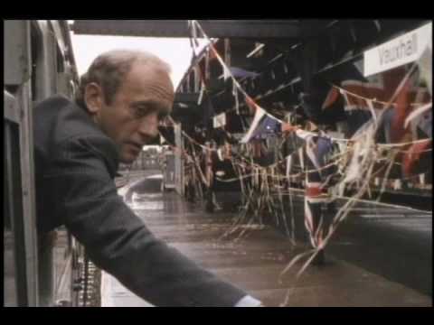
Deakins’ other 1984 film was the oddball just-barely feature-length music video-type thingy Return to Waterloo, directed by The Kinks’ Ray Davies. The plot, as it is, revolves around a middle-aged man taking a train ride and travelling through his imagination and memories in the process, and Deakins uses the two “timelines” to bridge the gap between his early documentary work and his later, more impressionistic work. During the normal scenes on the train and in the stations, Deakins’ camera focuses entirely on following the motions of the main character, prettiness be damned. But those pretty qualities manifest in the “flashbacks”, which contrast with the grounded style of those sequences (in one flashback to the protagonist as a young boy running, the image is gorgeously pastoral, bright and cheery compared to the dreariness of the locations in the present-day) and gives the film the feeling of a stylistic tapestry, befitting its fractured structure. Enjoy this even slightly verite-influenced Deakins while it lasts, ’cause he’s gone from now on.
1986
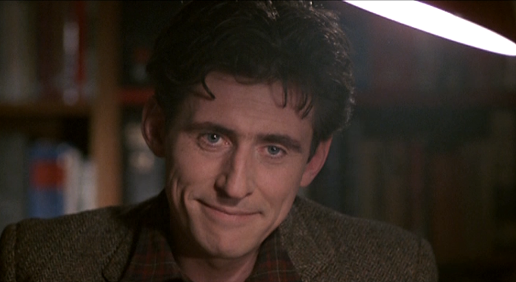
Almost ten years before David Drury’s Defense of the Realm was made, Alan J. Pakula’s All the President’s Men made the mundanity of working in a newspaper into top-notch suspense filmmaking. I can’t say that Deakins’ cinematography here equals Gordon Willis’s work there, but that’s more than a bit of an unfair comparison, and Deakins’ work here is excellent. Indeed, from the first scene, dramatizing a car chase that ends with the driver fleeing onto a red-lit air base, this is an exquisitely-shot motion picture. As with Willis, Deakins does make the newspaper office where Nick Mullen (Gabriel Byrne) seem more hospitable than the various shadowy locations Mullen finds himself, including his own flat, but if you look carefully at the lighting there, one notices how soft and bright it is, as opposed to the more hard-edged lighting in the other locations. This lighting puts the office almost in a fog, like there’s a very real possibility the newspaper is hiding something very, very bad behind its surface appearance, and whaddya know, it is (this lighting repeats late in the film, in a sinister meeting that’s the closest the film gets to Pakula-Willis, in this case The Parallax View). In other journalistic thrillers, the newspaper is always lit like a safe spot for the protagonists, but here, Deakins conveys the feeling that absolutely nowhere is safe in this film. And he accomplishes that with his compositions as well. Deakins uses the tallest widescreen ratio possible, 1.66:1, here, and the height of the compositions are not matched by the actors’ positions, leaving them dwarfed by empty space in almost every shot (even close-ups leave negative space). This visually represents how tiny they are in comparison to the huge story that they’re unraveling, as well as leaving the viewer in a state of perpetual worry as to whether or not something is going to happen in the wide-open background (the apex of this is one scene where Mullen is in an elevator, his head the only part of him in frame, with the rest of the space showcasing all the places where somebody could be coming from).
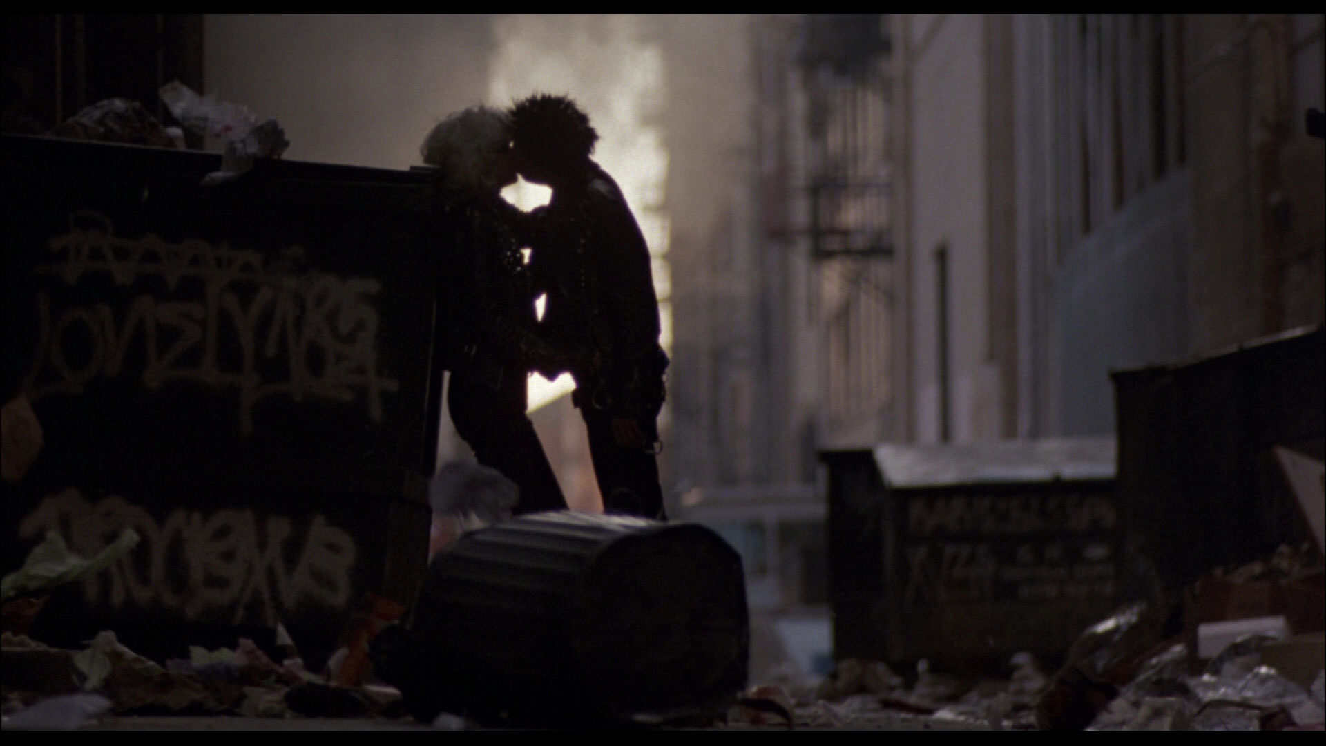
Deakins’ work on Alex Cox’s Sid and Nancy has basically been boiled down to one shot in the public consciousness; the one where Sid and Nancy are kissing and garbage rains down on them (Deakins’ suggestion was that the rain not just be trash, but trash bins and cans, to give the shot a harder edge than “wow much romantic”). The rest of Deakins’ work goes mostly uncommented on, which is a shame, because, from the first (evocatively-lit) shot of a catatonic Sid Vicious being questioned by (mostly out-of-frame) police officers on, this is a wonderfully-shot film. Much of the portions of the film set in England are shot in jittery handheld, which works as a way of capturing the squalor of the film’s locations and making it beautiful without making it “pretty” (the difference between beautiful and pretty is key in Deakins’ career, and I go into it a little more in the forthcoming Part 2). And the format brings some truly inspired shots, like an early concert sequence where the camera has to work to find Sid in the mass of flailing bodies, and in a one-shot that follows Sid and Nancy as they walk away from police beating up the kids who came to see the Sex Pistols’ performance on the Thames without a care in the world, madly in love, even as the concertgoers flee right next to them (that last one in particular has me convinced that this movie was an influence on Lubezki’s work in Children of Men). Deakins also knows exactly when to keep the camera steady during these parts, like a series of static shots where the audience quietly observes Nancy violently reacting to her parents refusing to give her and Sid money. When Sid and Nancy go to America, the camera calms down and the images grow more and more dreamlike, effectively putting the viewer in their dazed headspace as they deteriorate.
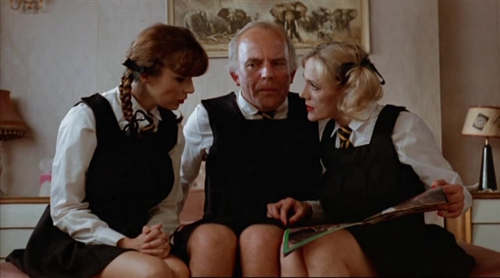
Terry Jones’ first non-Python directorial effort, Personal Services doesn’t find him getting Deakins to reuse the bolder visuals Jones had created for The Meaning of Life, but instead finds Deakins returning to the visual style of Sid and Nancy, using the handheld photography once again to capture the pure griminess of the film’s suburban locations, where Madame Christine Painter (based on Cynthia Payne) establishes a brothel. Just as in many moments of Sid and Nancy, the camera here is restless, exploring rooms, hallways, and people (at one point early on, a fight appears to be occurring an inch, at most, away from the lens) with a kind of roving curiosity. This is even used as a joke during a fantasy sequence, where Chrstine’s vision of living in luxury involves the camera doing hilariously pointless circles around her and her suitor (this sequence also makes a joke about the lighting resembles an absurdly opulent version of the subdued sodium lighting of the interior scenes). As with Sid and Nancy, the style works perfectly for the film, the more grounded, unobtrusive but still beautified (in his forum, Deakins talks about how he’s not a fan of handheld that “draws attention to itself, that says ‘you are watching reality now'”) style befitting a story whose effect comes from how mundane its surroundings are (whereas the larger-than-life mythos behind Sid and Nancy lent itself better to a more directly stylized approach).
1987
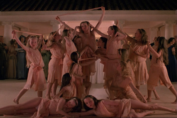
For his final collaboration with Michael Radford, White Mischief, Deakins would travel beyond Britain for the first time since his documentary days, for the film’s story of wealthy Brits escaping the Blitz to enjoy a carefree life in Kenya. Such a story would make the handheld of his previous two films out-of-place within the film’s opulent setting, and so Deakins elects to return to a lusher style than that of those two films. From the first scenes, Deakins uses the film’s visuals to create a picture of unbeatable glamour, even as bombs descend on Britain. Just look at the way Greta Scacchi is lit throughout the film, and especially in the opening; she’s awash in soft, flattering light, looking like a movie star of the film’s time period even as she’s hiding underground during the bombings. When she and her fellow members of the elite head to Kenya, the sun almost never ceases shining on them (when it doesn’t, the image is drenched in perfectly moody blues), and the sky above them is always a perfect shade of blue (during one early scene when they go to the beach, the combo of the sky and the beautiful blue of the water is almost too much to handle, aesthetically speaking). It’s like one character in the film sez; “Not another fucking beautiful day.” And the interiors maintain that warmth, first as a way of visualizing the passion between Scacchi and Charles Dance (Joss Ackland, as Scacchi’s husband, is the subject of most of the coolly-lit interiors), and later as an ironic counterpart to the brutal murder which drives the story while still managing to not ruin the fun for everyone.
1988
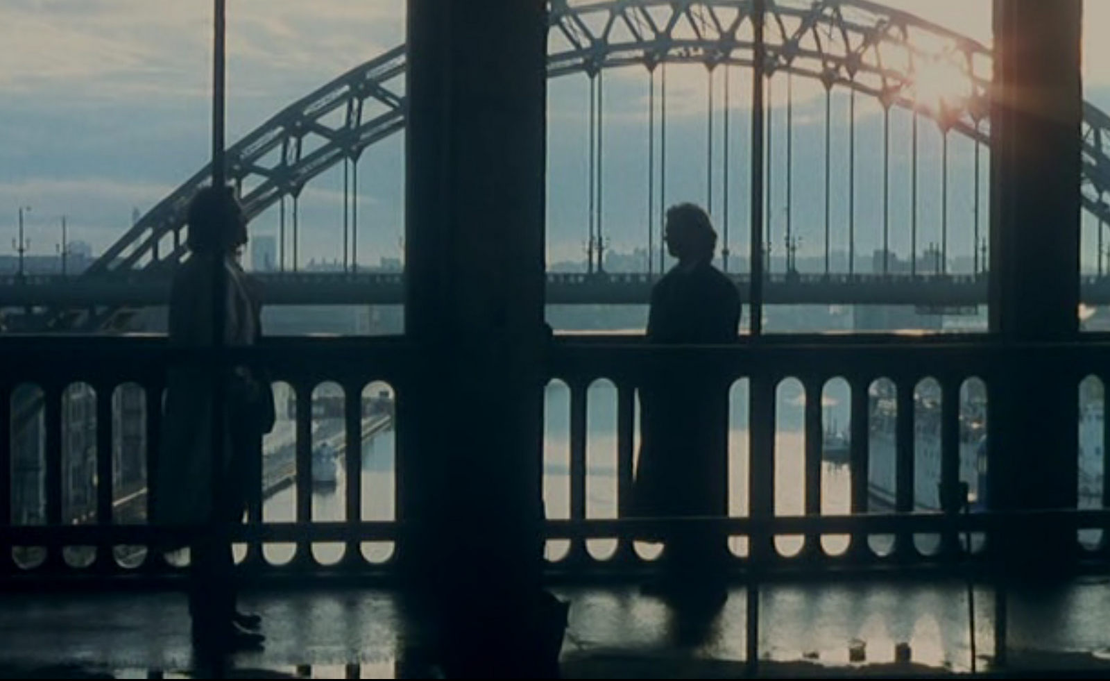
For his return to Britain, Deakins shot Mike Figgis’s directorial debut Stormy Monday, which takes place in the less-than-glamorous English town of Newcastle, but this is as far removed from the dirty pseudo-realism of Sid and Nancy and Personal Services as they are from Sicario. This is a film that’s all about attractive, pretty surfaces, in the cast (it’s primarily about Melanie Griffith falling in love with young Sean Bean, after all), hanging over the story (the town is getting all prettied up to impress American businessman Frank Cosmo, played by Tommy Lee Jones in the first of four roles in front of Deakins’ lens), and all throughout the frame. The Coens have said that the reason they hired Deakins was that they were impressed by his handling of this film’s interior scenes, and looking at it, it’s easy to see why. In every interior scene with shades over the windows, they’re drawn perfectly to provide just enough illumination while still maintaining the film’s contrasty, neo-noir look (scenes without them are similarly gorgeous, such as the moody lighting of the bars that the characters frequent, broken up by neon signs). And all throughout the film, the camera takes in pristine sight after pristine sight; a perfectly fogged up shower door (this shot would see a much-maligned reprise in Skyfall), pianos that look like they’ve never been touched, a beautifully red-lit alleyway, hardbodies at a gym, perfectly blue-shaded night scenes, and an interior of a car given heavenly backlighting by the headlights of the car behind it. Even as the film’s situations grow more and more unpleasant, Deakins’ work never loses it glossy veneer, working with the saxophone score to create an atmosphere of cool that no arm-breakings in the world could disrupt.
1990
1990 would be the year that Deakins hitched a ride to America, where he would stay for pretty much the remainder of his career. Although perhaps it would be more accurate to say that he hitched a ride with American filmmakers, because his first film in this year, Bob Rafelson’s Mountains of the Moon, is American only in the sense that Rafelson is, as it tells the story of two Brits (John Speke and Richard “No, not that Richard Burton” Burton) in Africa, although thankfully, unlike the subjects of White Mischief, they don’t spend their time there doing awful things. Also unlike White Mischief, Deakins gets to explore of Africa’s beauty than one area around a mansion, and the results are predictably stunning. Deakins shoots the African landscapes in a way that always lets them and the sunlight speak for themselves (in a forum post, Deakins said that he shot on a film stock that made fill light almost completely unnecessary), whether the end results are arid and desolate or gorgeous and lush (the magic hour sequences in particular are utterly beautiful). When the film returns to Britain, Deakins makes sure that the aesthetic quality doesn’t go markedly down, with these sequences including some utterly gorgeous scenes lit by candles (my favorite is one close-up of Burton blowing cigar smoke into his glass) and many others gorgeously lit with window light (the two main locations shot this way, the house of Burton and his wife and the Royal Geographical Society, being Burton and Speke’s domains after they came back). But my favorite sequence comes early in the film, when Burton and Speke are in Africa for the first time and are attacked, with it being so pitch-black outside that the attackers are only identifiable as a result of the torches they carry (this was Deakins’ idea, as Rafelson initially wanted to include “moonlight” in the scene, although he was won over when he saw the finished version).
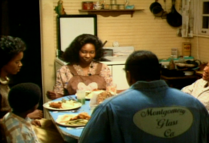
Deakins’ second American film was The Long Walk Home, a pretty good drama set during the Montgomery Bus Boycott (it can only be seen in its original aspect ratio on Netflix Instant). Those accustomed to the sheer beauty of Deakins’ more recent work might be shocked by how thoroughly, completely unshowy his work is here, mostly serving as a way to silently complement the story. Not to say that it doesn’t look good. Oh, it does look good. My favorite shot is probably the one of a terrifyingly-crowded meeting for racist white male assholes held in an indoor basketball court, but overall, Deakins does a fine job bringing out the simmering hiding beneath the surfaces of the characters with consistently warm (but not over-the-top hot, which another movie about maids in the Civil Rights-era South, The Help, indulges in) color temperatures (even during scenes set at Christmas). I’m sorry, that’s all I got for this one.
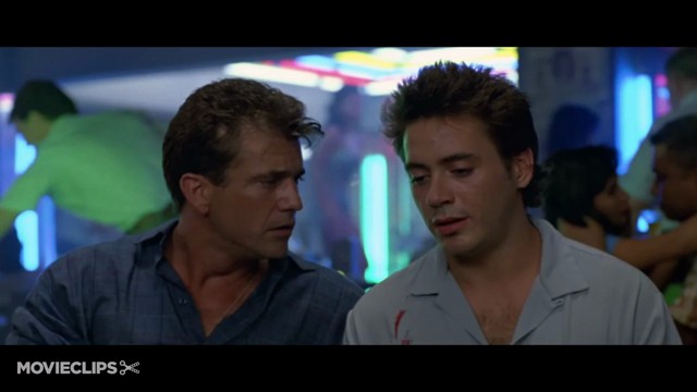
Deakins has said frequently that Air America, his first major American film, was useful in that it showed him the kind of films he didn’t want to continue making, movies without an idea of what they really wanted to be (the original idea here was for a more Catch-22/M*A*S*H*-esque movie, before it got whittled down to a dumb buddy comedy). One can see the conflict between Deakins’ work ethic and Deakins’ dissatisfaction with the film play out in the film, which is pretty much only interesting when viewed as a part of Deakins’ career (otherwise, it’s just a witless, aimless action-comedy that I would have forgotten that I had seen). Deakins does get some very nice shots in there, when the movie keeps still and doesn’t opt for explosions or high-flying stunts (you can practically see his eyes glazing over as he has to shoot those sequences). I’d particularly fond of the scenes set in a neon-lit nightclub and a golden-hued Buddhist temple, plus a blue-tinged sequence where Robert Downey Jr.’s character has to blow up a plant where dope is being manufactured (even without the synthesizer soundtrack, it would be Michael Mannly to the extreme) and a sequence where the main characters treat themselves to a nighttime round of miniature golf. Thankfully, Deakins would return to more stylistically and artistically fruitful American productions by the next year.
1991
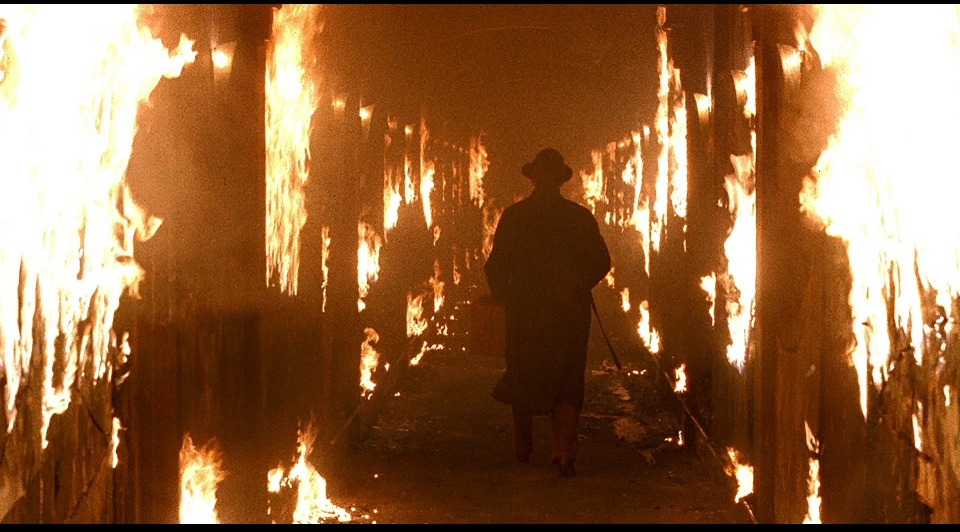
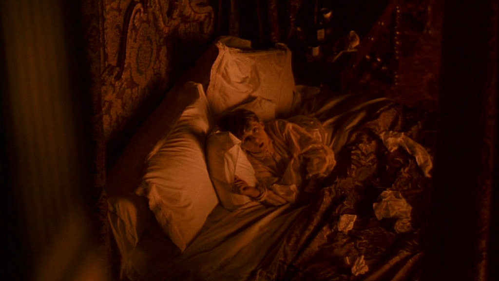
The story goes that the Coen brothers decided to find a new cinematographer to shoot their fourth film after their normal DoP, Barry Sonnenfeld, left to pursue a directorial career. Deakins was living in London at the time, cooling off after the bad experiences of Air America, when the Coens gave him the call, having been impressed by his previous work. They decided to work together and the result was their collaboration on Barton Fink. Even as they’ve made numerous films together, Barton Fink still stands tall in their collaboration, containing some of the most memorable images yet crafted by the Coens and Deakins. Much of the film is confined in the Hotel Earle, where the title character spends his time unable to write a Wallace Beery wrestling picture, and Deakins goes all out to make the viewer feel uncomfortable with every second they spend there. From its introduction, the Earle is a dimly-lit, oppressively ugly, ungodly hot place, and Deakins has a ball making it as repulsive as possible with his lighting (if this was the only movie he ever shot, I’d still call him a genius just for how he lights the wallpaper). By contrast, the scenes that venture out of the hotel, largely Barton’s visits to Capitol Pictures, are so bright and cheery (the urinals are cleaner and look better than Barton’s hotel room) that the horror of the hotel is only magnified by comparison. Other than lighting, Deakins gets some stunning shots in here, like a shot going from Barton’s bed into the hole in the sink, Barton watching one of the studio’s wrestling pictures in disgust, with the movie reflected in his glasses, and, of course, a man running down the hotel corridor while everything behind him is consumed by flames (honestly, it looks better on fire than it does throughout the rest of the film).
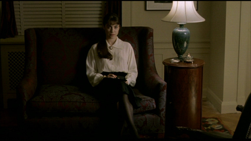
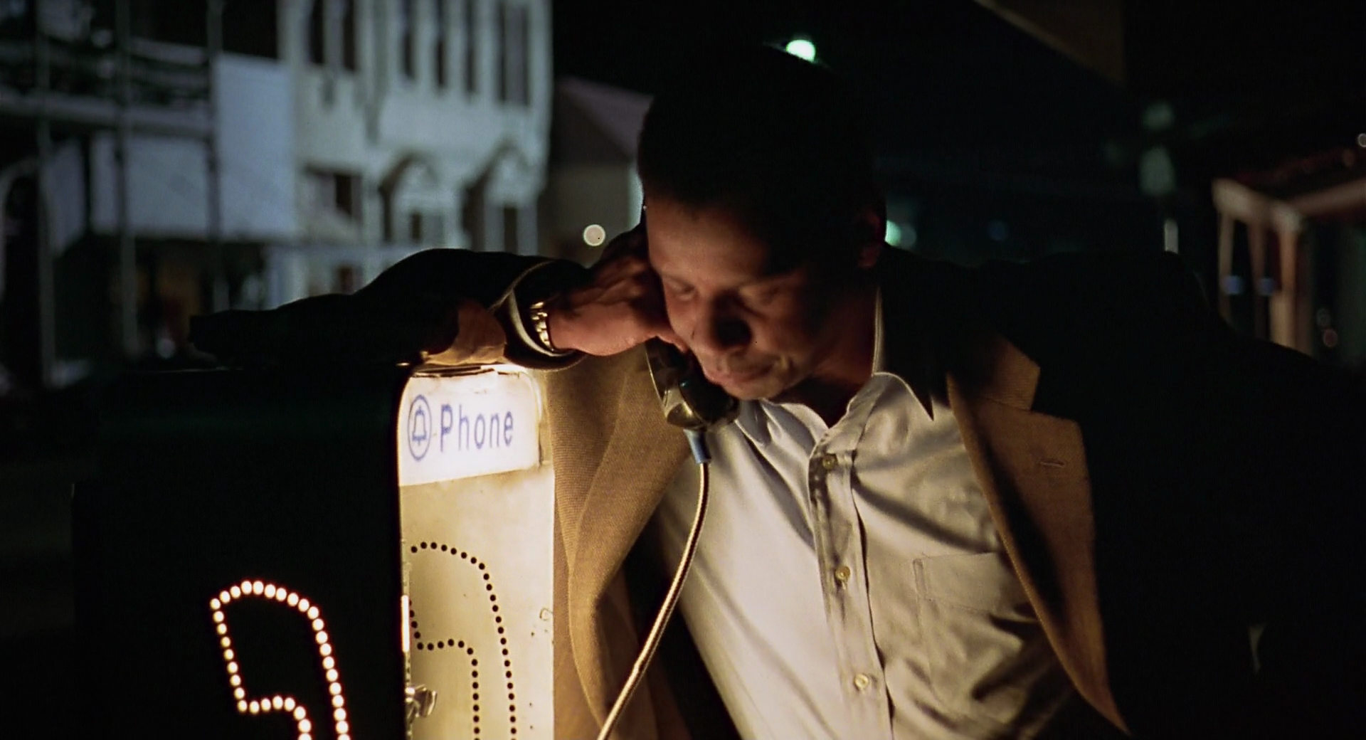
Deakins’ work on another 1991 film, David Mamet’s third film Homicide, would be bound to be ignored or overlooked even if it wasn’t opposite one of the most important films of his career. But it’s still great work on a great film. The film focuses on Joe Mantegna as a police detective whose work on a flashy drug-dealer case is suddenly interrupted when he’s yanked out of it and placed on a small, unimportant-seeming case about the murder of a Jewish candy shop owner in the Baltimore ghetto. The film’s color scheme is bleak all around, but Deakins’ lighting choices follow Mantegna’s confusion as he seems to find evidence of the murder being much more than just a robbery. The way Deakins lights the police headquarters, there would no way to get lost in them, the light being so hard and so steady. Whereas the scenes in the ghetto are so murky and dim that there’s always a danger of someone walking out from behind the murk in the back of the viewer’s mind. That fear is realized in the best shot in the film, and one of the best shots in Deakins and certainly Mamet’s careers; Mantegna is unleashing an awful, self-loathing-induced rant about being stuck with “my Jews” into a phone, his body facing the camera until he suddenly moves over, revealing Rebecca Pidgeon, the granddaughter of the dead candy-shop owner, who had been perfectly hidden by Mantegna up until that moment, listening to every word. Many people have many different ideas of what makes a perfect shot, but this is just about as perfect and painful a shot as you can get.
1992
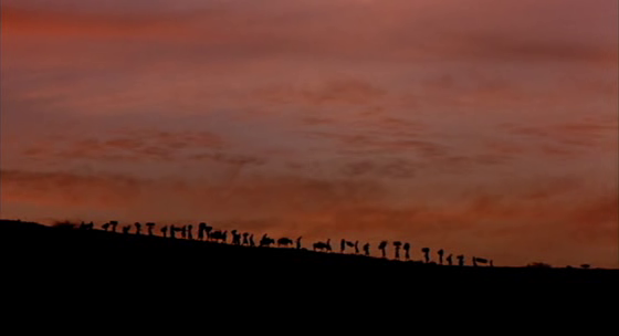
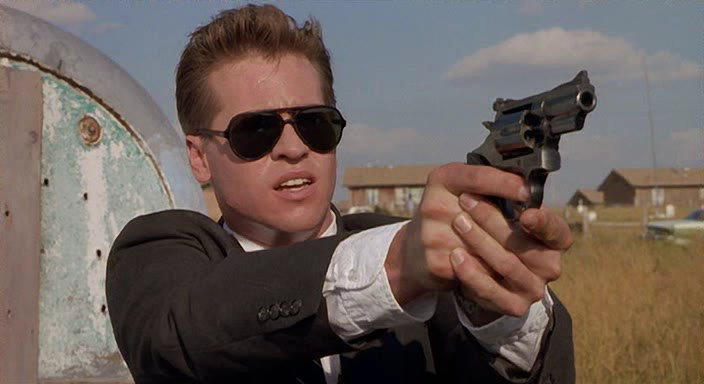
On the surface, Michael Apted’s Thunderheart appears to tell close to the same story as Homicide; a law-enforcement officer who’s neglected his cultural/religious roots is put on a case because of those roots and rediscovers them in the process of solving it. But that whole experience goes a lot smoother for Val Kilmer’s half-Sioux FBI agent Ray Levoi than it does for poor Bobby Gold, so a change in visual style between the two is definitely needed. The Native American reservation Levoi visits may be loaded with poverty and strife, but it is a much more beautiful place than the Baltimore ghettos of Homicide, full of lush green foliage, houses lit entirely with sunlight, and stunning vistas, all of which the camera takes time to look over even in the middle of gun battles (compare this to the non-reservation locations we see, like a motel room full of faux-earthy tones viewed in close proximity to the real thing, and a bar which only comes to life visually when it suddenly bursts into flames). But Deakins and Apted also take pains to establish that it used to be much more. In the opening sequence, we get two separate series of shots; the first is of Native Americans performing a ceremony cast in silhouettes against a perfectly blue nighttime sky, followed by another Native American running for his life in silhouette against a sunrise, him getting shot to pieces made disturbingly beautiful by the yellow surrounding him. As far as the film is concerned, this moment is the final death knell of this culture, and it’s only downhill from there.
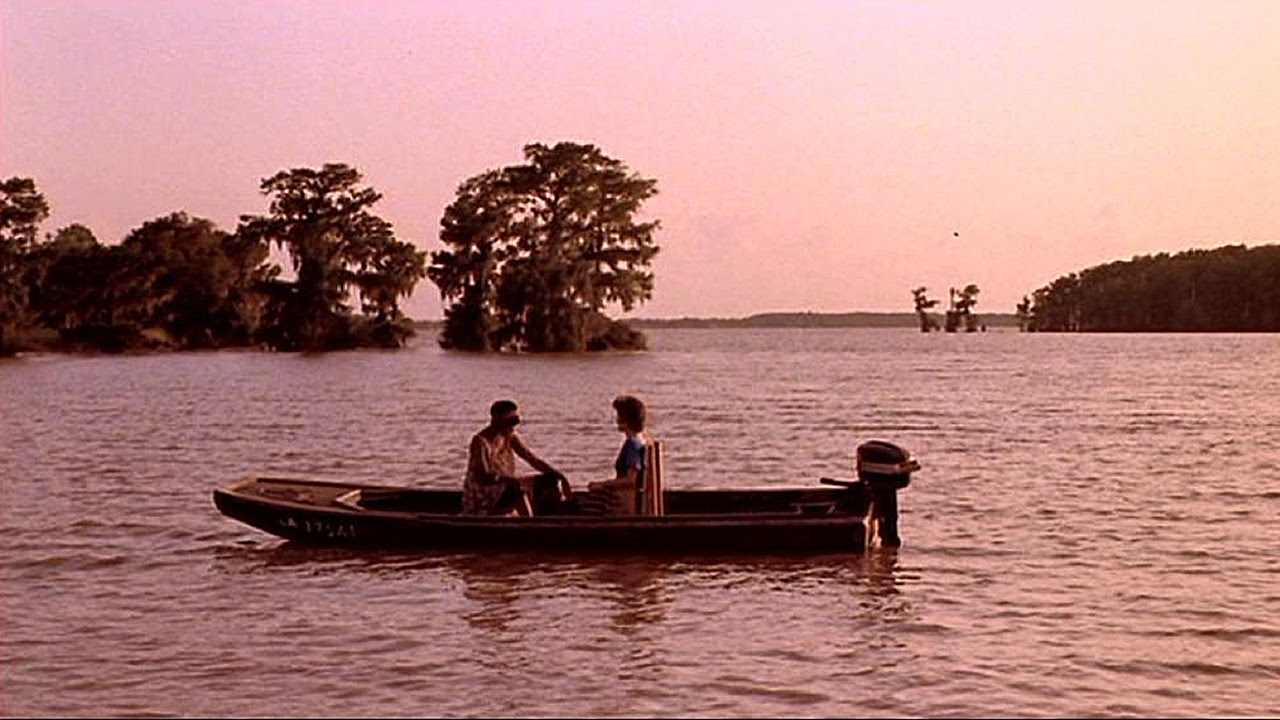
Deakins’ first and only film for John Sayles, Passion Fish saw Deakins making a semi-return to the location and focus of The Long Walk Home, although this tale of a white woman’s friendship with her black worker (in this case, a nurse helping her, a soap opera star, after she was paralyzed in a car accident) takes place in the present-day and is much less didactic with its story of interpersonal race relations. And then there’s also the experience Deakins had in America between then and now, which helps make Passion Fish much more visually memorable than Long Walk. Befitting Sayles’ loose, plotfree approach, Deakins uses the humidity and heat of the film’s Louisiana setting not to make the film feel sweltering, but as a soothing agent, giving the film an everpresent warmth that suits the movie’s hangout approach. But all that said, the best shots in the film are before the setting or the central relationship are established. The film opens with a series of shot that follow the main character from her waking up after the accident to her being sent home from physical therapy, full of gliding camera movements (look at the shot that goes from her freaking out in bed over her soap opera not showing her close-up to the TV playing the soap in one peaceful movement), close-ups, and shots that obscure the faces of everyone besides her (everyone else in these bits are pretty much like the adults in Peanuts).
1993
If anything about Deakins’ cinematography in Agniezka Holland’s The Secret Garden is often talked about, it’s how Deakins photographs the titular garden. This is with good reason, as the scenes in the garden are absolutely beautiful even before it physically comes back to life. As always, my main man wallflower explained it best; during the first few scenes in the garden, when it’s been ignored for a decade, the garden is depicted not as lifeless, but in a resting state. All it needs is for the light to hit it just the right way, and it can return to its former glory. And its former glory is gorgeously depicted later in the film, Deakins lighting the lush green of the garden (as well as the white clothes of the children exploring it) so that it’s practically surrounded by a halo. But if this movie was just lovely garden footage, the parts of the film before they get to the garden would be something of a chore. As one should expect, Deakins creates cinematic magic even in these more seemingly mundane stretches of the film. The film starts with its main character, Mary Lennox, in India with her parents. These scenes are lit scorchingly warm, but while that generally signifies the “nice” parts of the movie before things go to shit, here, the scenes are unpleasant for Mary even before her parents die in an earthquake (depicted as creating an apocalyptic inferno in their residence). When she moves to England, the scenes become chilly and near colorless (other than an irritating chat between Mary and the housekeeper of the estate where she stays, which returns to the extremely warm lighting), and a little harder for Mary, but Deakins stays away from expected “warm = life, life = good” lighting techniques in favor of something more unique. He returns to this with the introduction of Mary’s cousin Colin, who’s introduced bathed in a horrible orange tint that looks like it’s the only thing keeping the sickly, pale boy tethered to life. It’s only when the image reaches a safe middle ground, such as the less pervasively warm scenes between Mary and Colin later on and the scenes in the garden, that the characters find anything resembling happiness.
1994
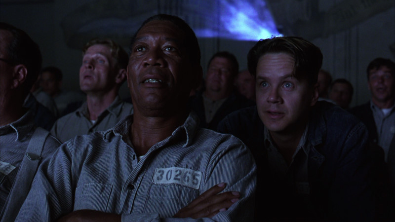
In 1994, Deakins had the strangest, most specific pattern going on with his two films that came out that year. Both were period-pieces starring Tim Robbins with oddball titles that probably helped doom them at the box office that managed to become cult or outright classics in later years. The one that really took off after bombing was Frank Darabont’s The Shawshank Redemption, a movie which you probably don’t need me to tell you is good. But while it’s so widely-heralded now, not many seem to speak about Deakins’ cinematography in it (the work that netted him his first of many Oscar nominations). Well, it’s great stuff. The early portion of the film is told in mournful blues, reflecting the pure misery of Andy Dufresne’s scenario and the prison where he was sent. But the palette slowly expands over the course of the film, with the scene where Andy convinces the guards to let him and his buddies work on the roof and drink beer being full of rich, warm colors, a hard-earned victory and breath of fresh air. And by the time Andy escapes, the camera acts just as eager to leave the confines of the building as Andy, travelling down the hole he carved to freedom and soaring over him after he gets out and lets the rain cleanse him (that moment is one of the most iconic images in Deakins’ career, and it’s sold just as much by Deakins’ exuberant camera move as it is by Robbin’s performance).
Deakins’ other Tim Robbins-starring 1994 flop was his second collaboration with the Coen brothers, The Hudsucker Proxy. Much like Barton Fink, Hudsucker takes residence in a heightened vision of the past. But whereas Fink‘s style is heightened in the sense that it’s the real world made a lot more grotesque, Hudsucker is a more thoroughly stylized beast, a complete fantasy of 1950s New York done with more love than the bile driving Fink. Compared to the Hotel Earle, the Hudsucker Industries building is practically a safe haven for all that’s good in the world. Which is not to say that the Coens don’t have fun poking holes in it, or the world of the film, either. The Coens, Deakins, and production designer Dennis Gassner design the film’s world as a place dominated by straight lines, from the perfectly parallel rows of columns in Hudsucker’s mail room and rows of desks in the offices of the Manhattan Argus to the desk in Hudsucker’s meeting room, which resembles a Yellow Brick Road leading straight out the window (which Hudsucker himself follows at the beginning of the film). Hell, even the Coens and Deakins’s typical whip-pans and push-ins get in on the act, viewing the world solely in those straight lines. And just as the film is about a round object disrupting carefully-laid plans, the intrusion of circles into shots only comes as a relief (however unconscious) to the viewer, whether it’s a drawing of one on a blank sheet of paper or a hula hoop lying in the middle of a sidewalk or a glimpse at the circular gears of Hudsucker’s clock tower. But beyond that, Deakins’ love of color-coding shows its face again here, and in a more densely-layered fashion. It’s not so simple that the “business” scenes are all coldly-hued; the first bit of life, in color terms, we see is in the way Deakins lights the wood on the desk where Hudsucker runs gleefully towards the window. It’s that the building is such a mishmash of colors and color temperatures that it couldn’t possibly be expected to run efficiently. Any earth tones in the offices are offset by the chilliness of the New York skyline peeking through the windows, a trip in an elevator dominated by exceedingly warm browns shows the dull blues of many of the other levels, and the clean warmth of the top floor is contrasted with the mail room, which is the dirtiest kind of warm possible (compare this to the office of the Argus, whose visual style is clean and consistent, full of almost sepia-toned browns). I haven’t even really gotten to praising Deakins’ treatment of the massive sets, but that’s another story.
1995
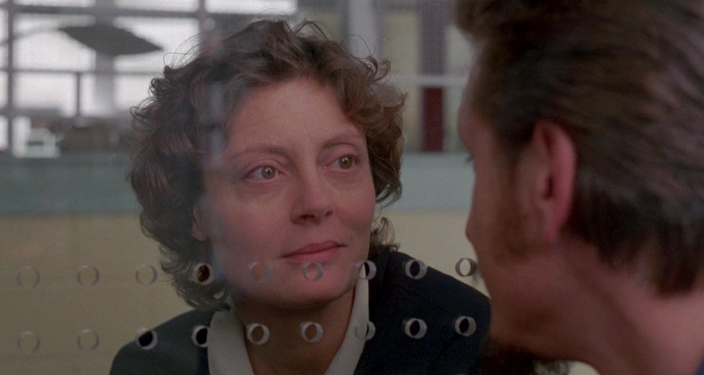
After making two straight films with the guy, it’s hardly a shocker that Deakins’ next project would be the directorial debut of Tim Robbins. But the film, Dead Man Walking, is a much more unobtrusively stylish film than either Shawshank or Hudsucker. But Deakins makes every shot in the film count, and helps it become visually much more than just a movie where two people talk to each other through glass a lot. Perhaps his biggest contribution is refusing to wallow in miserablism visually. This is a warm, inviting movie from start to finish (the only, necessary, exceptions being the images of the awful murder Sean Penn’s character committed, which are desaturated down to almost nothing), allowing the viewer to focus on the humanism present in its story as opposed to its nastier elements. And almost as big is the way Deakins manages to make those prison conversations interesting as visual storytelling. Just look at Susan Sarandon and Penn’s first scene together. Yes, it’s just two people talking through chain-link, but even the chain-length becomes a crucial part of this series of shots. As Sarandon begins to warm up to Penn, no longer is he seen to be obscured by the barrier, with Deakins filming him from closer-up, so that the camera sees his face through only one of the loops. And when Penn’s murder is brought up, it’s back to the drawing board and Penn has to prove himself worthy of seeing his face unobstructed again (when Penn shows Sarandon a picture of his daughter, the picture is seen through only one of the links, and when it goes back to Penn’s angle, it’s back to him through the barrier).
1996
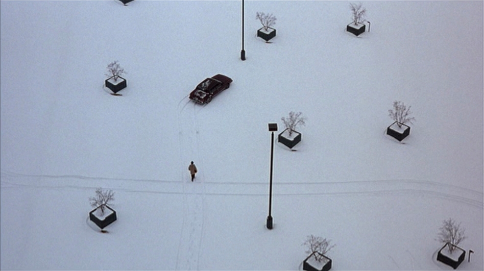
Deakins had plenty to work with the fantastical visions of 1940s Hollywood and 1950s New York the Coens had conjured up for their first two collaborations. But it’s their third film together, Fargo, the one where any beauty has been long-covered with snow, that would become the film that define all three of them. Perhaps it was the utter drabness and lack of color of the film’s locations that caused Deakins to step it up (not that there were many more steps up to take), but whatever the reason, what this lacks in the exuberance of Barton Fink and Hudsucker, it more than makes up for as a masterclass in visual storytelling. Almost every shot in this film functions as a little short story, and combined, it creates one of the most visually tight films in Deakins’ oeuvre. The most obvious example is the shot above, a perfect portrait of a sad little man living a lonely life in a dull world, but there are so many others. The tragicomic tableau of Jerry seeing his father-in-law’s body and, without even bothering to get out of his car to do so, opening the trunk. The shot of Jerry practicing his post-kidnapping phone call, Jerry cramped into half of the frame. Grimsud hunting down the witness, lit with the demonic red of a car’s headlights. Carl burying the money against an anonymous, endless stretch of road and show. Really, any shots of the horizon, pitting the characters against a white void from which there is no escape. Deakins’ work here is what pushes Fargo in the direction of tragedy as opposed to comedy, the stark compositions and muted, nigh-invisible color scheme sending a chill down the viewer’s spine even in scenes meant to get laughs.
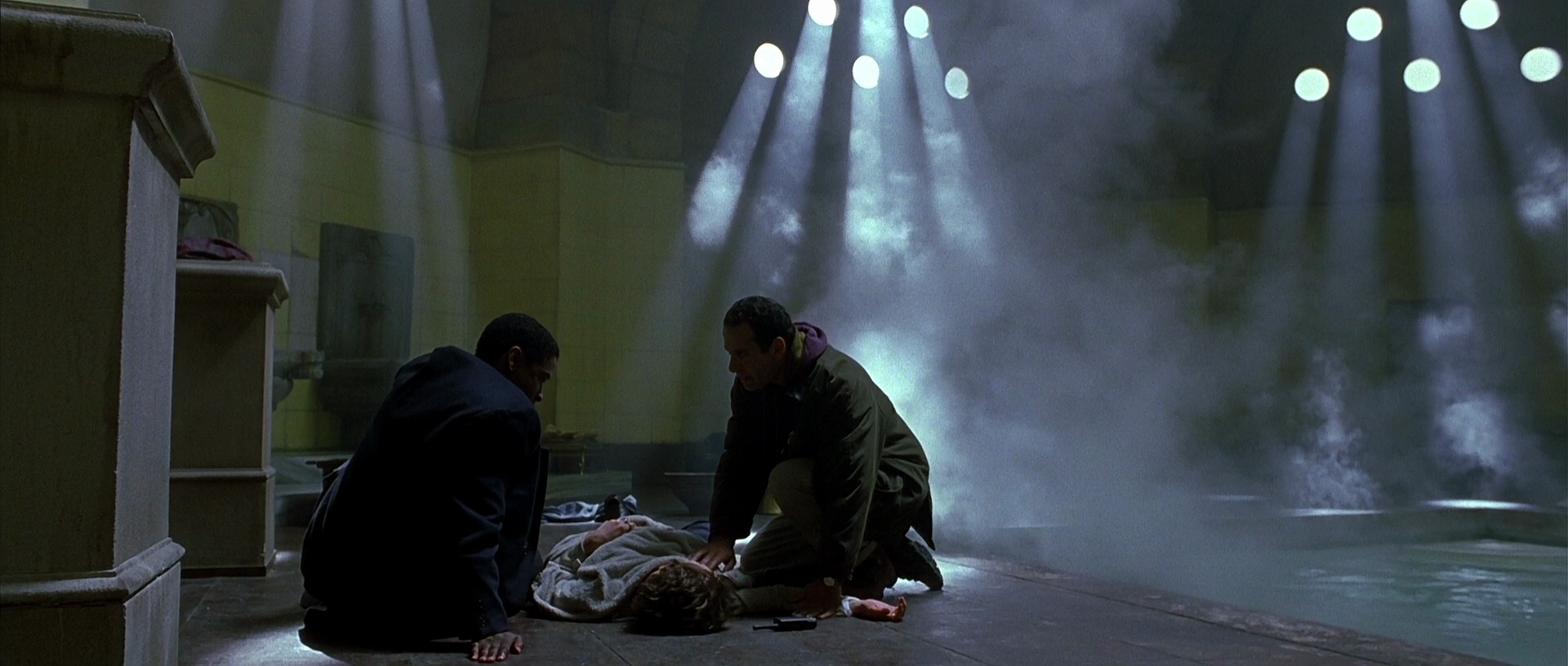
In the years following the debacle of Air America, Deakins had certainly shot some reasonably high-budget films, but none of those saw Deakins returning to make straight action movies, and certainly none of them saw him returning to make war movies. That changed in 1996, when Deakins shot an honest-to-god war picture, Courage Under Fire, for Edward Zwick. And from the first moments of non-archival footage we see, of Denzel Washington’s officer pepping up his troops in Kuwait, their surroundings dimly-lit with the occasional spotlight and the faint light of the burning oil wells in the background, the viewer knows that this is going have a much higher stylistic success rate than the last time around (this is backed up with the scenes inside the tank with Washington, where everything is bathed in red except the eyes, which are green as a result of looking at the surroundings in night-vision). It helps that Courage avoids the smart-assery of Air America that, inadvertently or not, made war look like a bit of a lark, with the battlefield in the opening scene resembling a vision of Hell by the end, followed by a charcoal-grey vision of what comes after. But that’s not the only thing the film is about. The meat of the film takes place as Washington does some research about the candidacy of the first female to receive the Medal of Honor and interviews the men who served under her, each of whom has their own recollection of what happened leading to her death. The interview scenes are all Hollywood (not a complaint, especially considering how well Deakins does do Hollywood), clean compositions, warm lighting, and fluid camera movements, while the flashbacks are an entirely different interpretation of the Gulf War than the opening scene. Here, the only color in the bleached-out frame is the occasional bursts of fire, the image mostly taking its visual cues from the arid locations these soldiers find themselves stuck in, with Deakins shooting these sequences in a much jitterier fashion than everything else (the style of the flashbacks, and the shots of those oil wells, would recur in Deakins’ second film about the Gulf War, nine years later). Deakins almost seems to be reusing his technique from Secret Garden, utilizing two entirely different, equally valid visual interpretations of “war is hell”.
1997
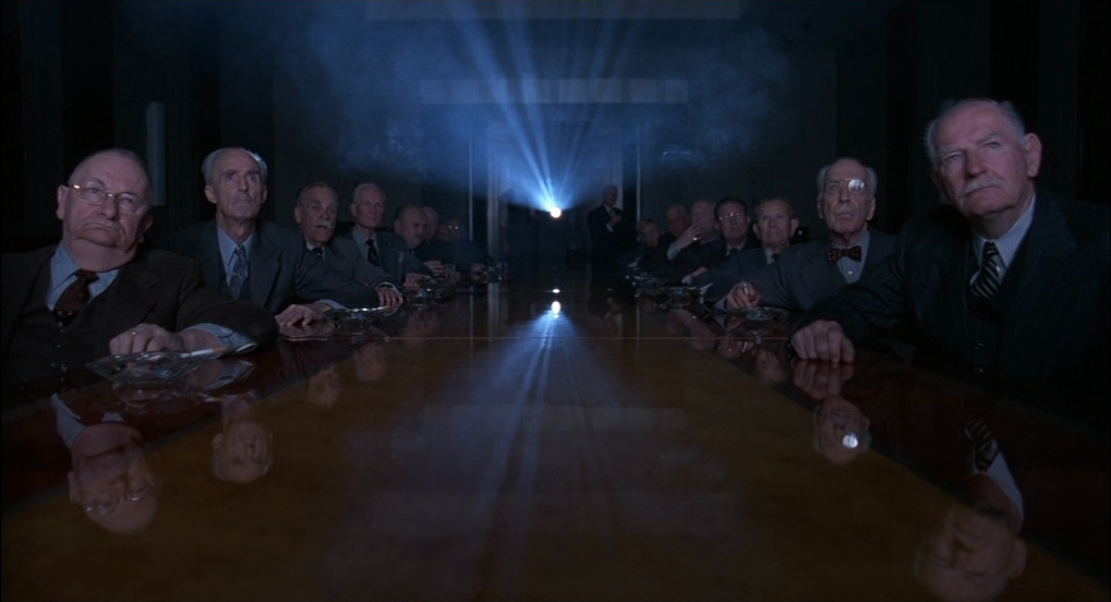
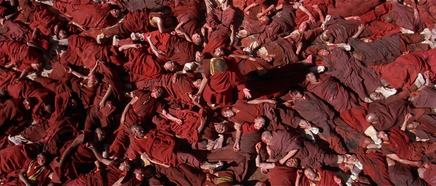
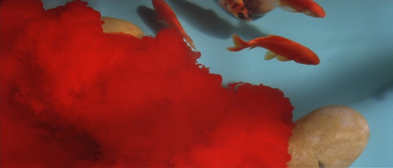
In a recent interview, Deakins had a surprising pick for his favorite of the film he’s worked on; Martin Scorsese’s Dalai Lama biopic Kundun. It’s surprising because Kundun should be the greatest movie ever made just on the basis of it being made by Scorsese, Deakins, and Philip Glass (plus Dante Ferretti and Thelma Schoonmaker), when it’s instead merely pretty good. But Deakins had good reasoning for the pick, as he liked how many shots in the film weren’t strictly literal. Indeed, while Deakins got the job on the basis of his documentary work (Scorsese wanted someone from that arena because they could work well with the mostly first-time actors), the best and most prominent images of the film (and pretty much every shot here is a winner) are the ones completely untethered to reality, like the two above (Deakins is a master with the color red here, using it sparingly at the beginning, ramping up its usage in the middle section before it only exists as disturbing accents in the last part) or a sequence where the Dalai Lama and one of his aides are light with a film projector as they have a pivotal discussion about China’s intentions for Tibet and the final shot of clouds covering Tibet. But, like I said, every frame of this movie is utterly gorgeous, and it’s a travesty that the only available U.S. release of it is Disney’s ancient, non-anamorphic DVD.
1998
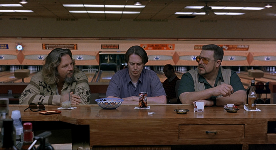
When you think about it in the context of Deakins’ career, The Big Lebowski is kind of a curious thing. It’s quite possibly the most widely-beloved of the films he’s shot (other than maybe Shawshank), and yet it’s probably the one of Deakins’ “major” films that is least-talked about in terms of its cinematography. Which is not to say that its look has been completely ignored. Certainly people talk about the Dude’s dream sequences, which are visually impressive (the shot of the Dude’s shadow against the wall at the start of “Gutterballs” could be one of my favorite Deakins shots), as are some of the flashier shots, like Maude’s sudden introduction, the party at Jackie Treehorn’s mansion (both of those owe their impact to the total darkness surrounding them), and Mr. Lebowski’s absurdly overdramatic seclusion in the West Wing, but most of the film is working at a much more low-key register, and that doesn’t tend to get people’s attention. But Deakins’ lighting is actually fairly instrumental in getting the viewer to settle into the film’s mood. My main man wallflower deemed the film’s look “hard but not brutal”, where the sun is shining but it isn’t oppressively bright. This middle ground is, for lack of a better word, relaxing, and it kind of serves as a way of cluing the viewer in that they should just sit back, enjoy the movie, and not worry too much about all this plot business. The scenes in the bowling alley best illustrate the film’s comfortable atmosphere, with Deakins lighting the spaces just lushly enough so that the viewer enjoys coming back to them, without making the manipulation obvious (it looks exactly as good as a bowling alley could look, and not better). This kind of quietly pleasant ambiance obviously wouldn’t win Deakins the Oscar, but it gave him another feather to fit into his hat.
(I couldn’t find a way to put this in the main capsule, so I’ll leave it here. Amusingly enough, the blocking of the shot where Wu pees on the Dude’s rug is identical to that of the shot where Jerry practices his call to his wife’s father in Fargo. Evil as shocking lack of conscience, evil as hilarious, baffling stupidity, it’s all the same to the Brothers Coen and to Deakins.)
If Courage Under Fire was a tentative step back towards the big-budget action filmmaking Deakins had been turned off by, then his second film for Zwick, The Siege, marked a full return, with no pretense of being a character drama like Courage had. He even broke out the 2.35:1 frame for the second time in eight years for this. But anyone worrying that his talents would once again be wasted would be put at ease by the first glimpses of his work we see, stunning desert vistas which give way to the image of a government-backed assassination obscured by a herd of goats. That scene is also the last glimpse we get in the film of real, genuine warmth. Certainly, the images run hot and cold afterwards, but the warmest we get afterwards mostly isn’t much stronger than “office building tans” (the scenes that do go above that almost all take place in the company of Annette Bening’s renegade ally to Denzel Washington, as well as during the sequences involving torture, their single-source warm lighting unconsciously setting the stage for Deakins’ work on Prisoners). Mostly, we get chilly cityscapes (the places constantly in danger of erupting into violence), set against perpetually overcast skies (the whites of the clouds are shot to look a little milky, so that no light even accidentally escapes or comes off of them). Other than that, Deakins’ camerawork is superb in tracking the film’s action, like during a chase early on and when Washington intervenes with someone holding a school hostage. And between the action, Deakins manages to add notes of pure artistry, such as the shot above and the beautiful, awful image of a wave of debris being carried by the breeze in the aftermath of the film’s inciting incident, a bus explosion.
1999
I covered Wayne Wang’s Anywhere But Here in the first entry of my “Bad Films Shot By Great Cinematographers” series (for the record, it’s not bad, just mediocre), and I talked about its look there. And I’m gonna talk about it again here! Deakins’ preoccupation here is utilizing differences in exterior and interior spaces to capture how the protagonists feel about their various environments (I hope that didn’t sound as pretentious as I think it might). The film’s mother-daughter duo, Adele (Susan Sarandon) and Ann (Natalie Portman), move from place to place throughout the film, with the film starting on them on the road, with washed-out colors and dim lighting, before things perk up when the two move to Beverly Hills, where the sky is either a perfect blue or blindingly white, and the grass is an unnaturally vivid shade of green. But that’s all a front, as the variety of interiors where the two stay are even dimmer and paler than the open road, and this is where they lay into each other. The key sequence to understanding what Deakins does here cuts between Ann on the phone in a house for sale with her cousin Benny, where the shots with Ann are set against walls with the palest, least attractive shade of pink known to man, and where the shots with Benny display better contrast and much richer colors. The grass is always more atomic-green on the other side.
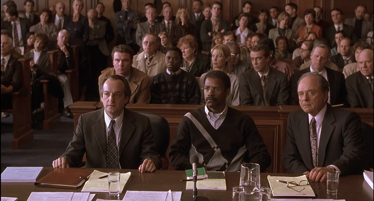
Deakins certainly didn’t end the millennium with his best-made film, but he did end it with one that does a lot to summarize his strengths he honed throughout the 15 years prior. His final film of the millennium would be Norman Jewison’s The Hurricane, which sadly was and is now mostly remembered for the extent of its fudging of the facts of the Rubin “Hurricane” Carter case. It’s sad because Deakins’ work here deserves to be recognized by more than just hardcore auteurists. The film jumps back and forth between several different timelines and locations, giving each one its own identity. The flashbacks to Carter’s childhood and young adulthood are covered in an ironic semi-sepia tone (perhaps a warm-up for O Brother, Where Art Thou), while the scenes showing Carter in the ring are all shot handheld in coarse, grainy black-and-white, daring the viewer to bring up comparisons with Raging Bull. But the bulk of the film is in the jail with Carter or in Canada with the activists and teenage boy who would set Carter free, the Canadian sequences (as well as the final courthouse scenes) following the flashbacks’ warmth by being full of rich, naturally warm brown tones, comforting to the viewer as they watch the deliberations for an innocent man to be set free. Meanwhile, the prison sequences are cold cold cold, making it seem like New Jersey is substantially colder than the Great North. Obviously, this sort of follows Deakins’ work on Shawshank (another movie this movie dares you to compare it to, between the setting, the photography, and Clancy Brown playing a warden, albeit this time a sympathetic one), but this deviates from that with how hard Deakins lights these scenes. Shawshank may have been largely about human suffering, but it’s still something of a fantasy in its presentation, while Hurricane‘s prison scenes look more like they took place in an actual prison, the light revealing every unflattering detail about it. The main exception are the scenes where Carter is in solitary, where the prison becomes a prison of Carter’s mind, the cell lit so that nothing seems to exist outside Carter’s headspace (Deakins would do something like that again in The Man Who Wasn’t There). It’s some brilliant work here, and just think, a lot of his best work isn’t even coming until Part 2!
Join The Narrator next Monday for the second part of this series.

