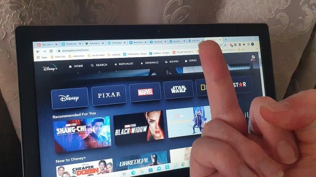
There’s going to be no substance to this post beyond me raging about the user interface for Disney+, but I find it so frustrating to use and so counterintuitive to what I want it to do that I have to verbalise it somewhere. The first time I ever got irritated with the service’s design was when I went to right-click a movie so I could open it in a new tab, only to discover it wouldn’t allow me to do that. I like to open a bunch of movies at their info page at once, then whittle down my choices to whatever I feel like watching right now. At first, muscle memory kept kicking in, and I accidentally hit ‘back’, which would take me out of the search bar entirely and dump me on the main page, and I would have to scroll down to find my place in the search options. It’s unbelievably infuriating, but because I never saw anyone else complaining about this, I figured it was one of the quirks of getting to be me. But then more stuff came piling on. I find most streaming services pretty easy to navigate and find something I want to watch when I don’t know exactly what I’m looking for; Netflix and Stan’s hyper-specific categories are really good for narrowing down a tone, and Amazon Prime has a good algorithm that breaks the movies and shows up.
Disney+ has ten genre categories and, in Australia, divides its website into two halves – the kid-friendly Disney section, and the adult-oriented Star section (as well, of course, as the Disney+ Originals section). When you actually explore these genre categories, you’ll find that all of them are arranged alphabetically. There is no way to divide them up by tones, awards, subgenres; one just scrolls through, starting at A and working your way to Z. It turns out this makes searching for a movie unbelievably tedious. The subgenre categorisations of other streaming services reminds me of looking at the video store when I was a kid, cycling through cool pictures that spark my imagination; Alphabetical order doesn’t quite spark my imagination the same way. The closest it has to categories are franchise categories – not just grouping together movies like the Star Wars or Marvel series, but episodes of shows (like all the Christmas episodes of The Simpsons). But this is also straight up counterintuitive; when I want to find Alien movies, I search for Alien movies.
It’s when I’m watching TV shows that it becomes maddeningly counterintuitive. I generally watch one episode of a show at a time, and most streaming services will pick up that I closed down the episode mid-credits and automatically start up the next one when I click on the “continue watching” option. Disney+ does not. If I click on the show icon in order to go to its page, most streaming services will jump to whichever episode I’m currently up to. Disney+… does not. I have to click through the seasons and then episodes of each season to find where I’m up to. The fact that it is the only service with these design problems and that it came long after most of them is what makes it even more infuriating; it makes the whole thing feel almost maliciously annoying. You’re not even the fifth out of the gate! Surely you could learn from the mistakes and successes of the people who carved the path! Fucking hell.


