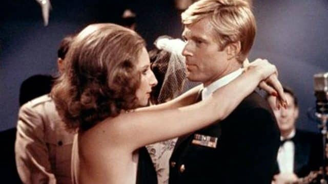
There’s a lot to be said about ’70s film. I’d argue, in fact, that it’s probably the most controversial decade in the history of Hollywood. For every paean about New Hollywood, there is an equal and opposite response about how bigoted New Hollywood was. And don’t get me wrong; you will sometimes even see writing about the glory of the films themselves, and there certainly are some beautiful films made in the ’70s. I don’t myself like Barry Lyndon very much, but at bare minimum, it’s a glorious marvel of filming capability, with the famous borrowed-from-NASA lenses Kubrick used. Likewise Days of Heaven, another movie I don’t like that is really beautiful. And Cries and Whispers, one I do, is simply luminous. But these are outliers.
For the most part, it’s a very brown decade. Not in the sense of skin; see also the bigotry. In the sense of how many of the films seem to have a thin layer of dirt on them. Even movies where you’re supposed to be admiring the spectacle often seem . . . gritty. Again, not grimdark, just that you’d want to wash your hands after touching anything. Even all that rich, golden light of Days of Heaven serves to illuminate a landscape that’s predominantly beige. It makes a certain amount of sense for the urban dramas, but it makes less sense for literally everything.
I think it’s supposed to be realism, which was one of the driving forces of the era’s film. After all, a lot of the examples I’m thinking about are rural dramas, where you get fields and things, and I guess the green, growing crops are less visually dramatic than wheat blowing in the wind. A lot of the others are urban dramas, which, you know, people I know who remember LA in the ’70s can talk to you a lot about how brown LA could be in those days, and that was just the air. I’m sure New York is the same. Pollution is what it is.
However, the film stock itself sometimes feels as though it’s got dirt on it. This is clearly a deliberate choice. Directors like Kubrick and Malick, well known for their attention to detail, still have that issue in various of their films. The Shining isn’t a film exactly grounded in realism, and it makes no sense for the Overlook to be dirty, However, the movie tends toward the sepia. There’s a quality to the light that I guess does heighten the artificiality for me—even daylight has those tones in the movie—but that leaves me wanting a shower.
Don’t get me wrong; this quality isn’t exclusive to movies I don’t like, though of course I also admit that there are a lot of Great Movies of that era that I don’t like. The choice makes a certain amount of sense in The Godfather, all things considered. It feels, a bit at least, as though you’re reading the whole story from a book with yellowed pages. That’s fine; that’s acceptable. It just loses some of its impact when you can see the same visual qualities in Halloween. Even Disney movies like The Cat From Outer Space has something of that feel.
Now, there are, as established, exceptions. The Rocky Horror Picture Show is many things, but beige is not one of them. However, as you see, even its film stock has some of the quality of the films we’re discussing here. It’s as though everyone decided that what movies needed in that decade, regardless of plot or setting, was a sheen of grime. In the film, that’s a certain amount of grain. This has to be a deliberate choice of someone’s, given that the same problem does not appear in movies made the decade before or the decade after. And, of course, that some movies managed to avoid the issue.
All in all, the ’70s were simply an ugly era in film visually. There are exceptions. There are always exceptions. However, the predominant shade of the era’s films is beige or taupe or one of those other colours that are fine as a backdrop but not great if they’re the whole screen. It’s definitely possible to do more with the visuals than they did, and I’d love to see a movie that took some of the best of the era’s filming and actually let colours exist. A Days of Heaven heightening green and blue. A Barry Lyndon in red and purple. The Godfather does work best in sepia, but not an entire decade.
Help me afford the handful of ’70s films I enjoy; consider supporting my Patreon or Ko-fi!

