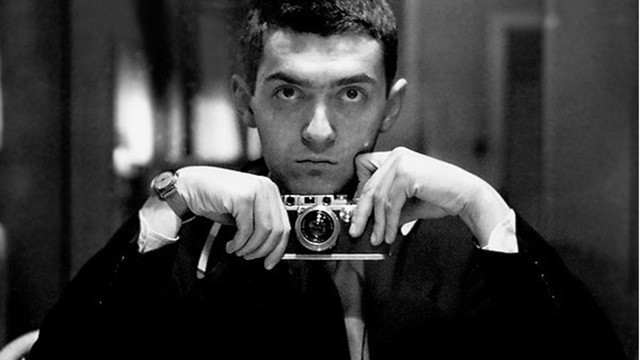
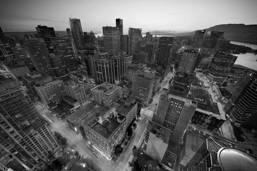
When he was 17 years old, Stanley Kubrick joined the staff of Look magazine as a photographer, and that would be his profession for the next few years; it arguably would be his profession for the rest of his career. I’m more comfortable ascribing aspects of Kubrick to his beginnings as a photographer than anything else, not because of specific images that would recur in his films (although you can find those if you want to) but because of the way he approached the world as a photographer, rather than a novelist or a dramatist. Calling up memories of Kubrick films, there are great performances, memorable dialogue (some good, some bad, but always memorable), but more than anything it’s the images I remember, held shots all: Jack Nicholson slipping into madness in The Shining, Kirk Douglas filled with mourning in Paths of Glory and with defiance in Spartacus; the first shot of the Star-Child in 2001, the last shot of Nicole Kidman (the last Kubrick shot ever) in Eyes Wide Shut.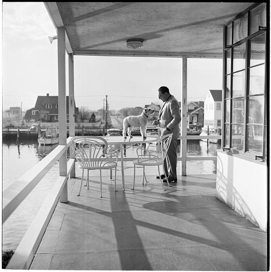
Looking at the photographs, you can see drama, even more than in other pictures of the period. Perhaps the most elemental aspect of drama is contrast, between hero and villain, between 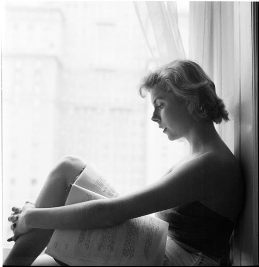 right and wrong, between good fortune and ill fortune, and part of what makes Kubrick’s photographs so compelling is the way he heightens contrasts. Contrast, of course, gets rendered so well in black-and-white; there’s nothing else but contrast there, no colors, just light against dark. (In the first half of his career, Kubrick would make only one movie in color, Spartacus, and his first movie of the second half–2001–would do so much with light against the blackness of space.) Kubrick would often play with light sources and rearrange them to increase the light/dark contrasts in the picture; another consistent technique of these pictures is a light source coming in from a specific but out-of-frame location, often underneath or to the side.
In some photographs, he would use an infrared camera to make the bright/dark contrast even greater–the whites are blown out and the darks look abyssal. 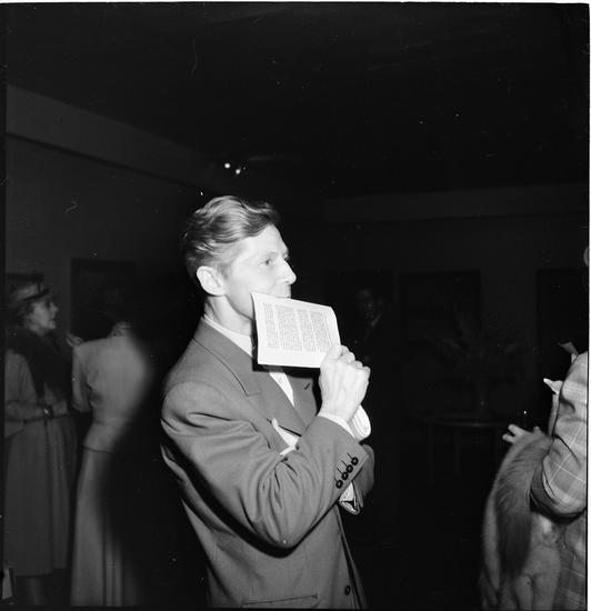 Kubrick was always into using the newest technologies, but something that was always there was that he used them for a purpose; it was never about being an early adopter, never about showing off the technology for its own sake, but about finding the aesthetic possibilities of the technology. (You have to wonder what a digital Kubrick film would have been like.)
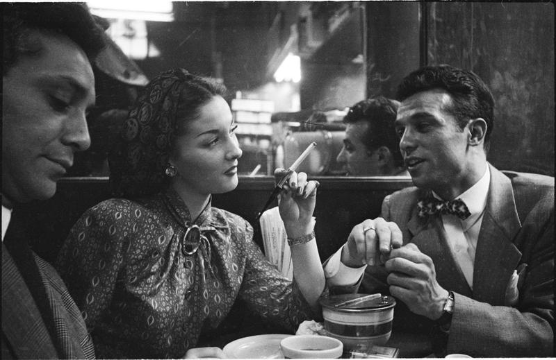 There’s so much opposition in a Kubrick picture. Faces gaze in different directions; images are broken by horizontal and vertical lines; elements occupy different regions of the frame with no bleeding between them, almost like comic-book paneling. Kubrick’s pictures aren’t kinetic, but tense. Shots of people in motion look like statues; shots of people at rest look like they want to start moving. He almost never gives a feeling of repose in the photographs, or like a captured instant, but like something is about to happen, one more aspect of the dramatic instinct, and one that would carry forward into the films. There have been few directors who did so well in the moments before action, creating that sense of forces just about to break loose. Kubrick’s instinct for tension serves the journalist side of his photography well; so many of his images feel like part of a larger story. They invite viewers to ask “what next?” Good photojournalism occupies a border zone between document and imagination; it shows us what is, and then invites us to imagine what could be.
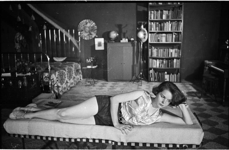
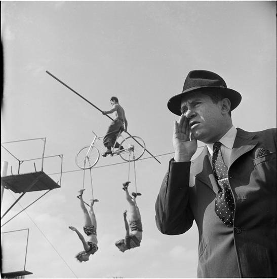
Kubrick wasn’t just a photographer, he was a photojournalist; his assignments and pictures were split pretty evenly between shots of celebrities and the kind of slice-of-everyday-life stories that Look, Life, and other magazines of the immediate postwar era did. It all added up to an officially sanctioned, populist version of America, one that existed within pretty strict moral parameters (no shots of strikes here, for example) but which does have its own aesthetics and appeal.
One part of that aesthetic is the evenness across subjects–it doesn’t matter if it’s a picture of Joan Crawford or some kid on the street, both of them get the same lighting and framing. Kubrick would always frame that way–a little bit distant, a little bit spacious around the subject; you can see this most clearly when editors have marked them for cropping, reducing the iconic space and turning the pictures into information. 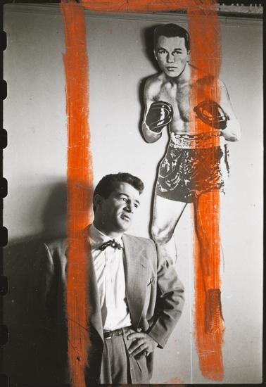 (To be fair, that’s a necessary part of magazine work.) The pictures are almost all medium shots; the few long shots tend to be uninteresting; I suspect it’s because Kubrick couldn’t arrange the lighting the way he could for closer shots. The backgrounds are usually quite spare; often they’re empty. It’s a style that was widespread at the time, and Kubrick heightens the iconic aspect of it (his use of vertical space here anticipates the “tallscreen” compositions of Killer’s Kiss), to the point where all of his pictures seem to be both living subjects and part of a collective memory, the subconscious of the postwar era.
If you see Kubrick as a photographer before everything else, it clarifies one of the myths about him, the myth of perfectionism, the idea that nothing in his movies could be an accident. That myth comes in part from his practice of putting his actors through twenty, thirty, forty takes; but as Joan Didion sez, “what might be seen as mysterious in one occupation can be standard operating procedure in another,” and for a photographer, taking many many many pictures of the same thing is just what you do–Kubrick took well over a thousand photos for the “Prizefighter of Greenwich Village” sequence alone. (That would later become Day of the Fight and the first fifteen minutes of Killer’s Kiss.) That’s not perfectionism, because that implies a pre-existing 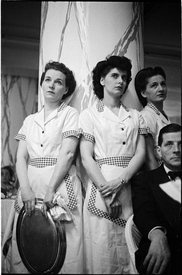 vision in his head. Photography works in part on the tension between what is found and what is made; taking many pictures is the process of discovery, seeing what minute changes in angle, lighting, and expression can do, turning what’s there in the world into a specific image. As far as I can tell, that was Kubrick’s process with actors–to keep doing takes until he found something he hadn’t seen before. Mike Leigh leads his actors through a process of finding story and character; Kubrick led his actors through a process of finding images. He was a far more improvisatory director than most people imagine.
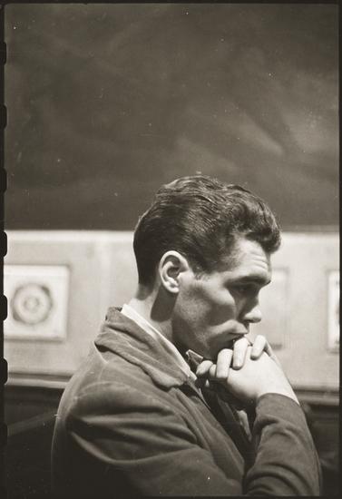 Beginning here, and all through Kubrick’s work, is the enduring, expressive power of the human face; there are so many shots that belong in the Kubrick portrait gallery. Walter Cartier, the fighter in his Look photostory and Day of the Fight, should be considered his first great camera subject; his face as Kubrick shoots him evokes a balance of delicacy and strength, and he always looks smart–there’s a definite resemblance to another postwar icon, J. D. Salinger. He found so many great faces here, and a photograph lets us just look at them and learn; perhaps what he was doing in his later career as a director was finding a way to let faces have the same impact in a movie as they do in a photograph. Kubrick’s films, especially the later ones, have the kind of pacing and framing that makes us look at faces and lets the face do the complex work of evoking our feelings, and our wonder.
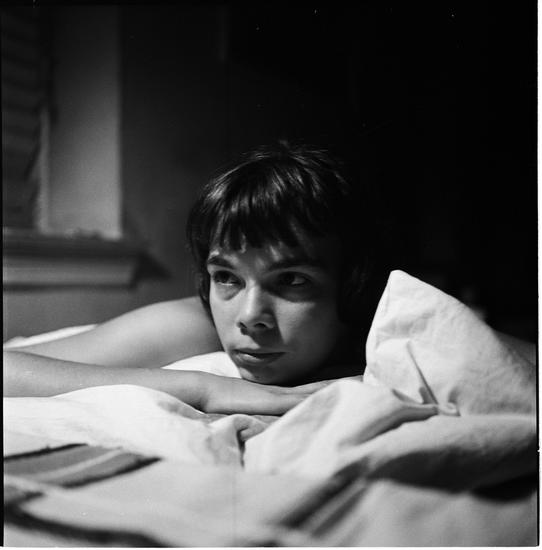
Looking at all these pictures, there’s another aspect that surprised me and shouldn’t have: they’re often very funny. Humor has always been part of the Kubrick worldview, and it’s a specific kind of humor. The best word for it would be “puckish,” almost literally so, in that there’s a little bit of “Lord, what fools these mortals be” in it. What’s different from that line, though, is that there isn’t a sense of distance. Puck finds mortals to be fools, and it’s clear he isn’t one, but I’ve never gotten that sense of judgment from Kubrick’s work; I’ve never felt superior to his characters, never felt invited to feel superior. 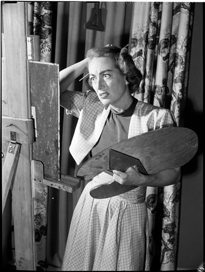 His films, and his photographs, are never grotesque, never alienating; he’s not like Diane Arbus. The photographs tip over into funny with just a little bit of exaggeration, and we feel that’s just part of our world, partly because of that leveling between the celebrity world and the world of everyday life. In Kubrick’s photographs, and his films, one part of being human is to be funny, and to not always realize it until we’re caught by a camera.
More than anything else, that’s what I see in these pictures and in his later films, all the way to Eyes Wide Shut. He discovered in these photographs the eternal, unyielding power of the human face; he both created and found the funny, the iconic, the geometric, and the dramatic. He could make something that had its own life out of what he saw through the camera lens, and he could make that endure across time and space. What these photographs show, and what his films would create, would be something that had its origins in the world of magazine photography but would become unique to him, a sense of reality not bounded by realism.
Except for the header image, all photographs are from the Museum of the City of New York’s collection, accessible here. Go check the collection out, there are many thousands of Kubrick pictures there and you can order high-quality prints.
Previously: Three documentaries
Next: The Killing (1956)

