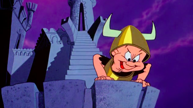
Art in general and animation in particular tend to showcase two opposite impulses. One is to record reality as faithfully as possible and make the art seemingly real. The other is to ignore reality altogether and create work that is plainly imaginary and imaginative. 1957’s best-remembered animation, “What’s Opera, Doc?” fits snugly into this discussion, and we can best see these qualities in comparison with one of its influences, Fantasia, and the rest of the animation being made at Warner Brothers’ biggest rival. That film attempts to make its fantasy seemingly real and takes the tradition of classical music deadly seriously, while the Looney Tune revels in the fact that it is clearly a drawing on paper and punctures the pretentiousness of more “artistic” work.
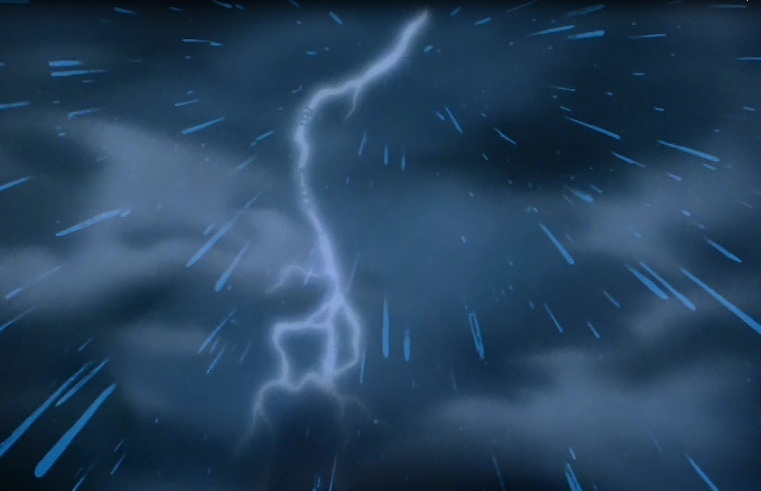
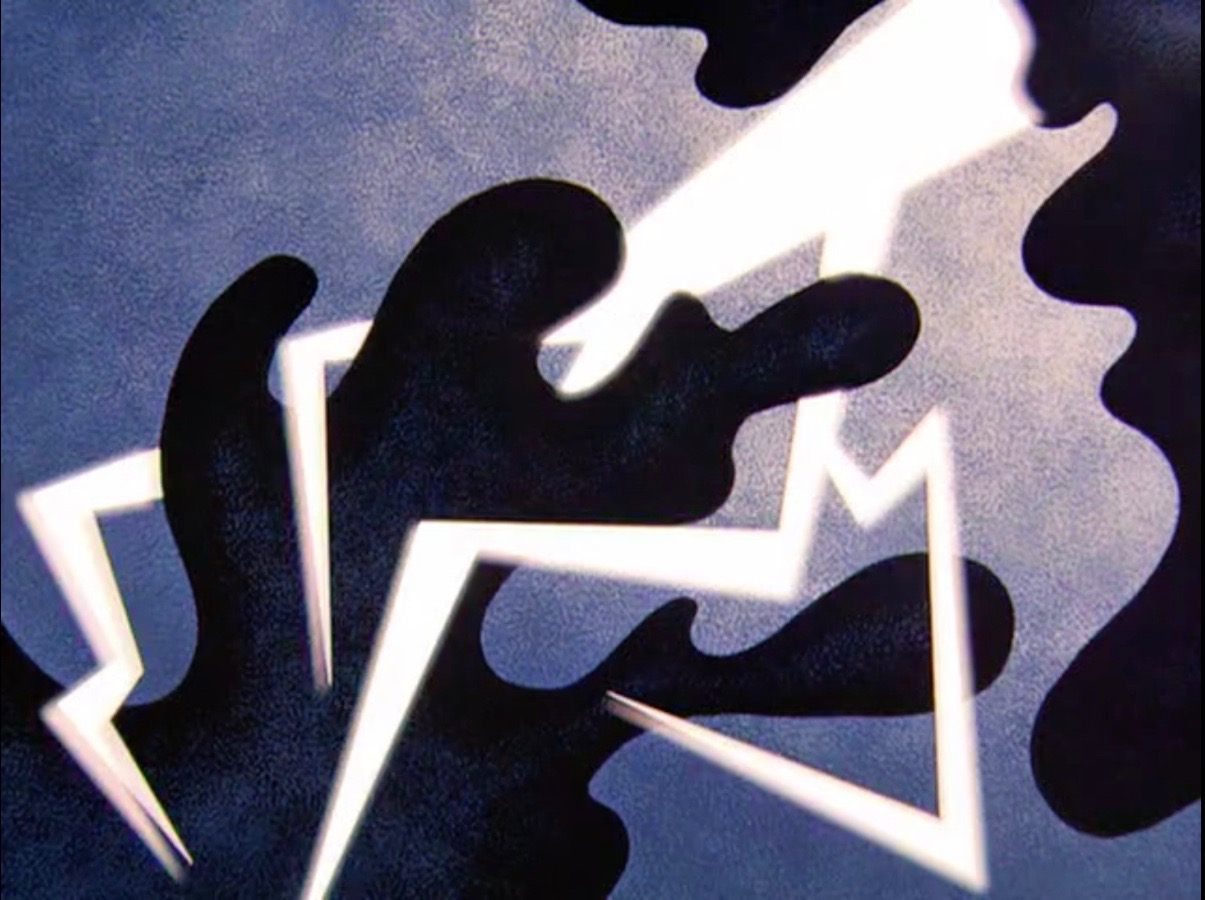
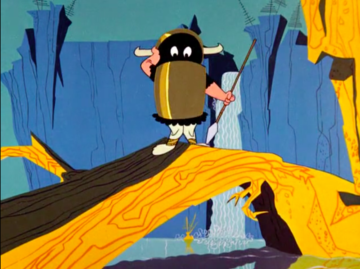
Both movies open in very similar ways, imitating a classical music concert with a program-style title card and the sound of a tuning orchestra. After that, though, all bets are off. While the lighting in Fantasia is transparent and glowing, director Chuck Jones’ lighting appears as harsh white beams separated by solid lines instead of gradients. Lightning appears in the opening just as it did in Fantasia’s “Sorcerer’s Apprentice.” But Looney Tunes lightning bears only an incidental resemblance to the real thing: instead, we get pure white zigzags against a wave-patterned sky. The clouds are even more abstracted: scalloped planes that move apart like the set on an old vaudeville stage. Even the mountain appears like a paper cutout. Like Disney, Warner Brothers takes its influence from fine art painting. But if Walt’s studio created moving Michelangelos, “What’s Opera Doc?” looks more like Matisse.
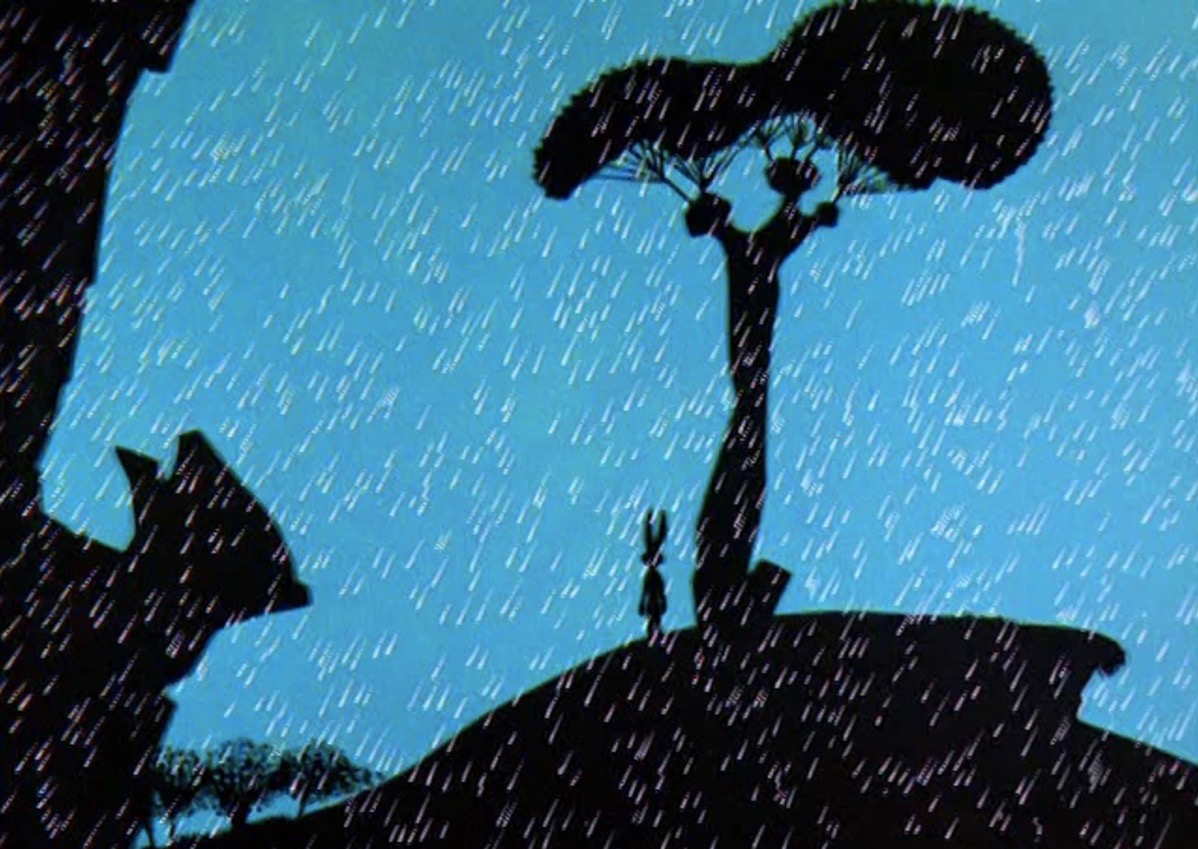
While Disney occasionally employed muted colors (see the prehistoric “Rite of Spring” section), Chuck Jones clearly has no use for them: in the first part of the cartoon, everything conforms to a simple, bright color scheme of blue and gold. Though the “set” design is plainly flat, it is not without its own wonky sense of perspective: the wallpaper-barked trees and three-pronged rocks taper to almost nothing when seen from above.

While “Fantasia” utilized stagy spotlights only in its stagier moments (such as the mushroom dance), the Bugs Bunny short uses them with wild abandon – Elmer’s solo, Bugs’s “death”, or even the middle of a storm.

Jones’ portrayal of shadow is also different. While Disney’s shadows were transparent and photographic, Elmer Fudd’s helmet casts an ink-black shadow, broken by inexplicably glowing eyes. Though some of these differences can be explained by budget, there was a lot of artistic decision involved as well. If Disney’s animators would animate every drop in a waterfall, the Bugs Bunny crew are content to paint a pattern of waves.
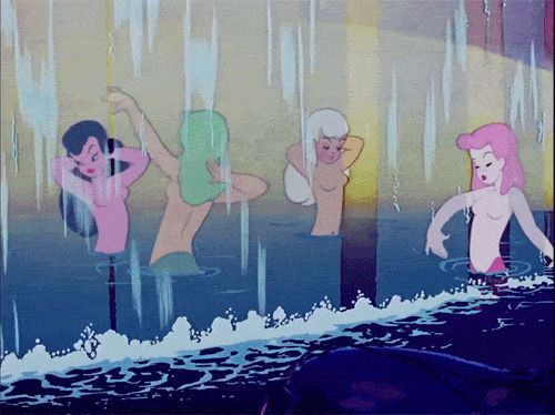
When Elmer finally lets loose his rage, the entire foreground turns red, contrasting against a cool blue background, giving the film more emotional punch than a more realistic approach could.

In terms of reverence for source material, and life in general, the two could hardly be more different. Fantasia unironically creates fear in its audience for the devil on the mountain. Jones pays tribute to that image, with the Viking warrior’s imposing shadow on the cliff face – until the camera pans down and reveals that it is just Elmer, wearing, for all intents and purposes, a tin can.

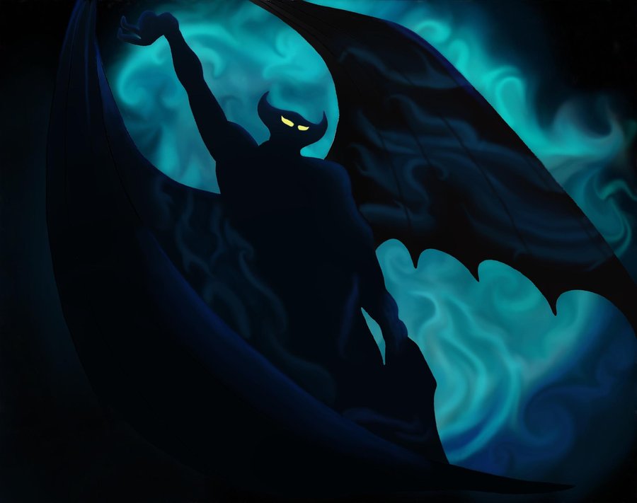
The Sorcerer’s Apprentice engendered awe for a small man magically controlling the elements. Elmer Fudd performs roughly the same actions – but his sweeping gestures are reduced to a ridiculous dance.
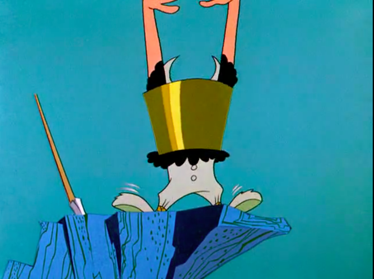
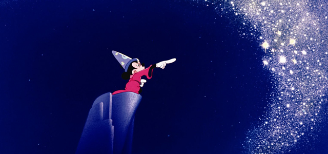
“Fantasia” was in many ways a flattering tribute to the highbrow virtues of classical music. Jones obviously has a healthy respect for the classics too, but that hardly keeps him from making fun. Hearing “Ride of the Valkyries” as a melody for the refrain of “Kill da wabbit!” might not inspire kids to watch the New York Philharmonic, but it does get a loud laugh, and a healthy distrust of social norms. Wagner gets thoroughly lampooned when Bugs shows up dressed as Brunhilde on her white charger – which in the Looney Tunes world, weighs upwards of a thousand pounds.

If Disney gave us the images that artists saw while listening to music, Warner Brothers goes one better: every movement is obsessive-compulsively matched to the fall and rise of the notes. At one point, the Wagnerian music is dropped completely, as Bugs’s falling helmet is accompanied by a toy-piano “plink plink plink” – a travesty Leopold Stokowski would never allow. Bugs Bunny and his creators refused to take themselves seriously – or anyone else either. It might not be “high art”, but it’s no less powerful in moving us in another direction: towards laughter. And stranger still, once they have established that tone, they turn it another direction entirely. Bugs faking his death, a joke told so often it’s no longer good for a laugh, is suddenly good for tears. Though Warner Brothers’ cartoony style may seem less serious than Disney’s, its control over the audience’s emotions is every bit as powerful.


