Earlier this year, The Narrator wrote a piece about the course of Emmanuel Lubezki’s career. He figured it would be a one-off, but he has decided to do something similar for other noteworthy cinematographers.
The world of cinema lost a true titan in 2012 with the death of Harris Savides from brain cancer at the tragically young age of 55. But while his filmography is abbreviated, that doesn’t mean that it’s not a complete body of work, in style and consistency. Each film on its own looks good-to-great, but when viewed together, they cumulatively paint a picture of a true master behind the camera.
Phase I (1990-1999)
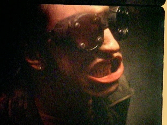
Generally, when an accomplished cinematographer shoots music videos, the tendency is to look at them at sidenotes to their career, not part of it. But that’s nigh-impossible with Savides, as some of his most accomplished and iconic work came from shooting music videos in the 90s (and a few in the 2000s). While he worked with numerous music video directors during this period (such as Jake Scott, on the “Everybody Hurts” video, and Michel Gondry, on the “Like a Rolling Stone” video), the most fruitful collaborations came with his videos for Mark Romanek. Each video reveals an ability to shoot in just about any fashion and make the result beautiful in a completely different way each time. The hand-cranked, deteriorated images of the Nine Inch Nails “Closer” video couldn’t be further from the sleek, high-contrast black-and-white imagery of the Michael and Janet Jackson “Scream” video, or the unnervingly precise camera movements of the Fiona Apple “Criminal” video, or the gorgeously-realized surrealist imagery of the Madonna “Bedtime Story” video. He could do anything to fit any artist, and it was no surprise when he made the leap to feature films (not counting his work on the Zalman King classic Lake Consequence). But alas, his feature debut was the mediocre down-by-the-bayou thriller Heaven’s Prisoners. A tale about a recovering alcoholic ex-detective (Alec Baldwin), women of various levels of trustworthiness, and Eric Roberts being a sleaze, it’s not memorable stuff, and while Savides certainly doesn’t do a bad job (it looks quite good, especially an incredibly dark and contrasty home invasion and murder near the middle of the film), the photography is fairly standard stuff, the same kind of shadowy imagery that was standard-issue for noir-esque movies in the 80s and 90s. Much more noteworthy from the same year was him shooting the opening credits of David Fincher’s Se7en (he also makes a cameo in it as a 911 operator). It would be Fincher who would really stimulate Savides’ creative energy with his next film.
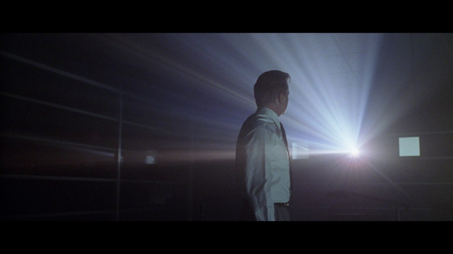
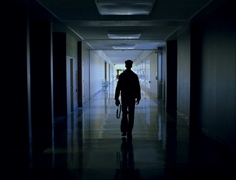
Savides’ first great-looking film would be Fincher’s The Game, a thriller that, unlike Heaven’s Prisoners, is actually, you know, thrilling. In addition to looking great, The Game establishes what would be a big part of Savides’ career to come; imitating the old greats. In this case, Savides draws inspiration primarily from Gordon Willis, particularly his collaborations with Alan J. Pakula (incidentally, Pakula and Willis collaborated one last time the year this film came out, with the tired The Devil’s Own). Willis was (and still is) best-known for the extreme darkness of him images, and Savides follows suit here, covering Michael Douglas’s world in shadows as he tries to figure out the nature of the “game” a corporation intends for him to play. Savides gives the film a rich, almost silvery look that couples beautifully with Fincher’s eye for compositions. Savides’ work proved difficult to replicate on home video without disaster (although Universal/Polygram didn’t even try in that regard), but thankfully, Criterion has since provided a release which best showcases the film’s stunning visuals. But the same cannot be said for Savides’ next film, John Turturro’s Illuminata, which is currently stuck on a mediocre, out-of-print DVD, which is all it will get unless some higher-up at Lionsgate has an inexplicable hard-on for it. The film is no great shakes, never really working as a backstage farce, but Savides’ work is unobtrusively lovely, drenched in muted colors with vivid splashes of red (and one beautiful golden-tinged sequence, where we see the rehearsal of a scene from the play-within-the-film). But his best work was still very much yet to come.
Phase II (2000-2009)
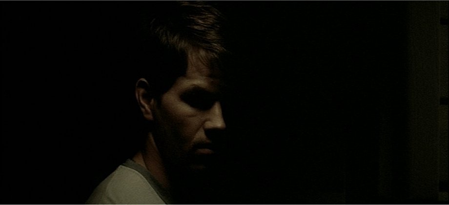
Savides and director Gus Van Sant had previously worked together on commercials and, of all things, a Hanson video, but their first feature-length collaboration was Finding Forrester, now regarded as the ultimate sell-out move by Van Sant, leading to his bottoming out and later artistic reawakening. But it’s better than that, and while it certainly falls victim to predictable story beats and over-the-top characters (see: F. Murray Abraham as Professor Snooty Q. Strawman), it’s mostly a nice, naturalistic, unassuming hangout movie. It doesn’t feel like a studio sell-out, and it doesn’t look like a studio movie either, despite Savides using the 2.35:1 ratio. Savides’ photography rarely calls attention to itself, working with muted colors against cloudy skies in dimly-lit interiors. The living space of the film’s Salinger stand-in, William Forrester (Sean Connery), in particular, have a dirty, mildewy look and color scheme which suggest that no light has entered it in a long time. It’s a less worked-over kind of beauty, while his second film released in 2000 (although it was filmed two years before), James Gray’s The Yards, is an obviously worked-over kind of beauty. Again, the obvious influence here is Gordon Willis, specifically the lighting of the first two Godfathers (just look at how Mark Wahlberg’s eyes are obscured in the above shot, that’s the Marlon Brando-in-Godfather lighting if I’ve ever seen it). But beyond that, Gray (who did extensive storyboards for Savides to look at and try to replicate) and Savides set out to create a painterly look, one of limited, yet warm colors and the darkness coinciding with them (they called this “the voluptuousness of death”). Of course, darkness in a painting is much lighter and less perfect than the darkness that 35mm captures, so Savides and Gray milked the blacks of their deepness and made them more fluid than one normally sees in a Hollywood film. This is a trick Savides would return to later. The result here is a film that looks absolutely gorgeous, making even the dirtiest working-class environments beautiful in their own way (just look at the candlelight-lit party for Wahlberg when he comes home). But it would be Forrester (or, more specifically, the partnership that began with Forrester) that determined Savides’ next stylistic direction.
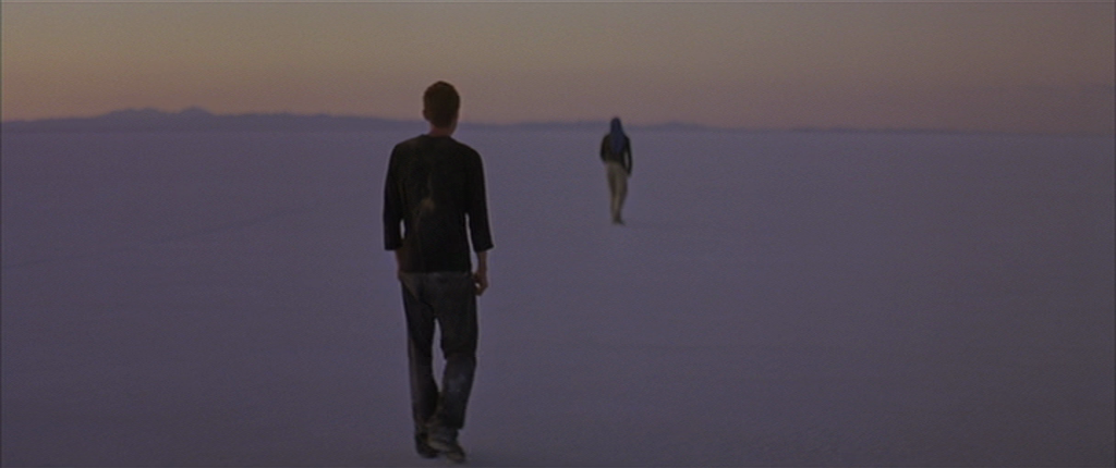
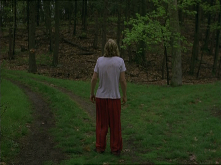
As it turns out, despite being Van Sant’s then-low point (although his post-Milk work is making it look like My Own Private Idaho in comparison), Forrester was useful in bringing Savides and Van Sant together for feature films, as Savides would be a crucial collaborator f0r Van Sant’s next three films, all of which comprise the Death Trilogy; Gerry, Elephant, and Last Days. The films are connected, plot-wise, by being inspired by actual deaths, but the strongest connective tissue is in their looks. Each film is told almost entirely in tracking shots, the camera following the lead character(s) throughout the film, bringing cinema back to its original definition; the recording of movement on film. There’s very little stage lighting used for any of the films, and yet they all look jaw-droppingly gorgeous and feature some incredibly memorable images; an endless walk across a salt flat set against the rising sun, the camera still continuing forward even after the person it’s been following is shot and killed, a mind-numbingly dull chat with a spokesperson for the telephone book seen in one unblinking shot. There’s little of the fussed-over beauty Savides used in his early films (perhaps carried over from his job making pop stars look as glamorous as possible), and this approach is the one that Savides would primarily focus on for the remainder of his career.
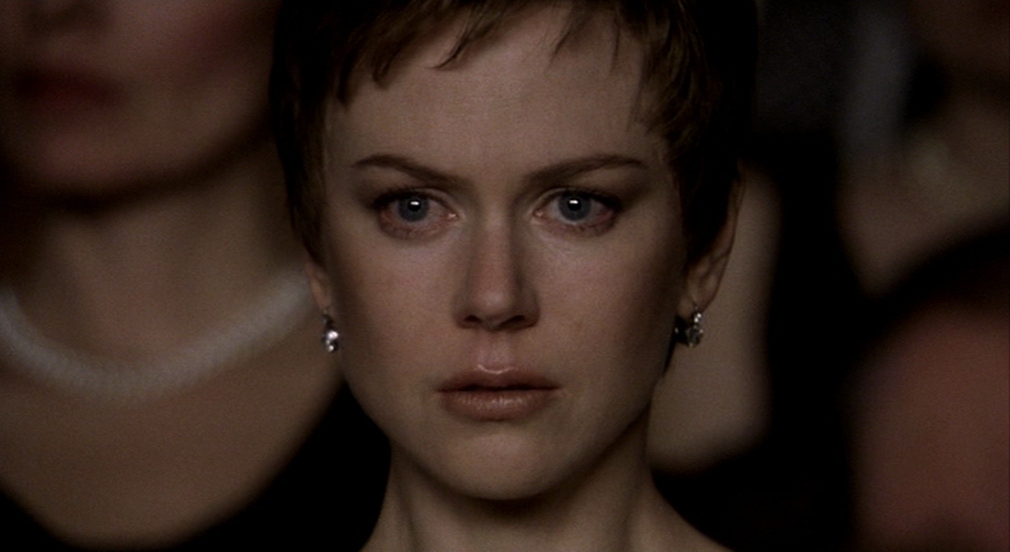
I say “primarily” because naturalistic is hardly the word to describe Savides’ breathtaking work on Jonathan Glazer’s Birth. Once again, Savides showcases influences from the past here, but aside from taking some cues from Stanley Kubrick (who Jonathan Glazer stole many images from back in his music video days), they go further back than the 70s, with the strongest discernable influence being Carl Th. Dreyer, specifically his close-ups on and Rudolph Mate’s lighting of Renee Falconetti’s face in The Passion of Joan of Arc. So many shots here focus entirely on Nicole Kidman’s face to tell the story (namely the standout sequence at the opera, seen above), and Savides carefully lights it so that every nuance and change of expression can be seen in crystal-clear detail. Elsewhere in the film, Savides continues the experimentation with milky blacks that he started in The Yards, which, along with Savides’ typically beautiful lighting, gives each image a fragility, as if the film itself could come apart at any minute, which fits the film’s story of a woman unraveling and ultimately being shattered. And Savides indulges in a tracking shot as good as any of the ones in the Death Trilogy, one which follows Kidman’s husband as he goes for a jog through Central Park and dies underneath a bridge.
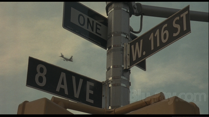
After taking 2006 off, Savides shot three(!) films that were released in 2007, each one taking inspiration from a specific 70s cinematographer, and each one looking gorgeous. Starting at the bottom of the heap, there’s Ridley Scott’s American Gangster. The movie itself is not nearly as compelling as it ought to be, wasting a great lead performance by Denzel Washington as 70s drug dealer Frank Lucas and spending far too much time (i.e. any at all) on the divorce of Russell Crowe’s cop character and his wife. But Savides doesn’t phone it in even if most of everyone else involved was. His primary influence here is Conrad Hall, the great cinematographer of the 60s and 70s who pioneered the art of letting “mistakes” like lens flare and under- and overexposure stay in the finished film, giving the end result a texture missing from a more “perfect” image. Savides follows his example here, going entirely handheld (although, because he’s working on a studio movie with big names directed by Ridley Scott, it’s still pretty slick handheld) and giving each image the feeling that it’s been “captured” in all its imprecise glory, with the sun getting into the frame, the low-key lighting, and the overexposed backgrounds. You wish the rest of the crew would have followed Savides’ example and made a film in debt to 70s movies in that it’s actually, you know, good, but you can’t have it all.
Much more successful as a film (you heard me right) and more audacious visually would be Savides’ third 2007 project, Noah Baumbach’s Margot at the Wedding. Savides also goes handheld on this film, also allowing for mistakes like lens flare and underlighting to pop up. But he’s not inspired by 70s American cinema here, he’s inspired by the work of French cinematographer Nestor Almendros, a man whose use of natural light on the films of Eric Rohmer, Francois Truffaut, and Terrence Malick remains a marvel to this day. Since Almendros wasn’t beholden to the studio system, his experimentation was even more extreme than that of Hall, and Savides follows his path by creating images that feel completely unplanned. Night scenes are incredibly murky, day scenes are frequently blown-out, and actors’ faces (even the big names) often get hard to see. It looks beautiful in a way that an oppressively sunny day looks beautiful, and it perfectly fits Baumbach’s intentions to create a 70s-esque study of very hard-to-like people doing awful things to each other.
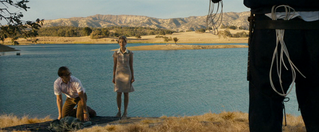
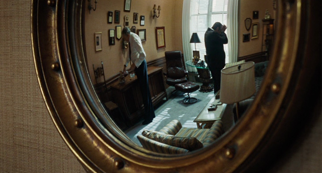
The most accomplished of the three films narratively would have to be David Fincher’s Zodiac, but it’s also the outlier of the three films stylistically. Like the other two, its look is influenced by a great 70s cinematographer, in this case Gordon Willis again, especially the look of All the President’s Men, where the action also primarily takes place in the offices of a newspaper (Savides and Fincher’s vision of the San Francisco Chronicle‘s office is a place full of rich golds, yellows, and browns, a lively, comfortable place far removed from the horror occurring in San Francisco at the time), but that’s where the similarities end. Whereas Gangster and Margot both revel in mistakes, Zodiac is a tightly-controlled beast, as one would expect from a David Fincher film (Fincher would sooner drop dead than he would shoot a movie handheld in natural light). But the big difference comes in Zodiac‘s use of digital to recreate a past look as opposed to the celluloid cinematography of the other two. Here, Savides creates images that feel like they could have been in a past movie, but which also go beyond the abilities of past cameras and film stock to capture. Like the unnervingly precise helicopter shot of the doomed taxi, or the perfect darkness of the (mostly digitally-created) crime scene at Washington and Cherry, or the extreme sharpness of the interrogation of Arthur Leigh Allen, or the stunningly precise color and depth-of-field of Lake Berryessa, a postcard-perfect piece of scenery that just happens to be the sight of a grisly murder. It remains one of the best-looking films in Savides’ career, and a perfect example of all of his stylistic concerns.
Where to go after Zodiac? The answer was back to celluloid and back to Gus Van Sant, to shoot Milk. While the film could scream “Oscar bait!” in the wrong hands, Savides avoids the pristine look of so many prestige pictures, choosing to give the film a fuzzier, more imperfect look without calling attention to it (some of the reasoning for the stronger textures was so that the newly-shot footage could fit better with the liberally-inserted archival footage). Savides used older lenses and as grainy a film stock as possible to, once again, milk the blacks to avoid the ultra-deep blacks of modern film stock and make the film appear to be of the time period that it covers. Savides also lit very simply (the scene near the end of the candlelight vigil for Harvey Milk was not even completely lit), and made sure to favor soft, natural-seeming light, for maximum unobtrusiveness. The result is a film that looks gorgeous because it doesn’t try to look gorgeous, a triumph of simplicity serving the story rather than serving itself (Savides and Van Sant dropped the original idea for the film to be shot documentary-style because they felt the style was serving itself).
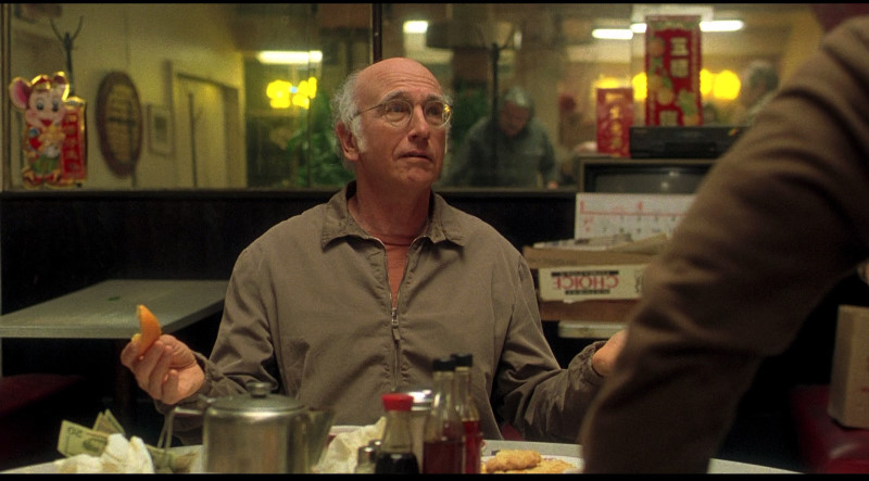
Not that simplicity is always the best thing in the world. On paper, Woody Allen, who has worked with Gordon Willis and some of the finest cinematographers to ever grace us, and Savides pairing up sounds like a match made in heaven. Unfortunately, as one of the good lines from Curse of the Jade Scorpion goes, it’s more of a match made in heaven by a retarded angel, because their first and only collaboration was Whatever Works. As huge of an Allen fan as I am, Whatever Works just doesn’t really, you know, work, for the most part. The first act is pretty good, aided by Larry David and Evan Rachel Wood playing off each other nicely, but by the time Wood’s hick parents show up to be converted into sophisticated New Yorkers, things take a turn for the grating. But that wouldn’t matter so much if Savides really knocked this one out of the park, but sadly, he did not. The film continues his quest to make the least modern-looking film possible, but the results here don’t really showcase much of the talent he displayed doing the same trick on other films. It’s simply-lit, but the lighting is mostly just unremarkable as opposed to beautiful in its simplicity, and there are few of his trademarks here (namely his love of blown-out whites), aside from one tracking shot that follows David as he gets up to open the door to his apartment. It’s a disappointing ending to an otherwise fantastic decade for Savides, and while he sadly wouldn’t be able to top it in the next decade, due to the next decade being unfairly truncated, the results show that he was at least giving it a try.
Phase III (2010-2013)
Savides started off the 2010s by, what else, recreating two kinds of 70s look for two very different directors.
After their last, European-influenced project, Savides and Noah Baumbach turned to the films of Vilmos Zsigmond for inspiration for their next collaboration, Greenberg. Specifically, they looked at Zsigmond’s films that he made with Robert Altman to lay the groundwork for the look of this film. In those films, and in many others, Zsigmond utilized a roving camera, zooming in and out of the action as he pleased, and Savides honors his intentions here, zooming in to get closer to the characters and, in particular, to see if the camera can crack open the title character’s shell (it can’t, really). In addition, Savides does something similar to Zsigmond’s most favorite of processes, flashing, which adds extra exposure to the film before it’s processed, bringing out the whites in the negative and extra details from the black areas. It’s almost never entirely dark in the film, and exteriors are always brightly hazy and sunny, the perfect conditions and lively camera seemingly mocking the introverted Greenberg for not enjoying his surroundings more. While Greenberg‘s images were notable in their movement, Savides’ camera in his next project, Sofia Coppola’s Somewhere, is noteworthy for its inactivity. The film’s look was inspired primarily by Chantal Akerman’s Jeanne Dielman, 23, quai du Commerce, 1080 Bruxelles, where the camera remains locked and focused on its title character as she performs chores and turns tricks for the entirety of the film’s 200-minute running time. And here, Savides and Coppola devoted the same focus on the activities of movie star Johnny Marco (Stephen Dorff), which include lying around and falling asleep until his daughter (Elle Fanning) shows up. Savides used the camera to capture the mind-numbing boredom and discomfort of his situation (he’s stuck at the Chateau Marmont, recovering after injuring his hand) by switching up the movement of the camera for different scenes, keeping it locked-down in the sequences featuring the most sterile, unsexy pole-dancing routines in human history, creeping in on Johnny as he sits in a makeup chair unsure if anyone is going to come back for him, and quietly tracking his daughter’s ice-skating routine, showing more life in that moment than Johnny. As was his modus operandi, Savides utilized an unassuming visual style that looks good without having it scream “THIS LOOKS GOOD!!!!!!”. No, his next film would be the one screaming that (and there’s nothing wrong with that either).
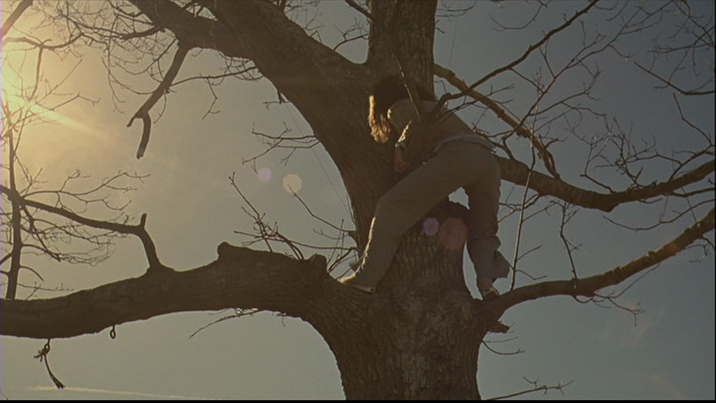
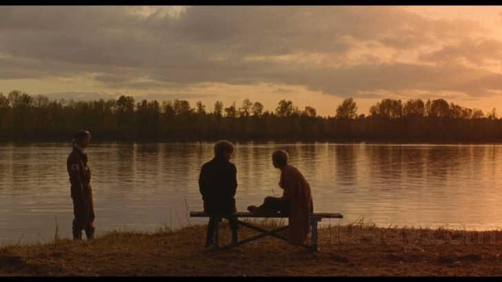
The last collaboration between Savides and Gus Van Sant, and by far the worst (narratively speaking), Restless is a god-awful pile of wank that’s only enlivened by some of Savides’ best cinematography ever. While the film is more obviously “beautiful” than most of his other recent work, it still shares many of his hallmarks, mainly the images’ light-sensitivity, giving them an airy, soft feeling that sets them apart from the crispness that’s common in many modern films. The film’s softness, in turn, aids the romantic nature of the film, or at least it would, if the central romance wasn’t between a mumbly twerp who can’t act and a Free Spirit who’s dying of Ali McGraw Disease. The film takes place in the Pacific Northwest, and Savides casts the already-beautiful surroundings in a rich autumnal glow, which makes them sing like they do in no other film. This would be Savides’ last film shot on 35mm, and it’s a beautiful (unintentional) farewell to that format. It would have been better if the movie wasn’t like a feature-length version of the worst Morrissey song ever written (full credit where it’s due, I stole that from Mark Kermode), but what can ya do, I guess.
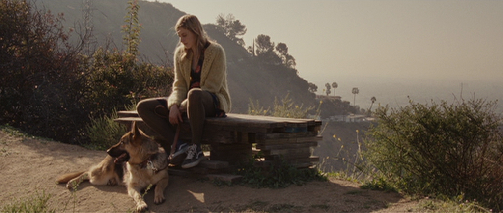
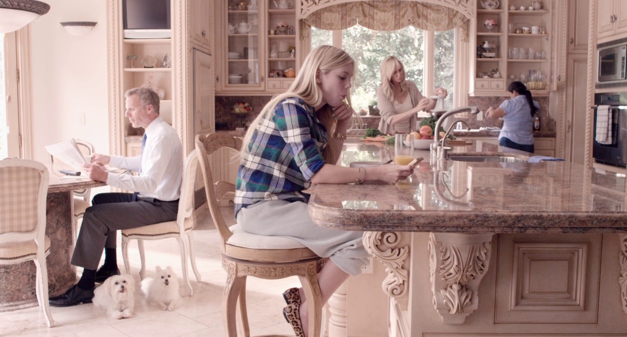
Sofia Coppola’s The Bling Ring would be Savides’ final film before brain cancer took his life (it was finished by Christopher Blauvelt, who had worked with Savides in the past as a 1st assistant camera and camera operator before becoming an accomplished cinematographer in his own right), and even if many bemoan that it wasn’t a quality end to Savides’ career (I think it’s quite underrated, and I would have done it for Lovefest III if that, you know, had a chance to happen), just looking at it stylistically, it’s a very fitting end. Savides’ love of whites is present throughout, bathing each and every daylight exterior in West Hollywood sunshine, with the interiors even brighter, with the sunshine reflecting nicely off the eggshell- and beige-colored walls (just look at the above shot). But the brightness doesn’t overwhelm, and it serves a purpose, that purpose being to cover everything in an ethereal, dreamy haze, which effectively puts the audience in the heads of the main group of teens, who must have thought of their robberies of celebrities’ houses less as petty theft and more as living in a dream for a half-hour before bringing home as much of that dream as possible. And other than that, Savides got the opportunity to craft one last great long take, a slow zoom-in on the break-in at Audrina Patridge’s house, where the two main characters silently move through each room like figurines exploring a dollhouse, all against the perfect digital replication of the L.A. skyline. It was reportedly Savides’ favorite shot from the film, and it’s one of the best shots he’s ever captured. However you may judge Bling Ring as a swan song to an extraordinary career, it never looks anything less than gorgeous. In that regard, it’s a thoroughly fitting farewell.
Phase I/II: Miscellaneous years
While Bling Ring was the final film he shot, the same year, he served as a “visual consultant” on Noah Baumbach’s Frances Ha, which amounted to shooting test footage for the camera eventually used to shoot the film.
Savides also struck up a small partnership with Martin Scorsese. First, Savides served as the DoP on Scorsese’s ingenious Freixenet ad, The Key to Reserva, where Scorsese riffs on his role as a film preservationist, preserving a (nonexistent) Hitchcock script that was never filmed by filming the only pages that exist from it himself. Savides does a pitch-perfect Hitchcock imitation in the short, and it’s no wonder Scorsese used him again, albeit just as a camera operator on his George Harrison documentary Living in the Material World.
In addition to working on music videos, Savides built up a prolific career shooting commercials. Since ads don’t generally include credits, you likely have no idea what commercials Savides has shot, but chances are you’ve seen a few of them. Sometimes, he followed directors he had worked with on feature films to the realm of commercials, or vice versa. In between Somewhere and Bling Ring, Savides shot an ad for H&M directed by Sofia Coppola, predictably set to Bryan Ferry. And before they started working on features together, Savides shot a Coppola-directed ad for Dior.
He also frequently shot ads directed by his old music video buddy, Mark Romanek, for the likes of Delta, Calvin Klein, and Apple.
And, to test the Thomson Viper camera that he would go onto shoot Zodiac with, he and David Fincher worked on a Motorola commercial.
But Savides also worked on commercials made by directors who he would not go onto work with on feature films, and the line-up of those directors is truly stunning. You’ve got Wes Anderson going frantically handheld for the first and last time in a pair of amusing IKEA ads, Spike Jonze reveling in destruction and mayhem in a Gap ad, John Hillcoat aping Malick in a Levi’s ad, Wong Kar-wai being all contemplative and shit in his part of a series of longform BMW ads starring Clive Owen, Alejandro González Iñárritu being shockingly unpretentious and unfraudulent in a Stetson ad starring Matthew McConaughey, Alfonso Cuarón (given his and Savides’ love for long takes, they’re a natural pairing) telling the story of a fish finding its way to freedom in a PBS ad, and some asshole deciding that the image of a chocolate man with a frozen face was a good thing to inflict on the world in an ad for Axe.

