Are movie posters becoming a lost art?
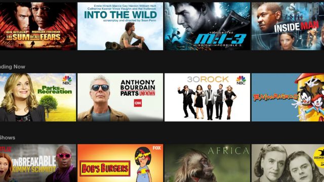
There are so many ways to bombard prospective viewers before they even step into the theater that it’s no wonder that Hollywood chooses to throw all of them at the wall to see what will stick. They have tent-pole movies, but they don’t have tent-pole marketing. Every film has its multiple trailers, its posters, its bus ads, its website, its Twitter hashtag, and so on. And as movies pop up on Netflix–or even originate there–the icons associated with the film get even more diffuse as Netflix’s algorithms shuffle various stills and character promos around to see what you, yes, you, will find most intriguing. And then changes it so that you will never find it again.
Digitization and distribution changes have made a lot of popular marketing art less iconic and often less distinctive. In order to judge a book by its cover, you have to make sure that that cover will remain vivid, its title and author legible, in thumbnail format and grayscale. Movie posters become DVD/Blu-ray covers (and formerly VHS covers) and then thumbnails themselves.
I recently came across some delightful (and highly recommended) articles on old Dell paperback mystery design, the “mapback” and the “puzzle piece” design, and they have me both mourning the loss of traditionally illustrated covers and thinking about how we this with movies, too.
If I saw “the Jaws poster” or “The Thing poster” or “The Graduate poster” or “The Exorcist poster,” chances are all of you can call to mind exactly what I’m talking. And there are, to be fair, recent posters that have the same effect–hello, Moonlight–but I feel like they’re fewer and fewer.
What do you look for in a movie poster? In a thumbnail image on Netflix? What intrigues you? What are some of your favorite posters, and do they have anything in common visually, or is there something remarkable how they particularly distill their subject’s essence?
(And if you want to reminisce about some classics, this Empire piece is a good place to start.)

