This Week, You Will Fight About:
- bad channels
- good doctors
- a recent indie
- a classic flop
- culture at large.
Thanks to scb0212, Drunk Napoleon, and Miller for contributing this week. Send articles throughout the next week to ploughmanplods [at] gmail, post articles from the past week below for discussion and Have a Happy Friday!
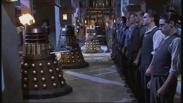
At Gatecrashers, Sammi Aren Leto, writing as Rhiannon Olivaw, writes about the design of the Daleks of Doctor Who and how it’s evolved over the decades, informed by both function and story:
Obligatory trivia first: the Daleks were a hair’s breadth away from being designed by a BBC man with whom most of us are familiar, one Ridley Scott (yes, that Ridley Scott), but scheduling conflicts led to them being developed by Raymond Cusick. Nation wished to avoid the archetypal ‘man-in-a-suit’ design and thus described them sparingly in his script, although he specified they would not have legs. Rumours and myths abound about what inspired Cusick’s design work – prima ballerinas, men in chairs, the ever-popular pepperpot – but the ultimate result was a squat array of angles and curves, of sharp faces and smooth bumps. A single bug eye poking out of a big dome, almost certainly intended to invoke WWII-era military helmets… A Dalek.
At Screen Slate, Justin Laliberty describes Bad Channels’ attack on good taste:
The tagline for Bad Channels really says it all: “Killer Music, Alien Airwaves.” As in TerrorVision before it, Nicolaou’s assault on free airspace is decidedly political, but he isn’t interested in making a hamfisted statement film. Rather, Bad Channels sees fit to load up its meager 88-minute runtime with as many musical performances, rubber creatures, and scantily clad people as possible, resulting in a film that feels as much a peer to TerrorVision as it does the cartoon equivalent of something like Pump Up the Volume (1990).
Jean-Pierre Jeunet looks back on his underappreciated classic Alien: Resurrection at The Independent, and pulls out the knives for his producers and writer:
“I know Joss Whedon said some bad things about me,” says Jeunet. “I don’t care. I know if Joss Whedon had made the film himself, it probably would have been a big success. He’s very good at making films for American geeks – something for morons. Because he’s very good at making Marvel films. I hate this kind of movie. It’s so silly, so stupid.” About the changes he made to Whedon’s script, Jeunet jokes: “Too bad, Joss Whedon!”
And Michael Koresky at Reverse Shot weighs in for the film tearing The Solute apart, We’re All Going To The World’s Fair:
Perhaps the recent film that feels most productively and excitingly “not really horror” while existing squarely in the world of horror is Jane Schoenbrun’s nocturnal We’re All Going to the World’s Fair. Too singular an emotional and aesthetic immersion to function as a true indication of where the genre might go, Schoenbrun’s film works with its own exceptional internal logic, using the trappings of horror to productively upend expectations while also imbuing viewers with the feeling that the genre intends to create. We’re All Going to the World’s Fair may not be a horror movie as we’ve come to understand it, yet it’s undeniably a movie about the experience of horror—as aspiration, as escape, as void.
Derek Thompson writes at The Atlantic about the “Moneyballing” of sports and culture that has been mathematically perfected at the expense of art and entertainment:
The Nobel laureate particle physicist Frank Wilczek once said that beauty exists as a dance between opposite forces. First, he said, beauty benefits from symmetry, which he defined as “change without change.” If you rotate a circle, it remains a circle, just as reversing the sides of an equation still reveals a truth (2+2=4, and 4=2+2). But beauty also draws from what Wilczek calls “exuberance,” or emergent complexity. Looking up at the interior of a mosque or a cathedral, or gazing at a classic Picasso or Pollock painting, you are seeing neither utter chaos nor a simple symmetry, but rather a kind of synthesis; an artistic dizziness bounded within a sense of order, which gives the whole work an appealing comprehensibility.
And Elan Kiderman Ullendorff talks to Annie Rauwerda, curator of Depths of Wikipedia and explorer of the the web’s most obscure troves of content:
Everything is better when you know more about it. I didn’t like hockey for a long time, but then it became interesting to me once I knew about the players and the history of the sport. I was studying neuroscience and I would wonder how I was possibly going to memorize these random proteins and enzymes. But if you dive in more than you have to, then that contextualizes and adds color in a way that helps you understand it at a different level. And the same is true with the internet. If you’re scrolling through social media, you’re probably gleaning a bunch of fun and interesting surface-level content. But when you’re digging through these murky back waters, researching backstories, looking at old newspaper archives, or just visiting odd, old archived web pages that haven’t been viewed by very many eyes, that’s really fun. It feels like treasure hunting: the internet is just so unfathomably large, and there are so many corners of it that haven’t really been explored in a long time. And to me, that’s very exciting.

