At the beginning of July, I covered the half-year in cinematography. Now that the year is through, I can finish the look at some of the year’s best-looking films. For the sake of fairness, the films I covered in that first article won’t be mentioned here, no matter how badly I want to (see: Magic Mike XXL and Mad Max).
The “It’s My List, I Can Do What I Want” Award: The Knick, Peter Andrews
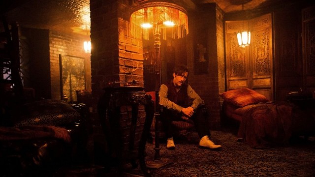
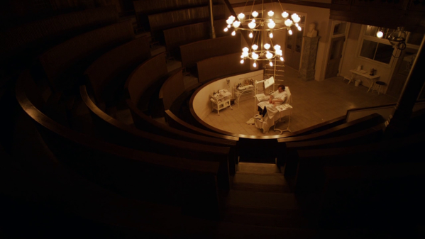
C’mon, just because I covered Magic Mike last time doesn’t mean Soderbergh can’t get a spot here, even if it’s for a TV show that is, to the best of my knowledge, not a film. Even more than he was killing it for the last ten years or so of his career directing theatrical releases, Soderbergh has been straight-killing it on The Knick, making a period show bracingly modern with every composition and use of natural lighting. The first season was hardly lacking for memorable images (one might still be the most disturbing thing Soderbergh has ever shot), but the second season kicked things into even higher gear, with many episodes resembling a collection of Soderbergh’s greatest visual hits. There’s a beautifully malicious reprise of the hospital sequence in The Underneath, a trip to Nicaragua that evokes the beautiful greens of Cuba in Che: Part One, yet more nods to Soderbergh’s hero, Gordon Willis (the ending of episode 5 strongly echoes The Godfather), and, best of all, surreal flashbacks/hallucinations that puts Dr. Thackery perfectly in line with fellow haunted Soderbergh protagonists such as Wilson and Chris Kelvin (in one scene in the finale, he also gets to channel Ocean’s Twelve‘s Night Fox with a frantically-scored warm-up montage)
The Boldness of Composition Award: (tie) Carol, Ed Lachman, A.S.C., The Hateful Eight, Robert Richardson, A.S.C.
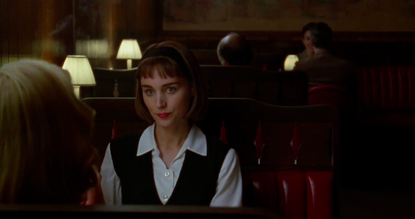
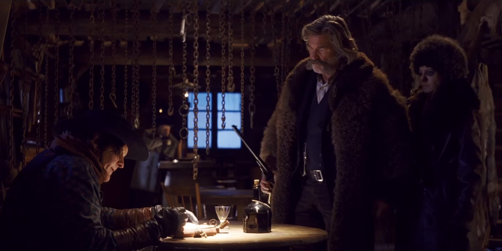
Much has been made about how both of these films were shot; Carol was shot on 16mm (Todd Haynes and Lachman’s second use of the format, after their HBO miniseries Mildred Pierce) and The Hateful Eight was shot on 65mm. Yes, both films make excellent use of those formats (Carol‘s gorgeously grainy, soft-edged textures, Hateful Eight‘s pristine landscape shots), but there’s much more to these films than their film stocks. They both are two of the best-composed films of the year, for one. Hateful Eight‘s use of the 2.75:1 ratio frees up Richardson and Quentin Tarantino to play with the positioning of the film’s actors in ways they couldn’t dream of even in 2.35:1 (this alone negates those endless complaints about the 65mm not being used well because the film mostly takes place indoors). Befitting a movie about people who seem to represent diametric opposites in society, many shots here place one character at one end of the frame and another at the other. In addition to the thematic importance, this also works wonders from a storytelling perspective, allowing Richardson and Tarantino to get across information in one shot as many times as possible, saving cuts only for when they’re really necessary. Working a much smaller frame, Lachman also uses his compositions to help guide along Carol‘s story, often telling what the characters are deathly afraid of saying. In so many shots in the film, the main characters are dwarfed in the film, tucked into corners, surrounded by negative space, separated from others by frames-within-frames. What makes this more than being arty for art’s sake is how thematically appropriate this is (we’re not talking Tom Hooper here), how it visually showcases the characters’ isolation from society, and how it makes the film’s close-ups feel hard-earned, more than just the standard mode of shooting.
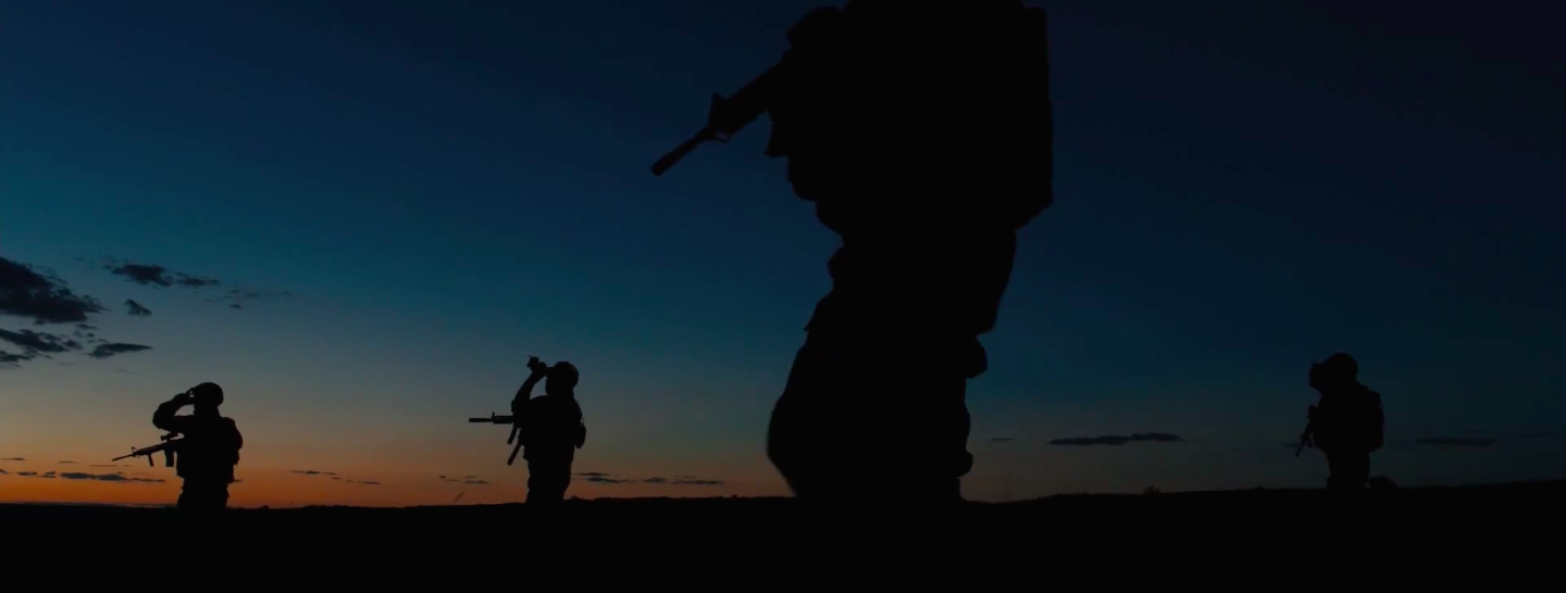
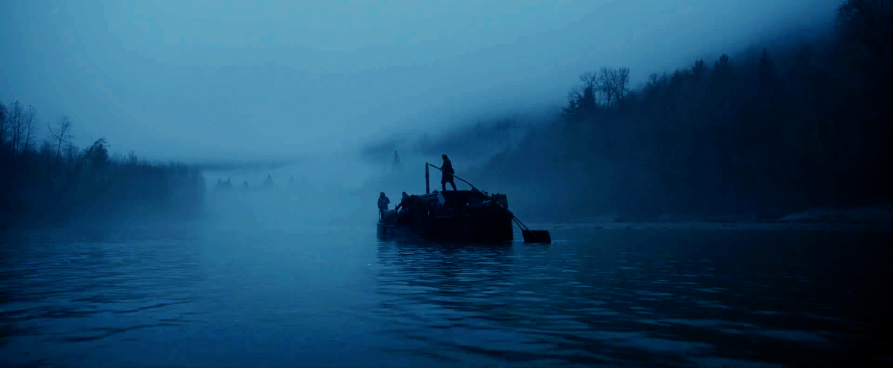
The “No Duh” Award for Most Obviously Gorgeous Film(s): (tie) Sicario, Roger Deakins, A.S.C. B.S.C., The Revenant, Emmanuel Lubezki, A.S.C. A.M.C.
Look, I’m not the first person that’s going to tell you that The Revenant and Sicario both have crazypants amazing cinematography. I’m not going to be the first person to mention the visual metaphor of the screenshot I chose for Sicario, or the one to talk about Lubezki’s use of entirely natural light. I have to include them here because they’d be my picks for the two best-shot films of the year, but I don’t have much to say about either. I’ll save whatever observations I could muster for Sicario for the Roger Deakins thingamajig (coming in a week, maybe), so I’ll use this capsule to expand a bit on The Revenant. The genius of Lubezki’s work there is not in the beauty of nature, or even in the beauty of the images he captures, but in how, underneath that beauty, there’s never a moment that makes you want to enjoy the great outdoors, because it’s a rainy, grey, awful place to be for more than the length of an establishing shot. I maintain that Lubezki deserved both of his previous Oscars, but he’ll super-duper deserve this one.
The “What Am I Missing Here?” Award for Strongest Maligned Cinematography: Spotlight, Masanobu Takayanagi, A.S.C.
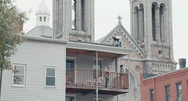
I had heard from seemingly everyone before I saw Thomas McCarthy’s Spotlight that it was the cinematic equivalent of oatmeal, bland and barely functional. Well, maybe it was lowered expectations, but I hold no truck with the people making Spotlight out to be some “point the camera at the characters and shoot” kinda movie. In fact, I was quietly very impressed by Masanobu Takayanagi’s cinematography here, which does a lot with a little. Sure, he doesn’t go crazy with the camera or indulge in any bravura tracking shots, but the filmmaking here really helps guide the story along in neat little ways. The most obvious examples are the shots of houses dwarfed by the Church (see above), which may not necessarily be subtle, but subtlety goes out the window the minute the alarming frequency of these priest molestation cases comes out (plus, the Church really does hang over Boston like it’s depicted to; McCarthy had to cut out more than a few shots like the one lest it become too heavy-handed). And speaking of that, my favorite shot in the film utilizes a quiet, patient camera movement, pushing in ever-so-deliberately when one of the Spotlight team’s sources reveals just how many pedophile priests may live in Boston. And the many scenes in the office of the Boston Globe are well-lit and -composed, rarely (like in the one shot I just mentioned) making the viewer feel anything less than comfortable and at-ease, as if the office is a womb protecting them and the team from the horror of the outside world. I’d like to know if the people making this movie out to be a crime against good cinematography have seen Still Alice, which is every bit as aesthetically bland as this is made out to be, and probably worse.
The Unbroken Award for the Biggest Waste of a Good Cinematographer: Pawn Sacrifice, Bradford Young
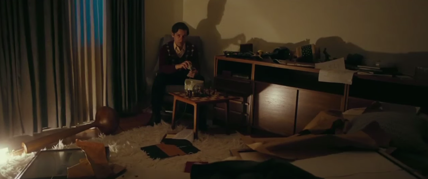
I’ve made my opinions on America’s hottest up-and-coming cinematographer, Bradford Young, clear in the past. His work is fantastic, mixing the obvious influence of Gordon Willis with a love for natural light and a knack for photographing black skin tones. He’s the reason I saw Edward Zwick’s Bobby Fischer movie Pawn Sacrifice, and he’s the reason that film registered disappointment from me as opposed to a shrug. That’s not to say that his work was the reason I was disappointed. No, he did a very good job on the film, and he does smuggle in some Willis touches (like all the scenes dimly-lit with cheap lamps) and at least one genuinely weird, wonderful shot (a POV of Fischer, seeing the world through eyeholes in a paper bag). But the film around him is pap that’s completely undeserving of him or his work, taking the easy route so often in its portrayal of a crazy guy who gets results for America, you stupid chief!, that one wonders why Zwick hired Young in the first place, especially considering this movie was made before Young had shot Selma or A Most Violent Year, when he had entirely worked on indie films that couldn’t be further away from the style Young was asked to use here (and that’s not including the fact that those films were almost all focused on the black experience, when, if Pawn Sacrifice had a black person in its cast, I missed them). It doesn’t help that Young’s work is surrounded by some of the worst faked archival footage I’ve ever seen in a major motion picture. Let’s hope that A Most Violent Year, not this, sets the path for Young’s future career path with white directors.
Purtiest Colors (Any Film Division): Crimson Peak, Dan Laustsen, D.F.F.
Unlikiest Postcard-Ready Treatment of Rhode Island: Irrational Man, Darius Khondji, A.S.C. A.F.C.
The “Keep on Keeping On” Award for Most Work in Films that I’ve Yet to See: Maryse Alberti, for The Visit, Freeheld, and Creed
The “Better Luck Next Year” Award: (tie) Eric Gautier, A.F.C., for Aloha and Grace of Monaco, Seamus McGarvey, A.S.C. B.S.C. for Fifty Shades of Grey and Pan
Shot of the Year: The final shot of Phoenix, Hans Fromm

